Objective
The goal of this tutorial is to learn how to use Evince for developing a classification model. The example in this tutorial is the classification of different tablets. The following steps are explained in the tutorial:
Import of image
Start by downloading the Tablets dataset
Download tutorial data from this link: Tablets.zip
Start Evince and choose to create a new project
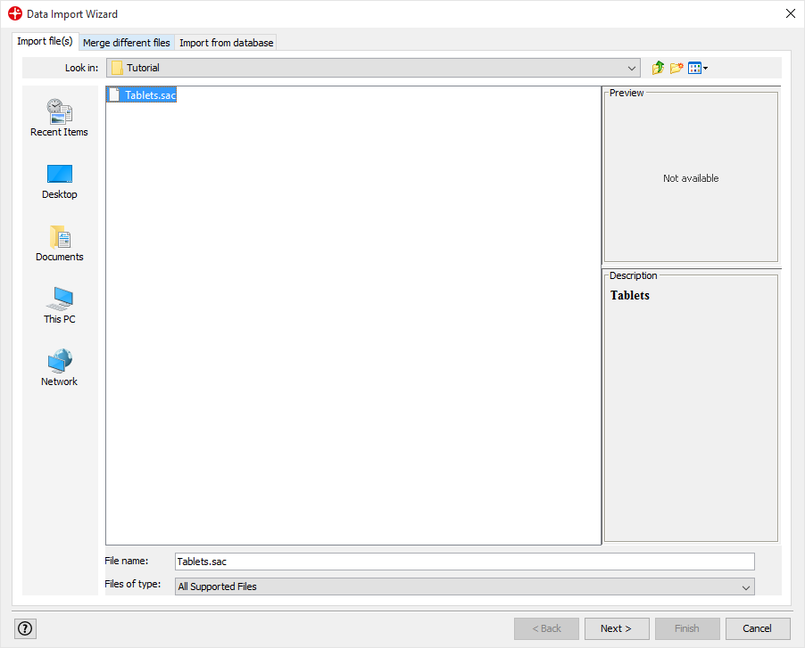
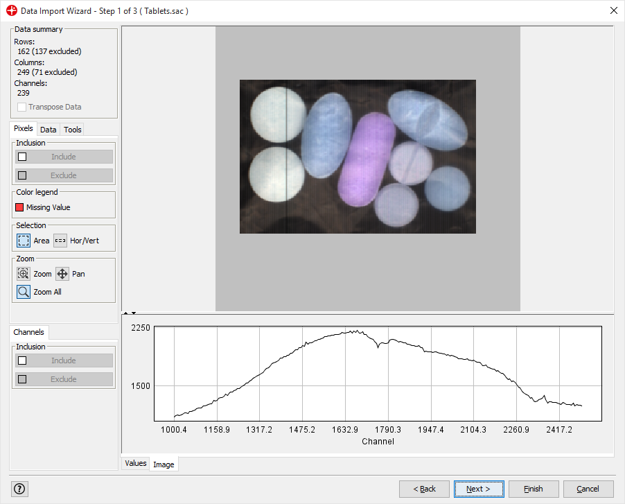
Browse to select Tablets.sac for import. Click on Next.
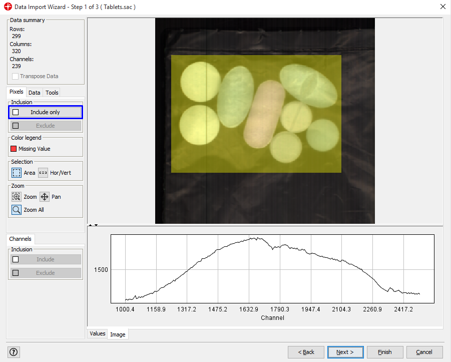
We only want to analyze the part of the image containing the samples. Select the area of the image by holding down the left mouse button and drag over the image so that the tablets are inside the selected square.
Click on Include only. Only the selected pixels will be included. Then click on Next.
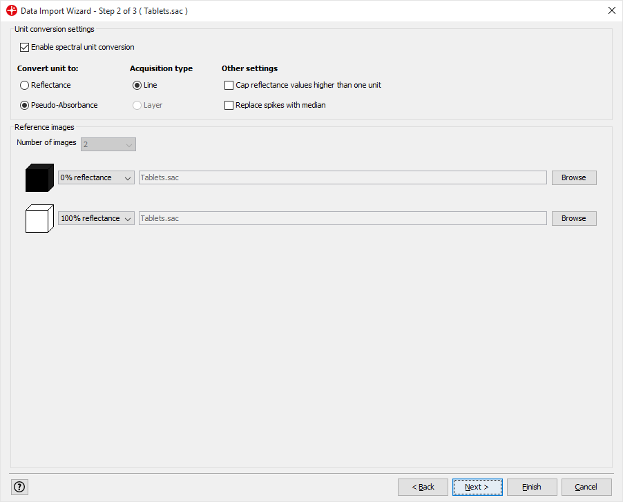
Click Next (We will apply the default settings)
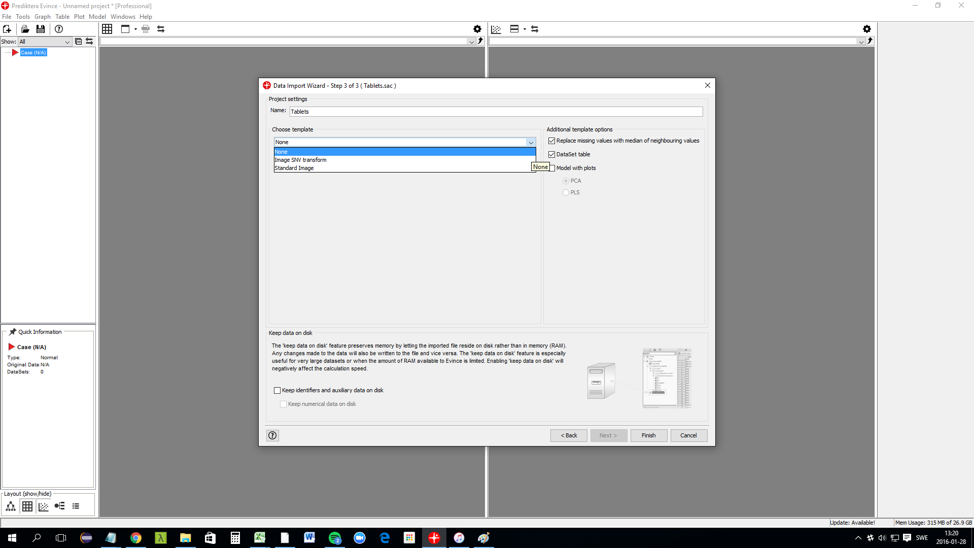
A template can automatically be applied to the image after import. In this example, we choose to use None. The model with plots should be unchecked since we will manually make these plots in this tutorial. Click on Finish to complete the import.
Background removal
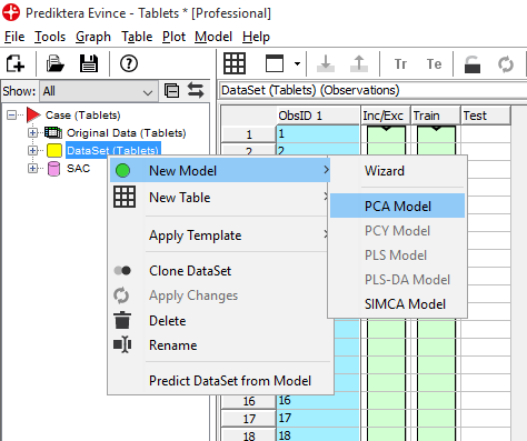
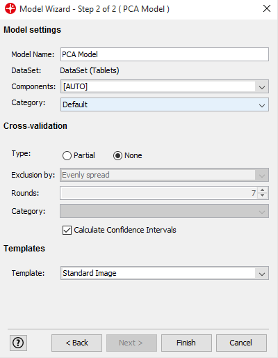
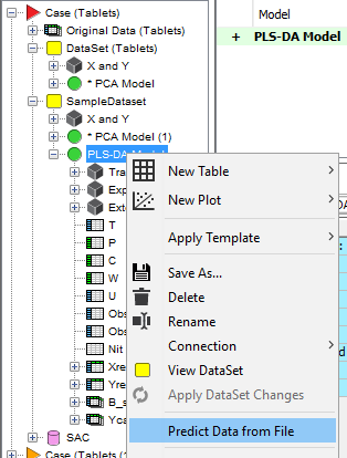
We will now start by creating a PCA model. On the left side of the screen, you can see an overview of the data sets and models created. Right-click on DataSet (Tablets) and select New Model / PCA Model.
Use default settings and click on Finish to create the PCA model
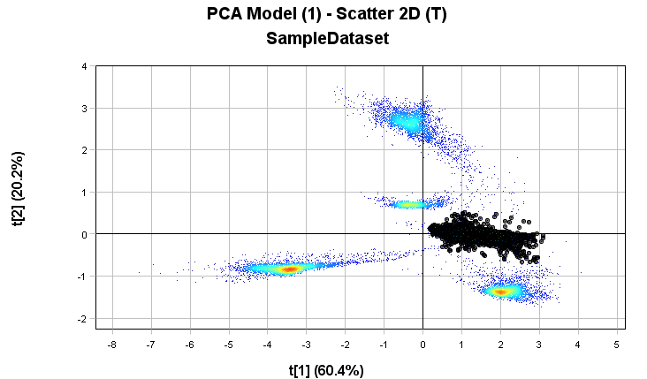
In the PCA Model - Scatter2D plot hold the left mouse button down and drag to select the pixels in the cluster on the left side. You can see how the corresponding pixels are highlighted in the PCA Model - Contour 2D plot which in this case are the pixels of the tablets.
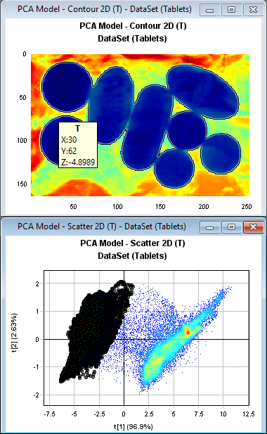
PCA: Principal Component Analysis is very useful to visualize the variation in a large dataset with many variables (in this case 239 spectral channels). The 1st component (t1) which is the horizontal axis in the PCA Model – Scatter 2D plot is explaining 96.9% of the variation in the data set in this example.
Right-click in the Scatter 2D plot to open the menu and then click Invert Selection to select the background pixels.
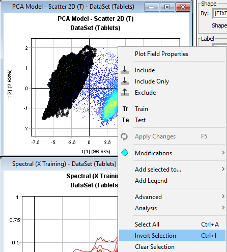
Right-click and press Exclude removing the background pixels

Right-click and press Apply Changes to update the model which is now without the background pixels.

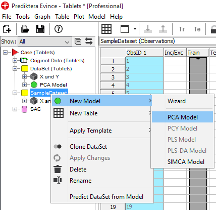
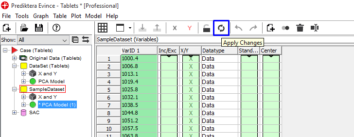
Right-click on DataSet and select Clone Dataset to create a new dataset with only tablet pixels. This means we are now making a copy of the data without the background pixels (this is not necessary to do but can be useful if we want to keep the original data set).
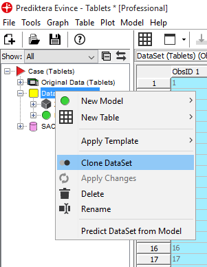
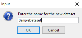
Enter a new name for the new cloned dataset (in this example SampleDataset)
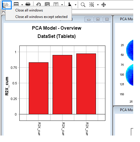
Right-click on the graph button and press Close all windows in the plot panel.
Right-click on the new data set and select New Model/PCA Model to Create a PCA model for the new cloned dataset. Use default settings and click on Finish.
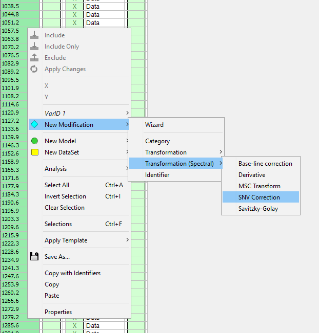
Click on the Variables tab (at the bottom of Evince screen) for the new SampleDataset dataset to see a table of all the variables (in this case spectral bands).

Right-click in the table and select New Modification/Transformation/SNV Correction to add SNV transformation of the spectral data.
Spectral transformations can be useful to filter or remove unwanted variations/scatter in the spectra. We recommend that you use SNV (Standard Normal Variate) in most cases, but as you can see in the menu there are other types that can be used. In this tutorial we started with no spectral filter as it in this case made it easier to see the difference between sample and background.
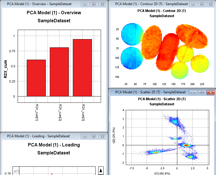
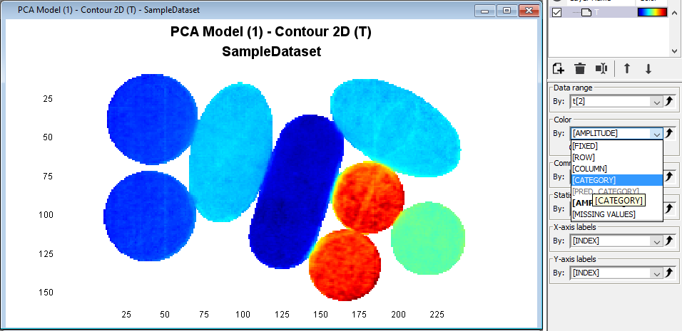
Right-click on the variables table and press Apply Changes or use the shortcut button. We can now see in the scatter plot that we have 5 separate clusters. The color in the Contour2D plot shows us the variation in the 1st PCA component.
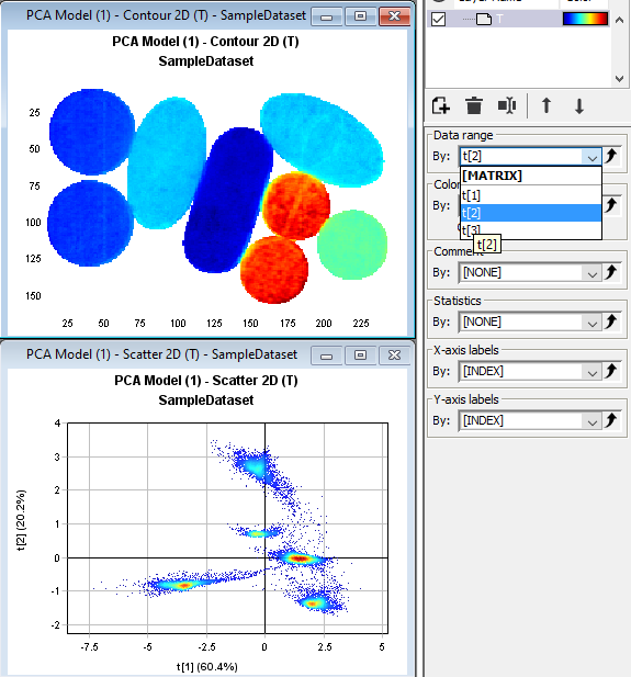
Click on the Contour2D plot and then change the Data range to t[2] in the drop down menu to the right. The plot is now coloured by the second PCA component.
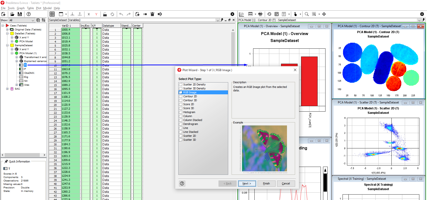
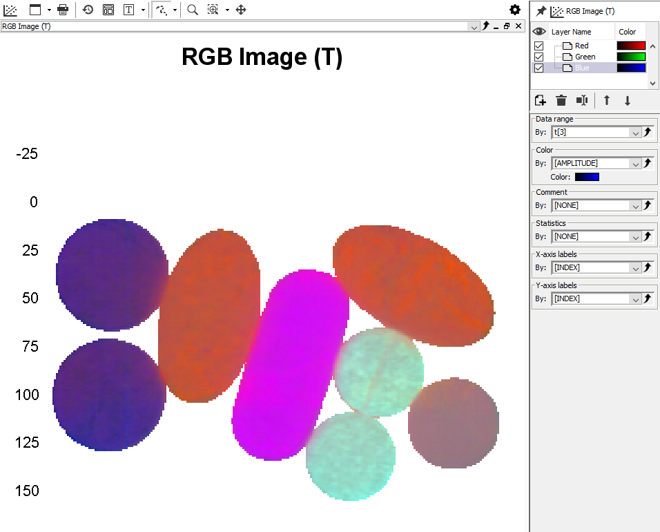
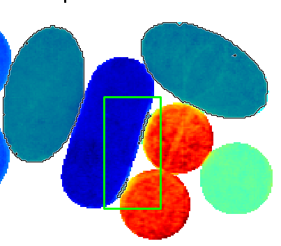
Left-click on the plus sign for the 2nd PCA model to expand it. Then click on the T (score matrix for the PCA) and then drag and drop it to the graph panel to the right. Select RGB Image. Press Next and Finish. A pseudo-RGB image is created with coloring based on the first three PCA components (t1, t2, t3). We can see that we have 5 different types of tablets.
Assigning classes
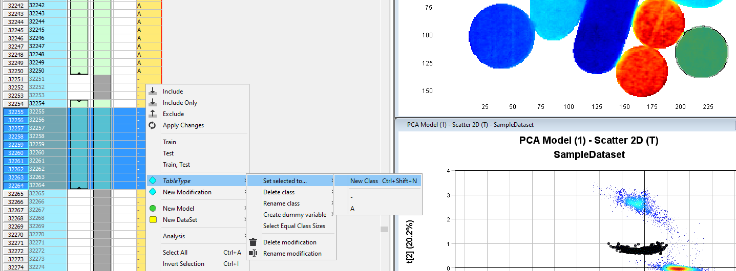
We will now assign classes to pixels according to the clustering observed in the Scatter2D plot. Start by selecting pixels from the first cluster from the top. Then right-click and select Add Selected to.../New Category.
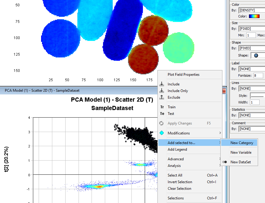
In the Category Name field write a new name (in this example TabletType) and uncheck the highlighted checkbox
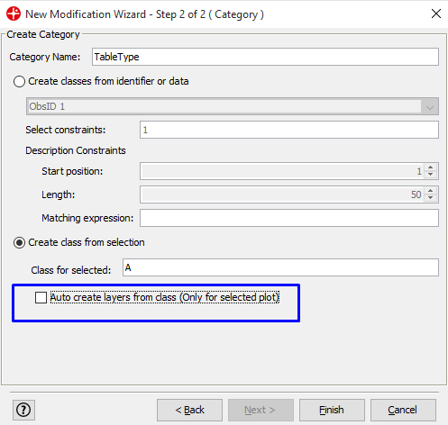
The selected pixels get assigned to class A. Click on the Observations tab to see the selected pixels and that these now are assigned to class A.
Select the next cluster in the Scatter 2D plot. Right-click in the yellow column in the Observations table. Click TabletType/Set Selected to/New Class. Write the name for the class (in this example B).
Select pixels for the 3rd cluster.
Some edge pixels might in this case get selected that don’t belong to the class
Keep the shift key on the keyboard pressed while selecting these edge pixels. These pixels are now excluded from the selection.
Assign the selected pixels to class C using the same procedure as before.
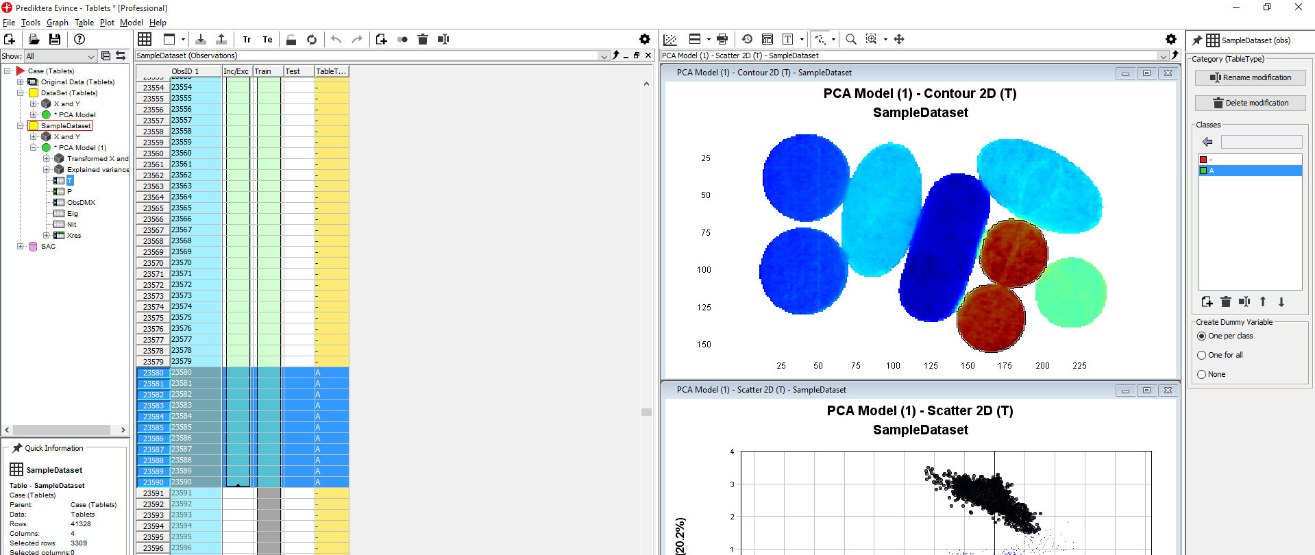
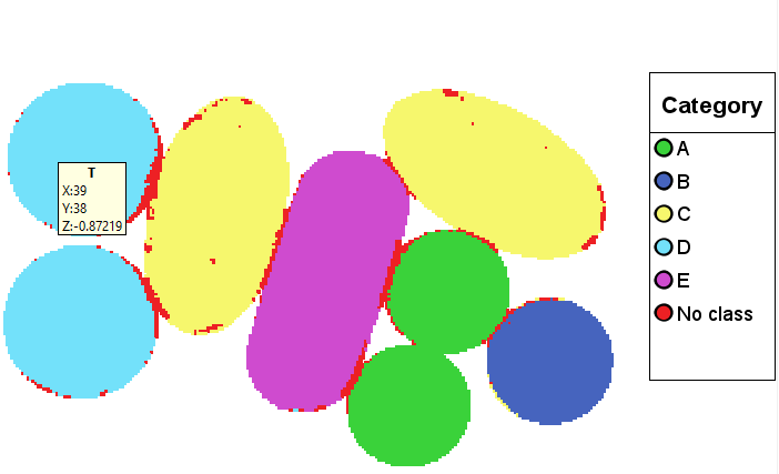
Repeat procedure so that we have assigned classes for all five clusters (A, B, C, D, E).
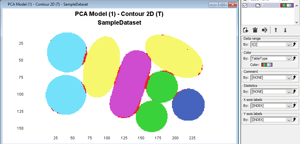
Click on the Contour2D to activate it and then in the Color drop down menu select Category and TabletType
Right-click in the plot and then press Add Legend to see the corresponding classes for each color.
Click on the Scatter2D plot and in the Color menu select by category. In the Size menu set Min pixel size for shapes to 2.

Create PLS-DA model
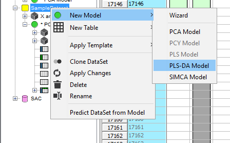
Now that we have assigned classes we can create a PLS-DA model for classification. Right-click on SampleDataset to create a PLS-DA model
Use default setting and create a model by clicking Finish
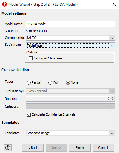
PLS-DA (Partial Least Squares - Discriminant Analysis) is a classification method that separates the data based on the class variable that we have added to the analysis. After you have trained the PLS-DA model with known data it can be applied to new unknown data to tell us which class it belongs to.
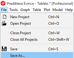
Save the project by clicking on the File menu and Save As
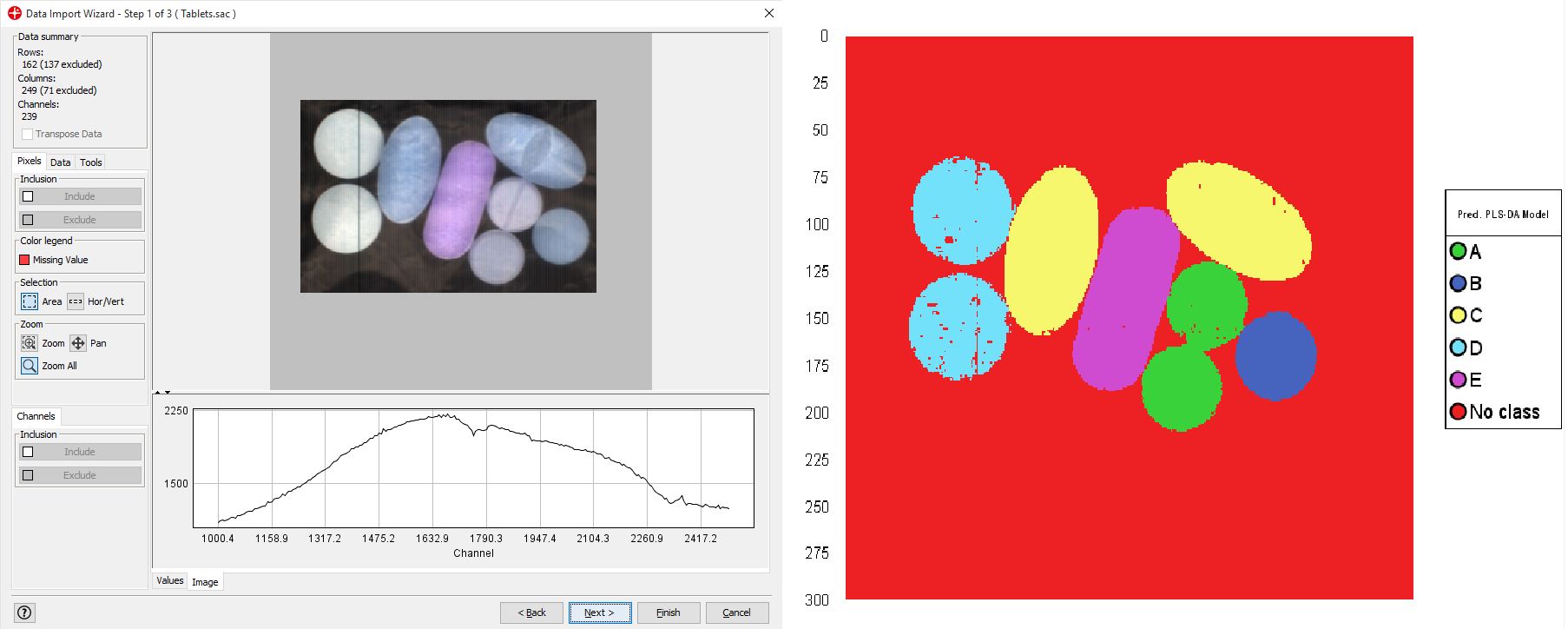
Use PLS-DA model for prediction
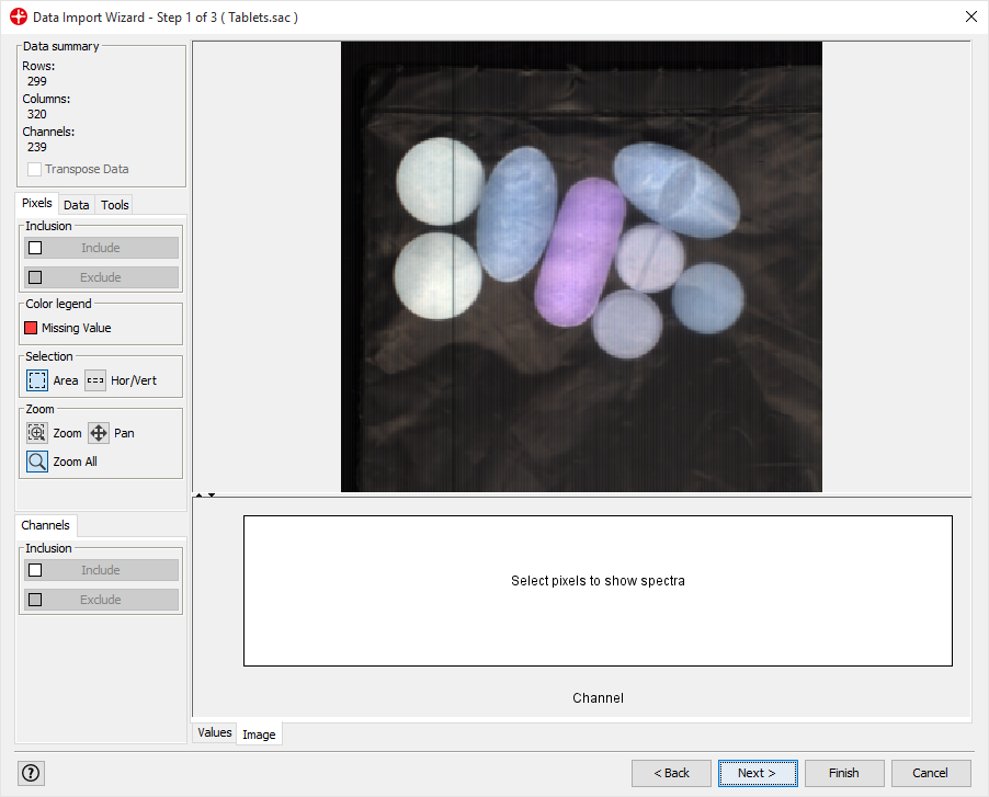
We now want to use the PLS-DA model for predicting classes in a new image. In this example we don’t have a second image, so just to show how this would be done we will import the same image that was used for creating the PLS-DA model.
Right-click on the PLS-DA model and select Predict Data From File
Import Tablets.sac and follow the steps of the data import wizard (use default settings).
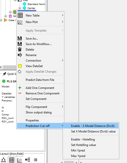
Right-click on the PLS-DA model and select Prediction Cut-Off/Enable - X Model Distance (Dcrit)
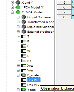
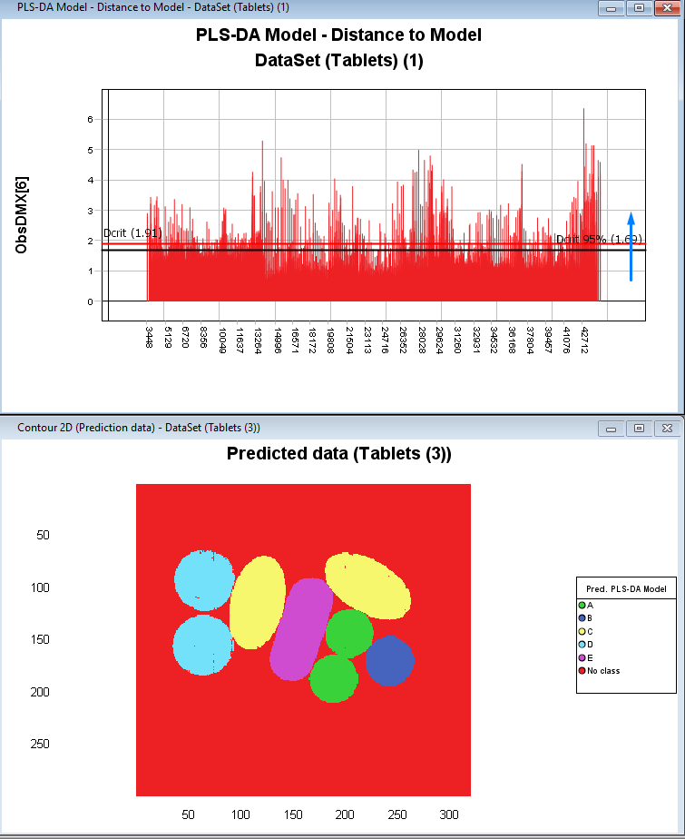
Click on the plus sign to expand the PLS-DA model and then select and drag the ObsDMX to the graph panel on the right. Then Select Distance to Model and press Finish.
By sliding the red Dcrit line you can set the tolerance threshold for what is excluded and predicted as No Class.
Conclusion
You have now learned how to start a new Evince project and to import an image. After that, you learned how to clean up the image and remove background pixels, set classes for pixels in the image, and train a PLS-DA classification model. Finally, we learned how to apply this model to a new image to classify the pixels in this image.
In this example, we didn’t have any images in addition to the image that was used for training the model. Ideally, you should always validate the predictive power of your model by applying it to a number of new images that were not used for training the model.