Objective
The goal of this tutorial is to learn how to use Evince for developing a quantification method using hyperspectral images. In this example, we will measure the % of three different types of powders (vanilla, baking soda, potato starch) that are mixed together in a plastic bag. The following steps are explained in the tutorial:
-
Assigning reference values (% of each powder) to each sample
-
Developing a quantification model (PLS) for the % of the three powder types
Tutorial data
The hyperspectral images were recorded using a SWIR camera (spectral range 1000-2500 nm). To reduce file size for download over the web the spectral channels were reduced from 256 to 67.
Instructions
Import and merging of images
Start by downloading the Powder quantification dataset to your hard drive. Download tutorial data zip file from this link: https://www.prediktera.com/download/sample/Powder_quantification.zip
Start Evince, select New, and click on Finish to start a new project
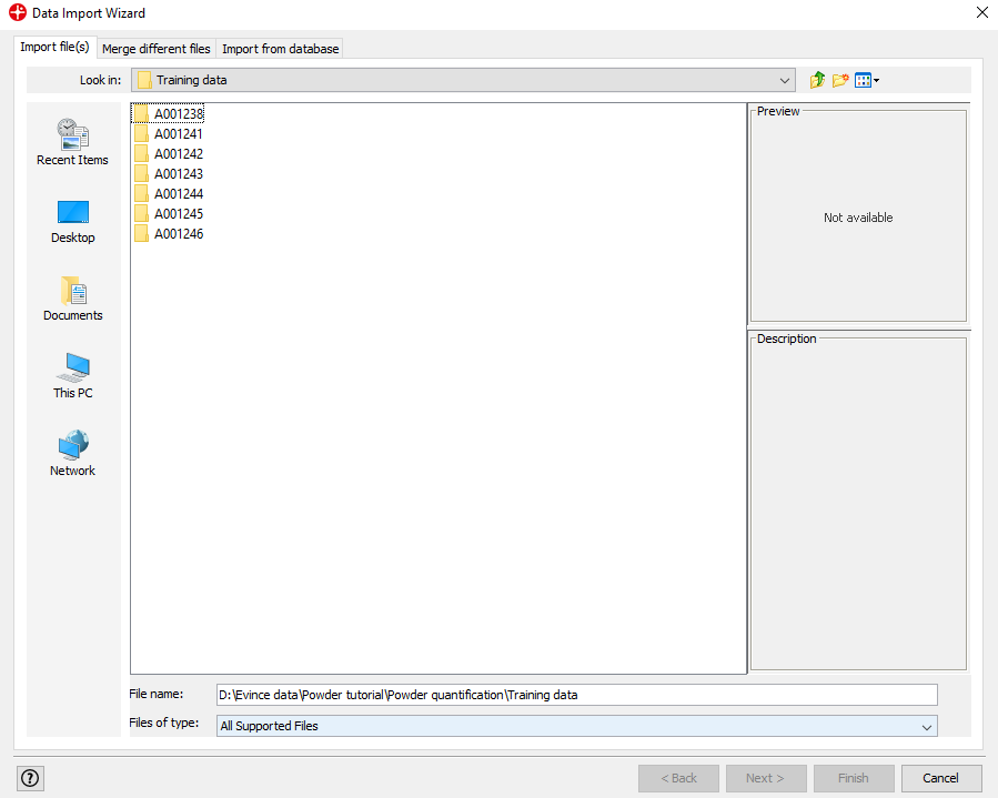
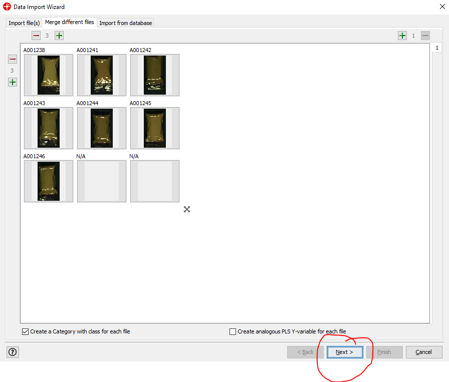
Find the Powder quantification/Training data folder, select all folders and click on Next (to select all folders hold down the shift key on your keyboard and click on the first and last folder). Click Yes to merge the selected files.
Click on Next
The Data Summary shows us that we have an image with 999 rows, 576 columns and 67 channels (spectral variables). By moving the mouse over the image you can see the spectral profile for each pixel.
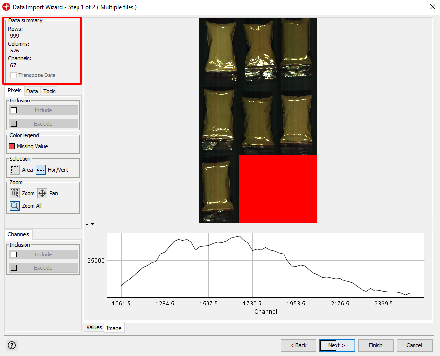
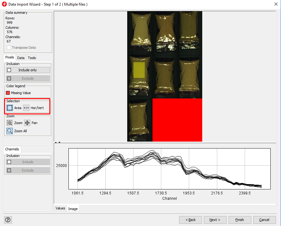
By left-clicking and dragging your mouse over the image you can select areas of the image and see the spectral profile for that area. Under the Selection menu, you can change the shape of the selection tool.
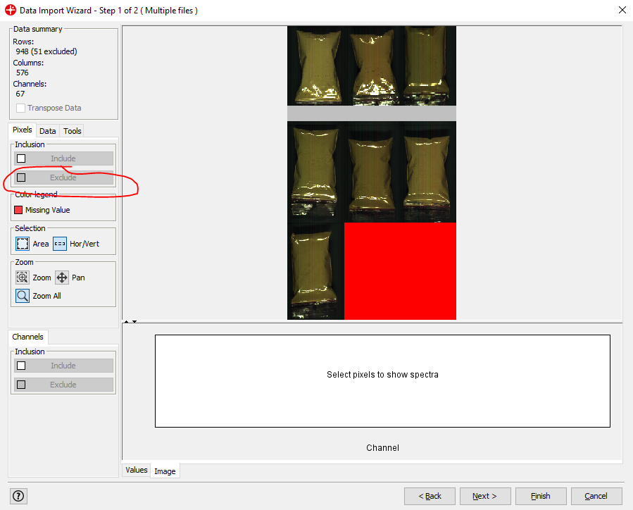
After selecting an area and clicking Exclude you can remove pixels from your image that are not of interest. In this example, we could remove pixels that are not from plastic bags with powder (i.e. the black background). This is not necessary to do but can be useful to reduce the size of the image file or to make the following data analysis easier (note that the red area cannot be excluded since this does not contain any image data).
Click on Next
Make sure the Model with plots is unchecked and Image SNV transform is chosen. (SNV is a transformation method used to remove unwanted variation from the spectra data)
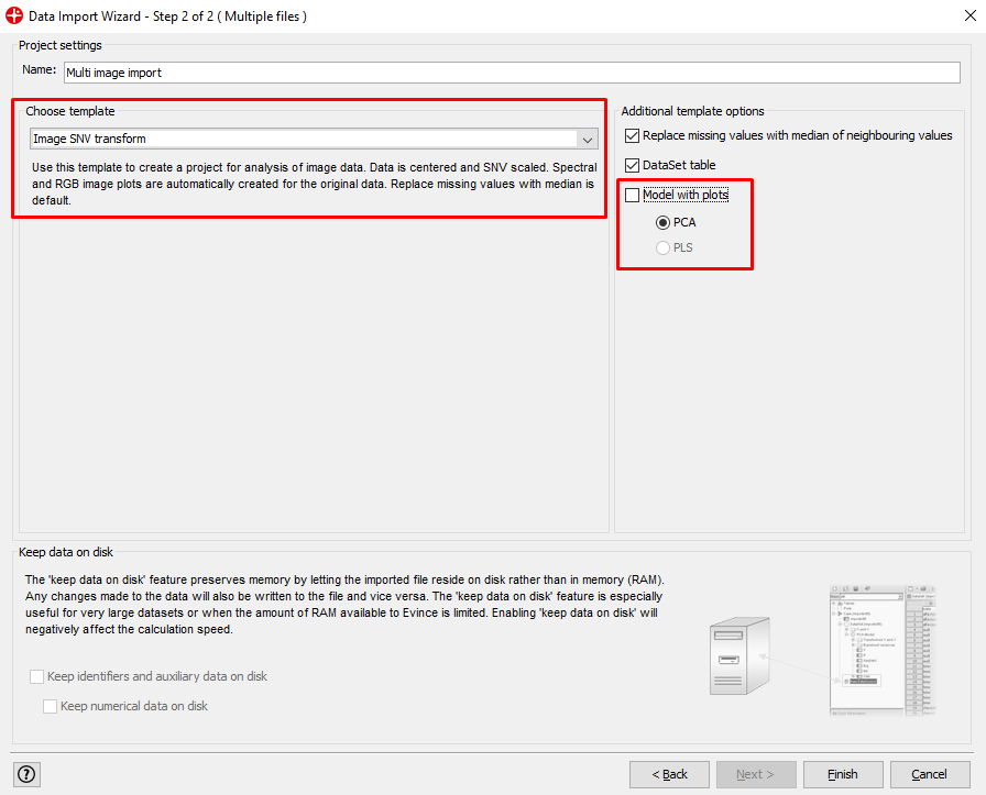
Change the name of the Evince project if you would like
Click Finish.
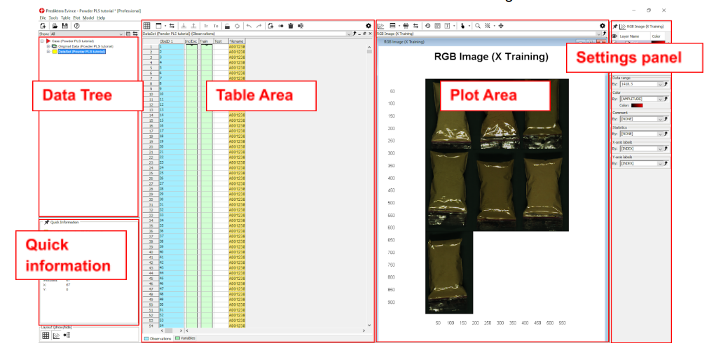
We have now finished the import of the images into our new Evince project. The screen is divided into the 5 areas seen in this image.
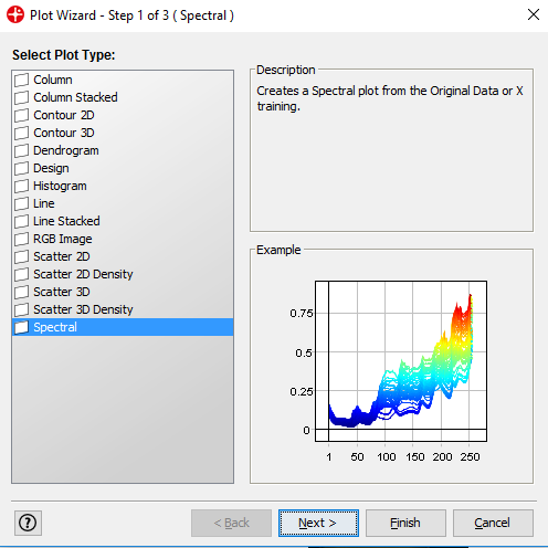
Click on the plus sign next to the Dataset to expand it. Left-click on X Training and drag and drop it to the plot area.
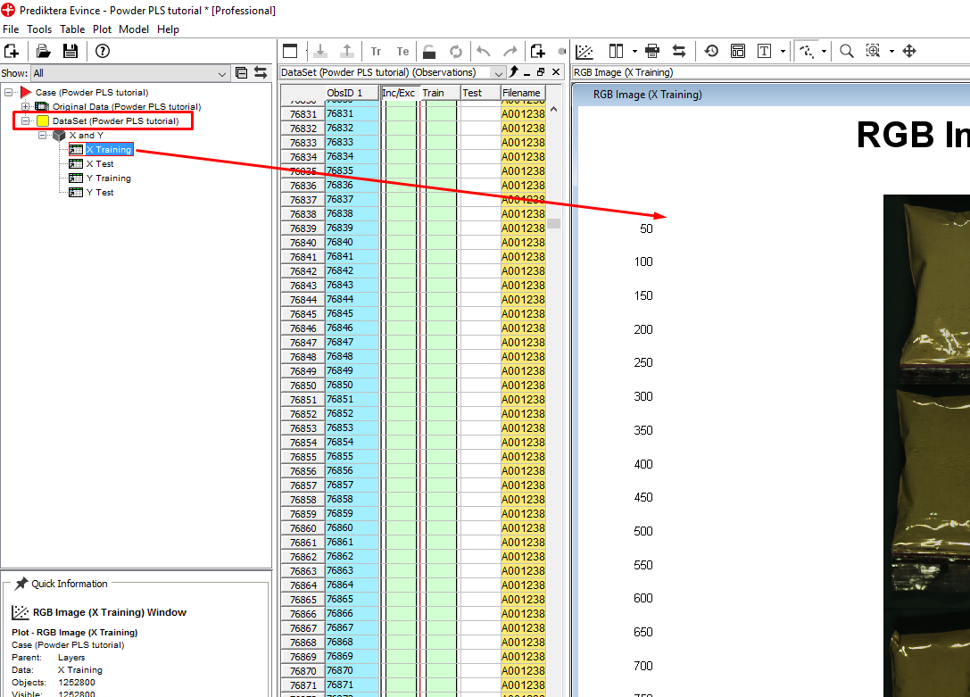
Select the Spectral plot in the next window and then click on Finish.
By moving the mouse over the pseudo-RGB Image you can see the wavelength for each pixel. This image is created from three wavelengths shown in the Spectral plot (Red, Green, and Blue lines). By dragging these lines with your mouse you can change the wavelength.
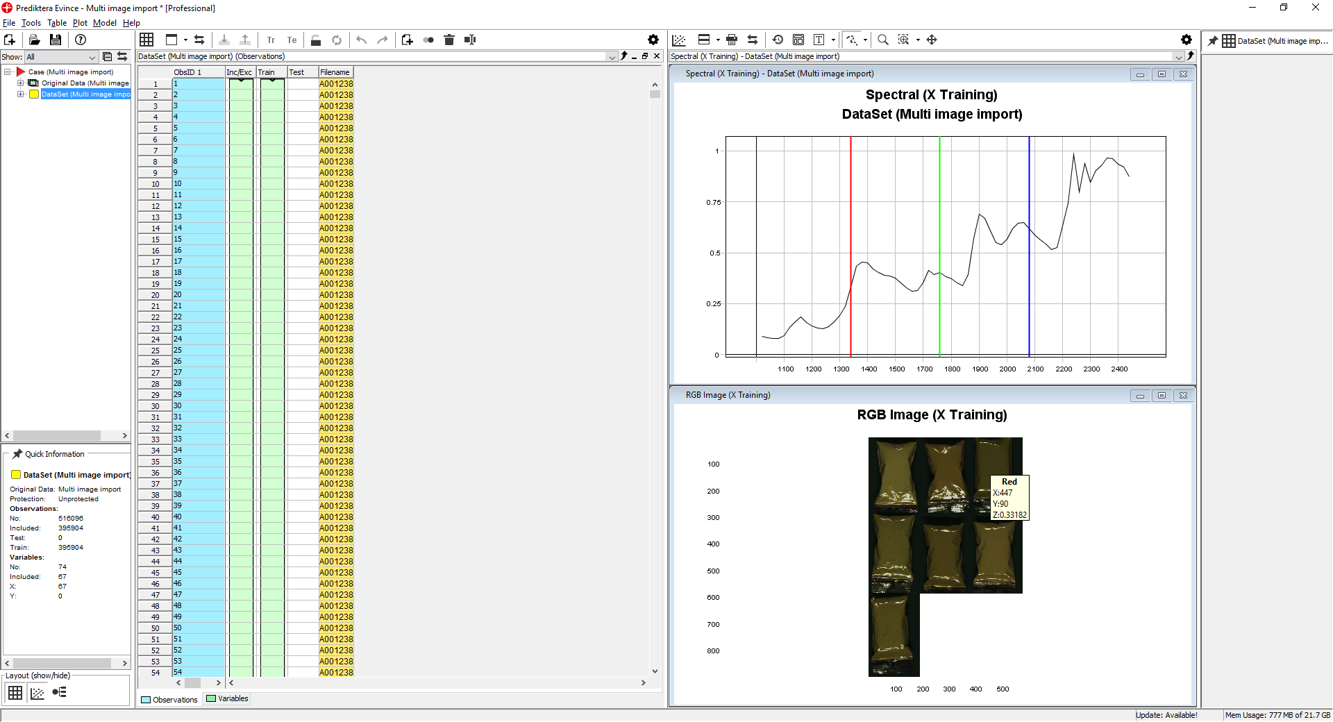
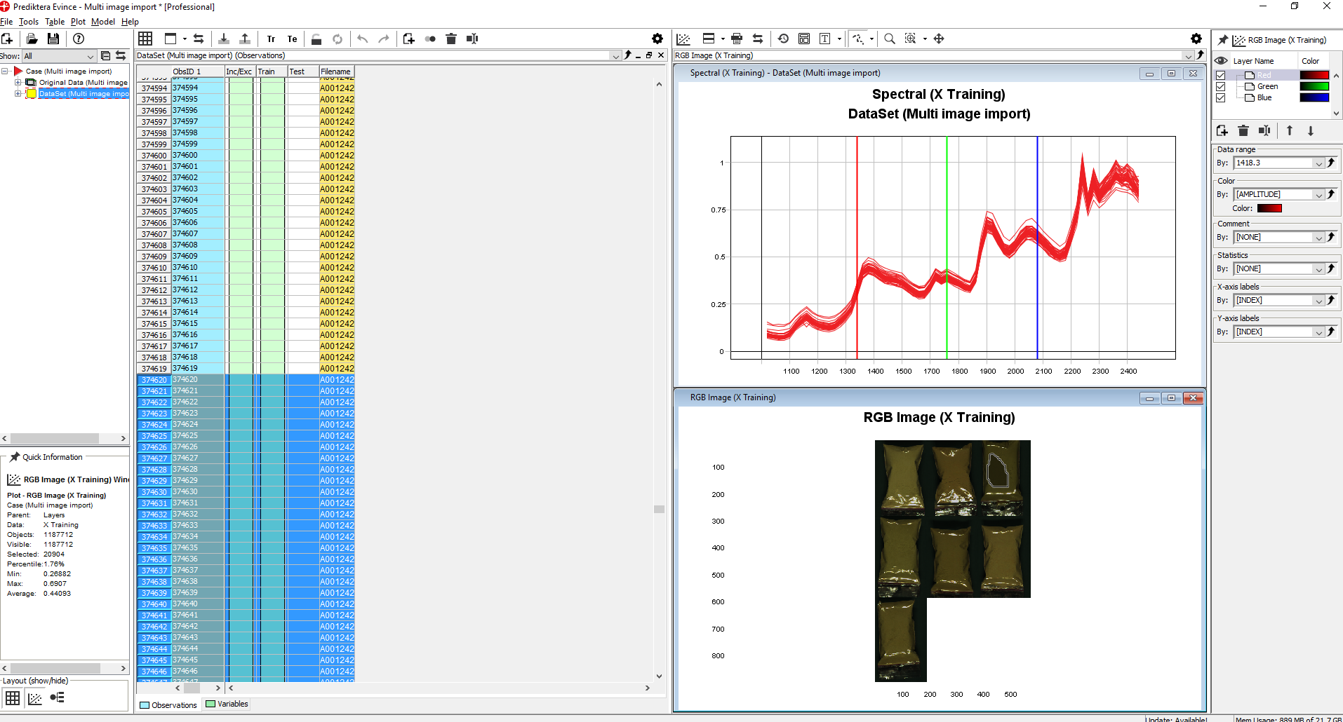
By holding down the left mouse button and selecting an area in the RGB Image the spectral profiles for all pixels in this area are shown (notice that the pixels selected are automatically highlighted in the data table)
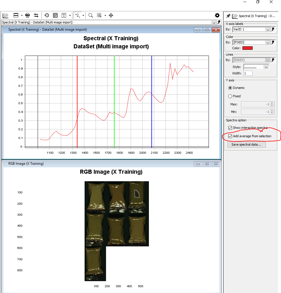
Click anywhere on the Spectral plot to activate the Settings menu for that plot, check the box to Add average from selection. This will give you the average spectral profile for the selected area. You can select additional areas with the mouse to compare the average spectral profiles for those areas.
Removing the background pixels from the images
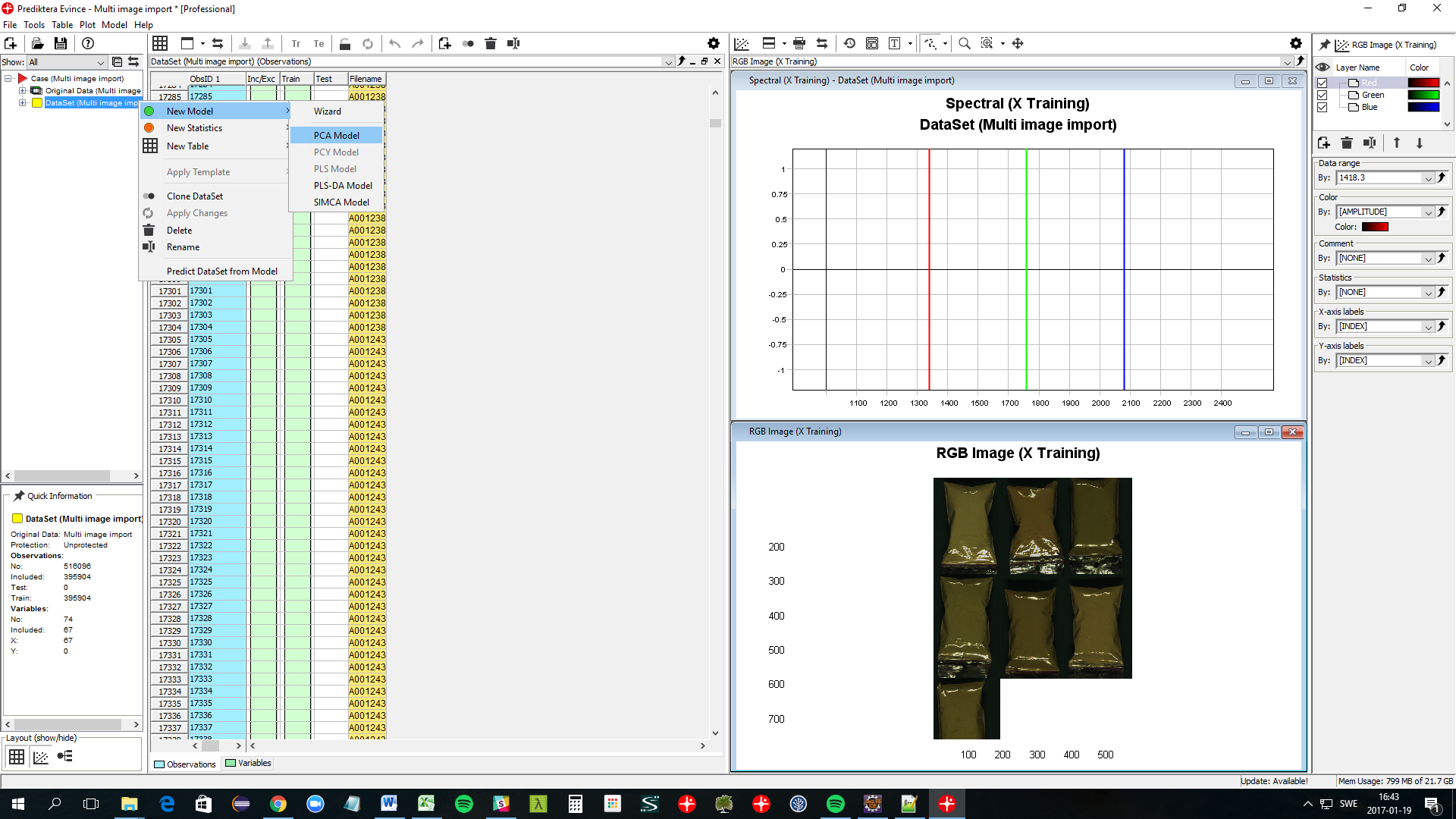
Right-click on the DataSet symbol in the data tree and select New Model / PCA Model. Click Finish on the following screen.
A PCA model has now been created for the image and a number of new plots are shown. For this exercise, we can close down all plots except the PCA Model - Scatter and the PCA Model - Contour plots.
Click on the Arrange drop-down menu and select Tile windows horizontally to enlarge the windows.
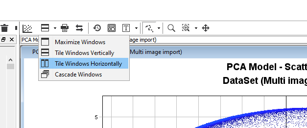
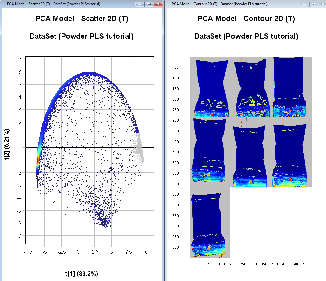
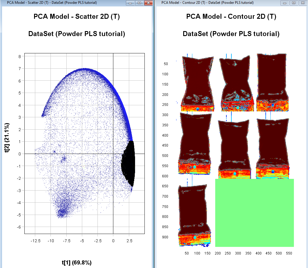
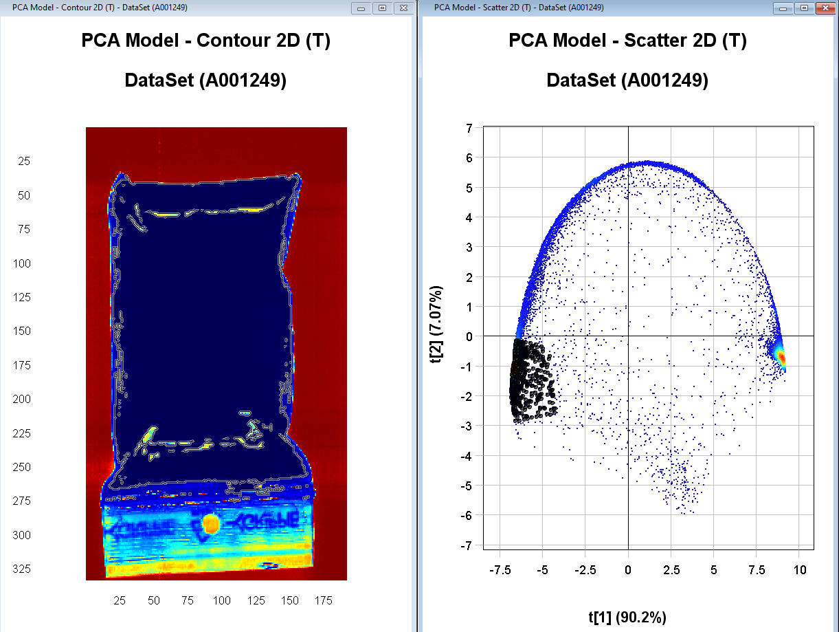
The PCA Model Scatter 2D (T) plot is showing how the pixels in the image are clustering based on similarity in the spectral profile. In this example, the first component t[1] is explaining 89.2% of the variation and t[2] 6.21% (you might get slightly different results if you did or did not exclude pixels in the import step). The color is based on pixel density (red = pixels are very close to each other).
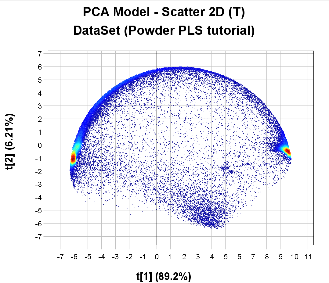
By holding down the left mouse button and dragging the selection tool over the cluster of pixels to the right we can see in the PCA Model – Contour 2D (T) image that these correspond to the background pixels (they become darker in color after selection). The PCA Model – Contour 2D (T) is colored by the variation in t[1].
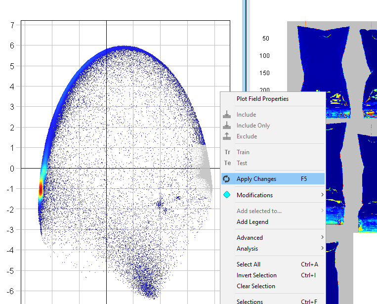
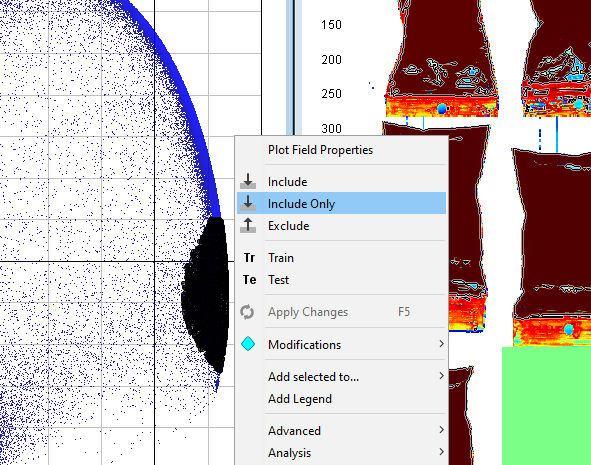
Right-click anywhere in either plot and click on Exclude
The excluded pixels are now greyed out
Right-click on the plot and select Apply Changes
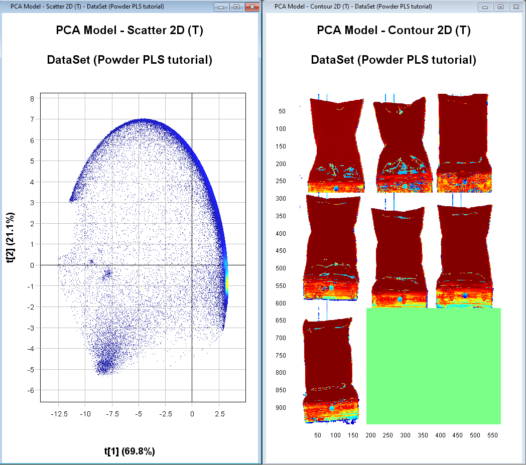
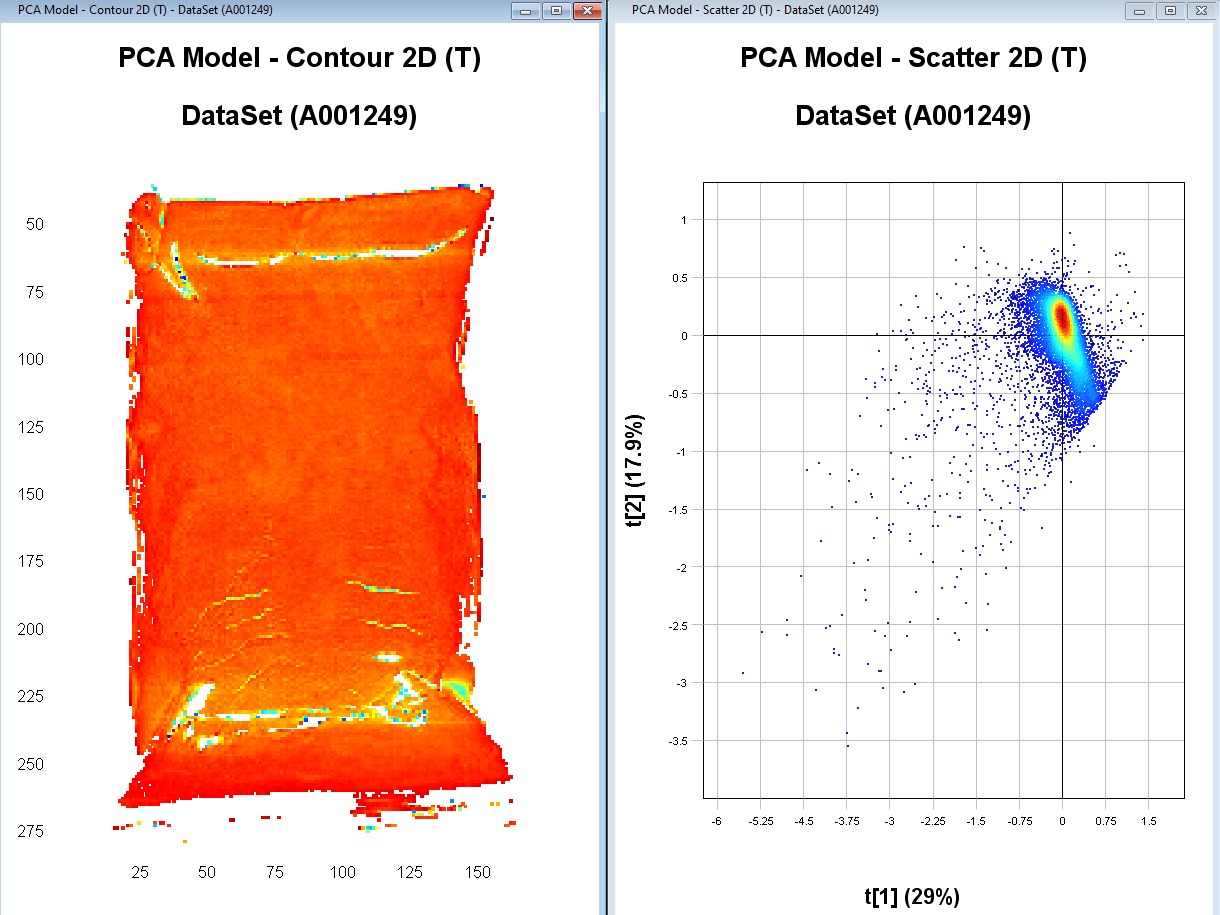
The PCA model has now been updated without the excluded pixels (depending on which pixels you removed, this plot might look different from the screen shown in these instructions).
We have now removed the pixels corresponding to the background. But we want to do some additional cleaning of the image to remove the part of the plastic bags that don’t have the powder in them, pixels on the edge of the sample (contains some influence from the background), and pixels that have too much glare.
Select pixels that correspond to a sample and see which cluster this corresponds to in the scatter plot (might look different from the screen shown in these instructions).
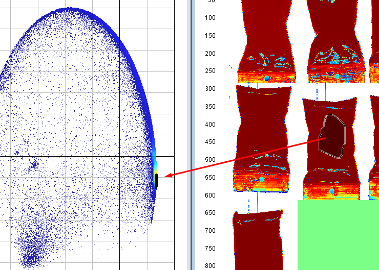
Select the cluster corresponding to the samples
Right click on the plot, click on Include only, and then right-click on the plot again and Apply changes
If needed repeat the two previous steps until you have an image where you have removed the pixels that are not sample (i.e. the part of the plastic bags not containing the powder). If you want to magnify an image or plot to see better hold the mouse pointer over it and scroll using your mouse wheel.
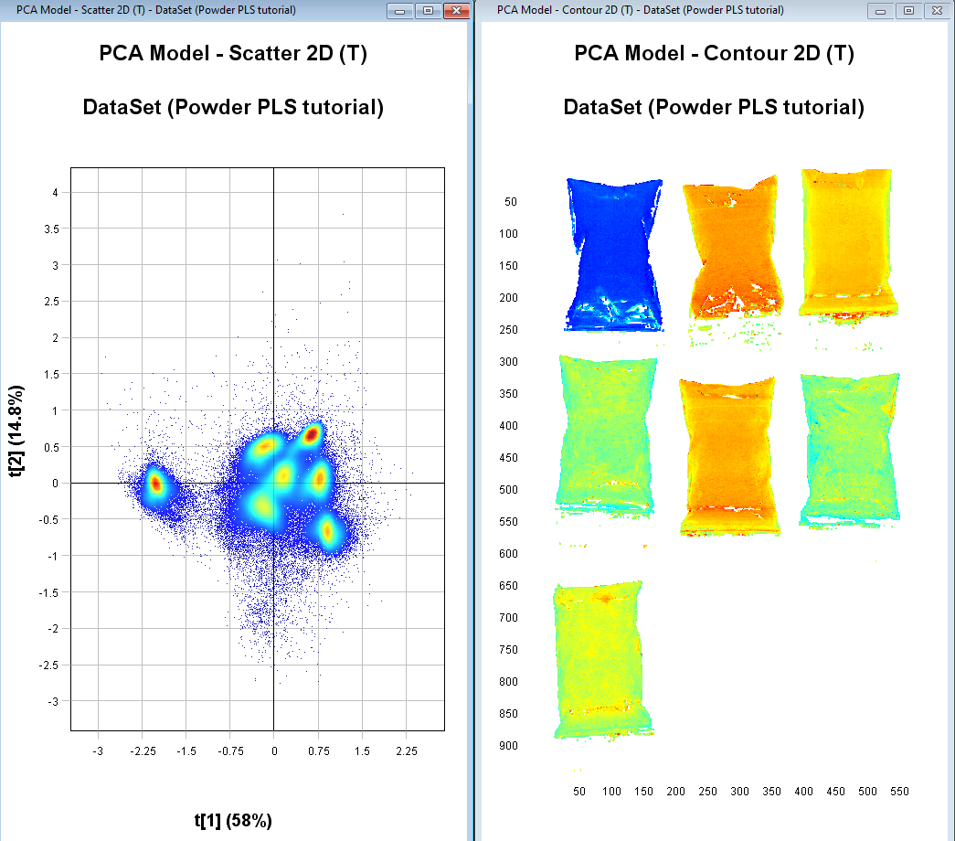
We should now have 7 distinct clusters in the scatter plot each representing a sample.
Identifying objects (samples) from each image
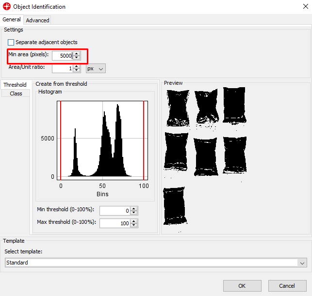
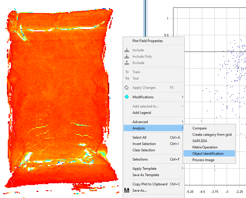
Right-click on the Contour plot and select Analysis/Object identification
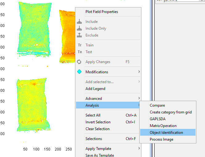
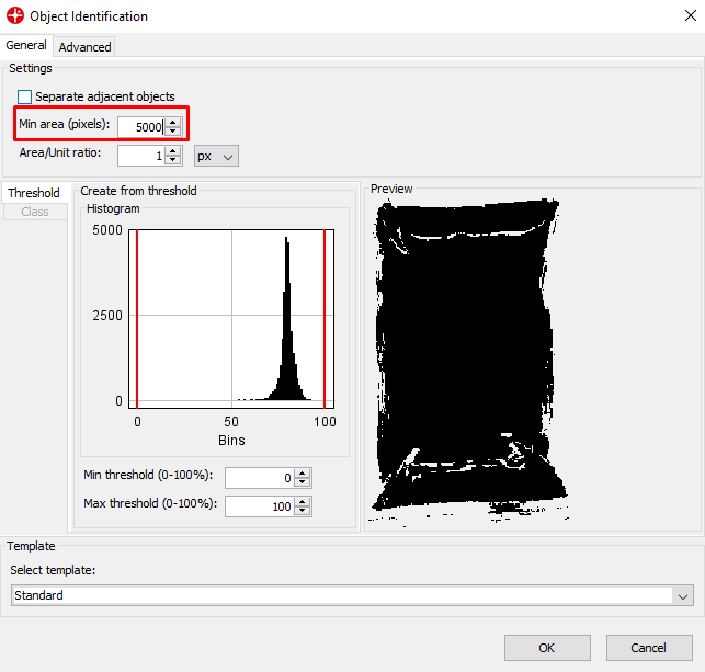
Set the Min area to 5000 pixels. This means that any object under 5000 pixels will not be found. This can be useful to remove small objects like dust. Click on OK.
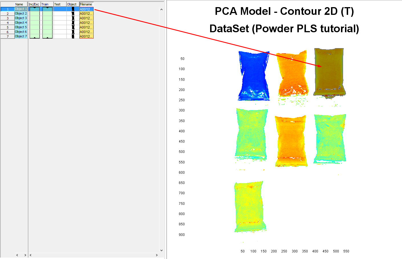
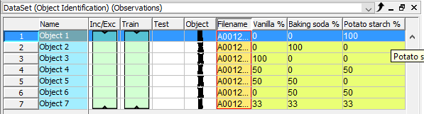
In the table area, you can see that we generated a dataset of 7 objects each corresponding to an average spectrum of all pixels for each plastic bag with the powder.
Assigning reference value to each sample
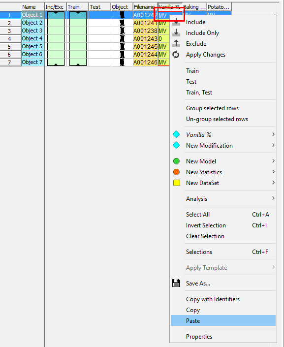
Right-click in the table and select New Modification/New Variable
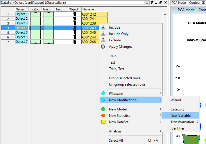
Write Vanilla % in the Data name field and click on Finish
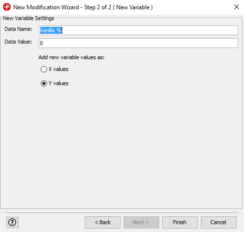
Repeat this step to add the variables Baking soda % and Potato starch %
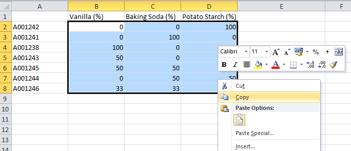
Copy the reference values from the Powder refdata table. The .xls file was included in the download of the image files.
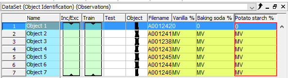
Paste the data into the table in Evince by right-clicking on the row for the first sample in the Vanilla column (please wait a few seconds while Evince matches the data with each object and the windows closes)
The table should look like this now
Developing a quantification model (PLS) for the % of the three powder types
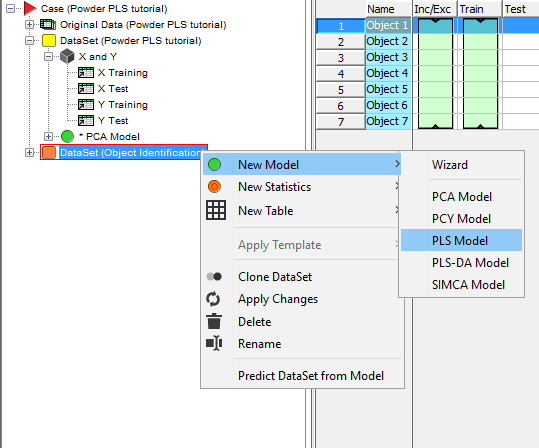
Now we want to create a PLS model with the reference values we just entered into the table for each sample. Right-click on the DataSet (Object Identification) and select New Model/PLS Model. Click Finish on the next window that comes up.
A number of plots are generated for the PLS model. You can close down all except The PLS Model – Overview and the Observed vs Calculated plot.
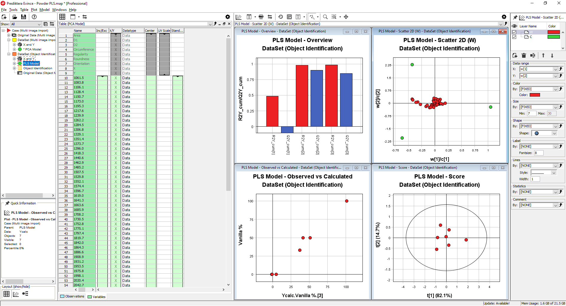
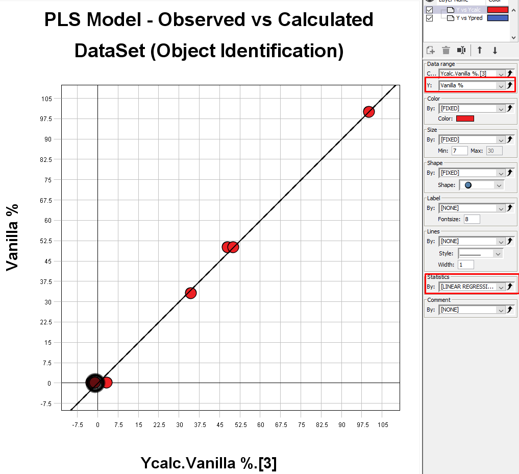
The PLS Model – Overview plot is showing us how well our model correlates between the information in the images and the % of the 3 different materials.
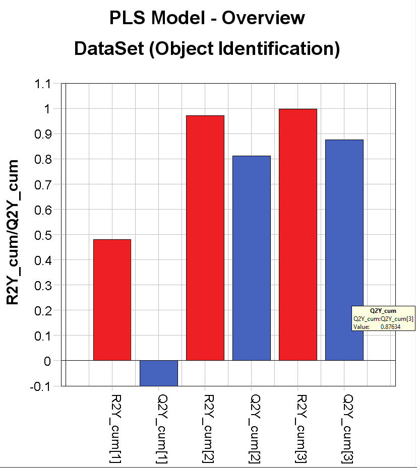
Evince uses an autofit function that finds the best complexity of the model. In this case, it has found 3 significant components. The red bars (R2) show the variation that is explained using 1, 2, and 3 components. In this case R2=0.997 (99.7% explained). The blue bars (Q2) is showing the predictive power of the model, i.e. how well it explains samples that are not in the model. In this case Q2=0.876 (hover the mouse pointer over each bar to see the exact number). These numbers might vary slightly depending on how the background removal was done.
The PLS Model – Observed vs Calculated plot is showing the calibration curve for our model. In the Settings menu under Data range and Y: field you can change the variable to look at. Under Statistics, you can add a linear regression line to the plot.
Testing the quantification model by predicting the content in a new image
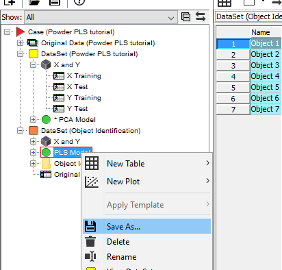
We now want to use this model to analyze the content of a new sample. Right-click on the PLS model in the data tree and Save As. Choose a name and location and click on Save.
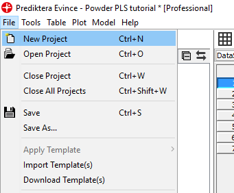
Click on File and New project, Select New and click on Finish in the next window.
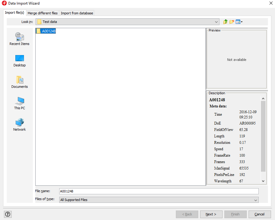
Find folder A001249 that contains the image that we want to analyze. Click Next and then Next again.
In this window, you can change the white and dark references that are applied to the image. If the reference files are located in the same directory as the image file and named darkref_”image name”, and whiteref_”image name”, as they are in this case, Evince will automatically apply these to the imported image. Click Next.
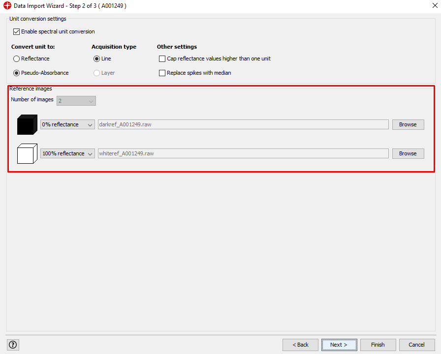
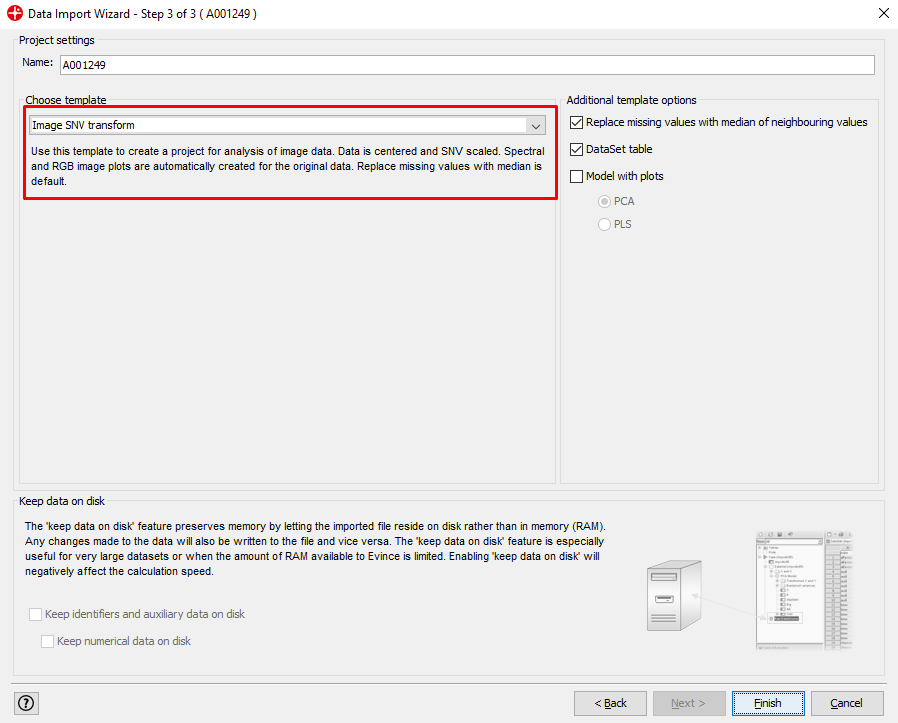
Choose the Image SNV transform template and click on Finish.
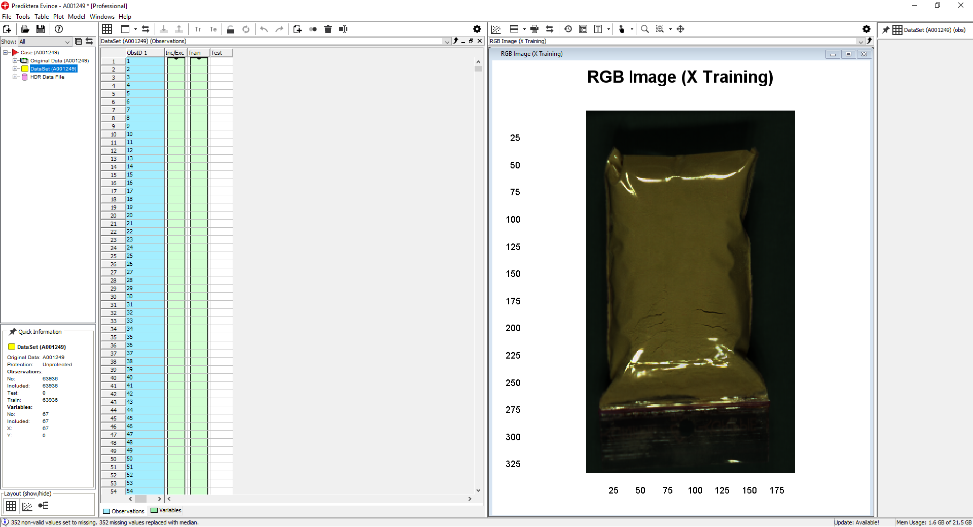
We have now imported the image into a new Evince project
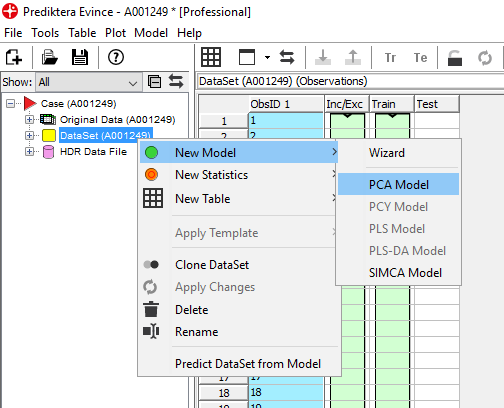
Right-click on the DataSet/New Model/PCA Model and then Finish.
Select the points in the left side cluster in the PCA Model – Scatter 2D. We see in the PCA Model – contour 2D plot that this corresponds to pixels on the sample.
Right-click on one of the plots and select Include only and then Apply changes. We now have an updated PCA model without the background pixels.
When you are satisfied with the clean-up of the image, right-click on the Contour Plot and select Analysis/Object identification
Set the Min area to 5000 pixels. This means that any object under 5000 pixels will not be found. This can be useful to remove small objects like dust. Click OK.
We now have a new dataset consisting of the average spectra of the sample
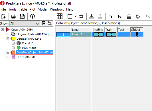
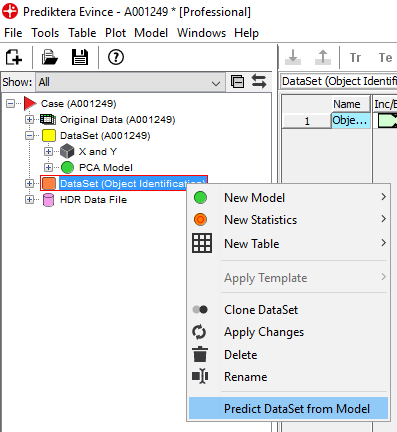
Right-click on the DataSet and select Predict DataSet from Model
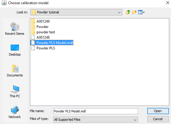
Select the PLS model that was created and saved earlier (.mdl file) and click Predict in the next window.
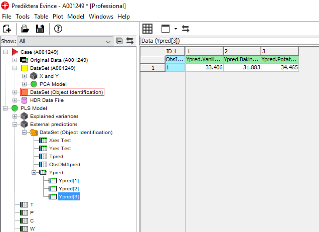
We can now see the PLS model in the data tree. Click on PLS Model/External predictions/Ypred/Ypred [3] and drag Ypred[3] to the table area. Click Finish on the window that appears.
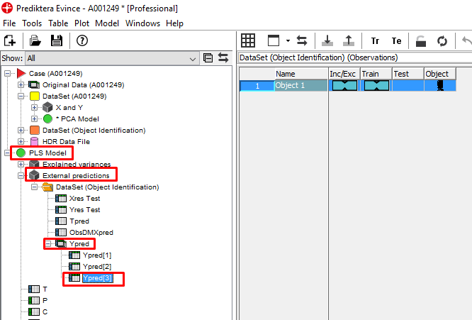
A table is generated that shows the predicted values of the 3 materials for the whole plastic bag with powder (based on the average spectra of the sample). This sample actually contained a mix of 33% of each material so the prediction is pretty close.
We are now interested in seeing the spatial distribution of the 3 materials in this sample. We can do this by using our model to predict the % of the materials in each pixel.
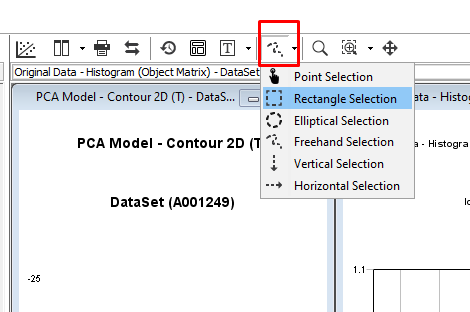
First, go to the menu for the selection tool and change to Rectangle Selection
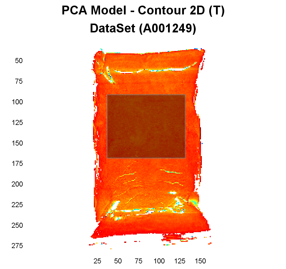
Hold down the left mouse button and drag the selection tool over the area we want to analyze in the center of the plastic bag
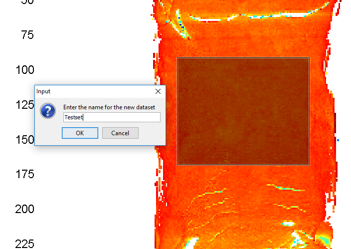
Right-click on the image and Add selected to/New dataset
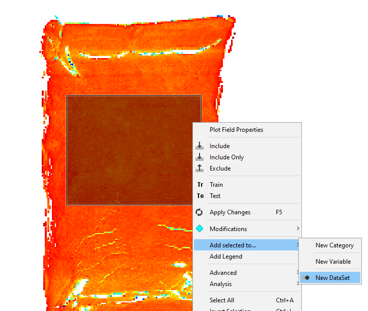
Give the dataset a new name and click on OK
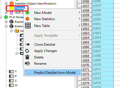
Right-click on the new DataSet in the data tree and select Predict Dataset from Model.
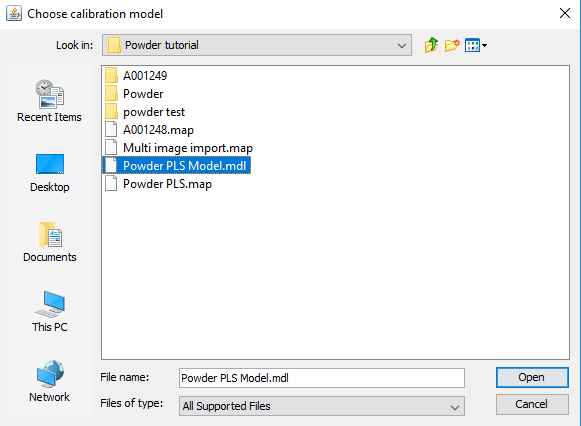
Select the PLS model and click on Open
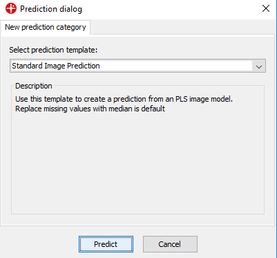
Make sure the Standard Image Prediction is selected and click on Predict
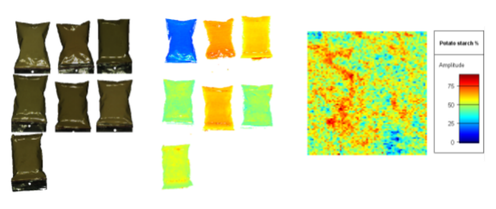
A contour plot is now generated that shows the spatial variation of the % of the 3 materials. In the Settings menu under Data range, you can change the variable to look at. After changing it, click on the Contour plot to make sure the color scale is updated.
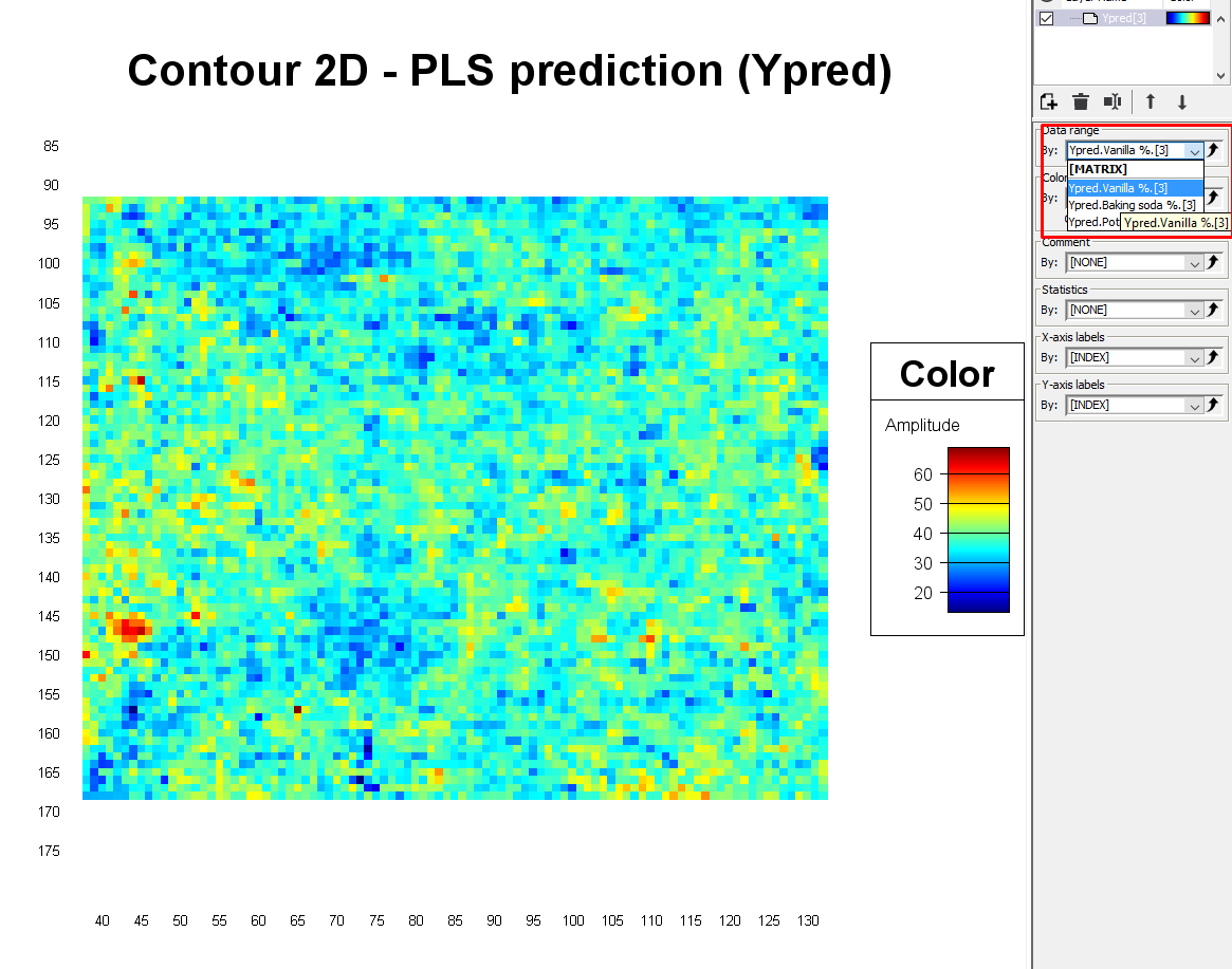
The pixels that are red show areas that have a higher % of that specific material, and the dark blue pixels are the areas that have a lower %. If the powders were well mixed and therefore homogeneous in this plastic bag, one would expect that all pixels would be colored light blue/green corresponding to 33%.
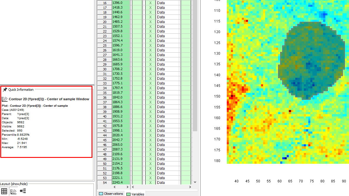
By selecting an area we can see the min, max, and average value in the Quick information window
Conclusion
Congratulations on making it all the way to the end!
You have now learned how to use Evince to make a PLS quantification model using hyperspectral images. You also know how to first do a clean-up of your images before the analysis and how to apply the quantification model on new samples.
The model we developed in this tutorial enables us to analyze the content of new samples of plastic bags of powder with an unknown % of 3 materials. The model seemed to perform well as confirmed when testing it on one new sample. As the next step, it would be wise to validate this model by using additional samples with varying % of the 3 materials, though we will not cover that in this tutorial.