In this tutorial, you will analyze hyperspectral images of plastic bags with a mixture of powders made from baking soda, vanilla sugar, and potato starch. The tutorial images contain samples with a known amount (%) of these powders, the training data set, and samples with an unknown powder distribution, where you will determine the mixtures content.
Your goal is to learn how to use Breeze to make a Quantification model, Partial Least Squares Regression (PLS or PLS-R), and then use it to predict new samples.
|
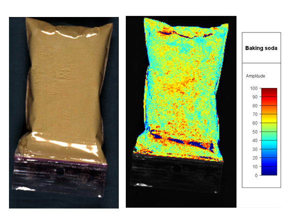
Hyperspectral image SWIR camera
(data was reduced to 67 spectral bands to reduce file size) |
|
The steps in the tutorial are:
Start tutorial and download powder measurements
Start Breeze with the shortcut created after installation.
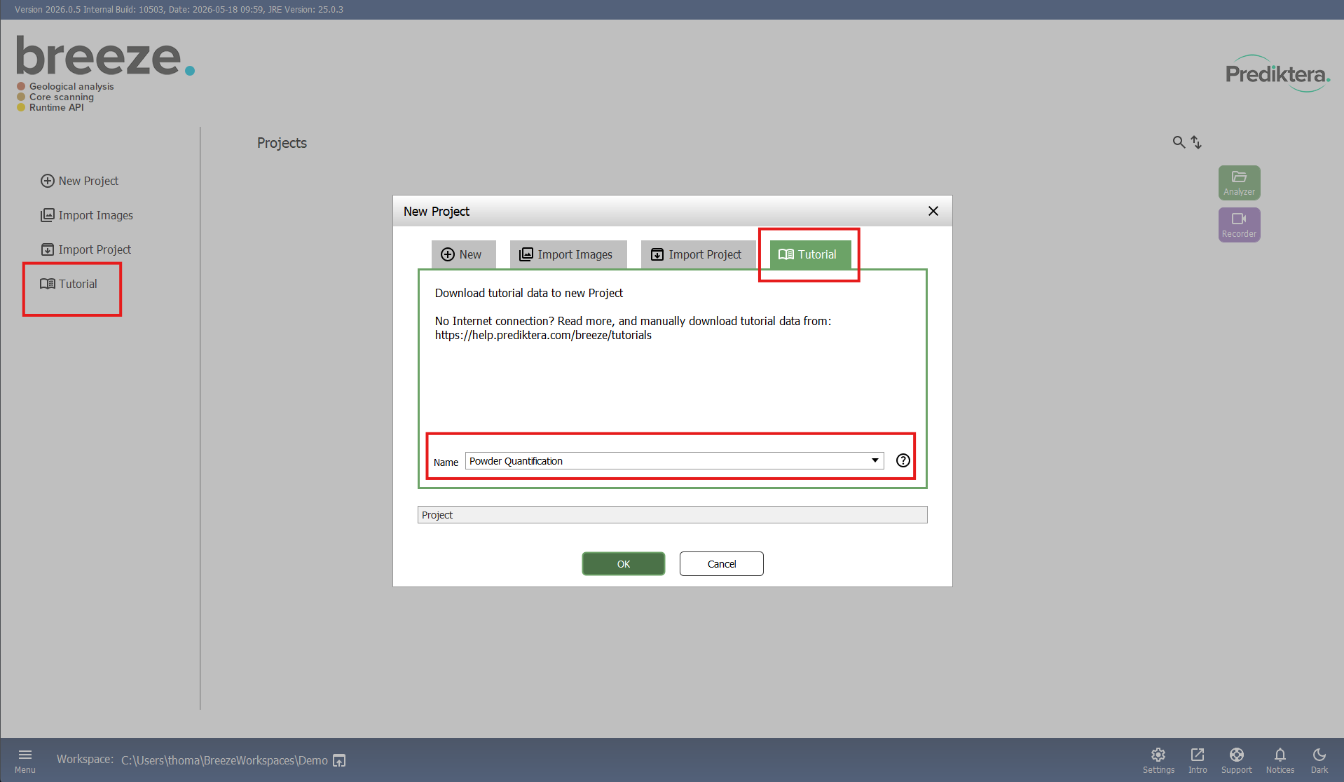
The Breeze start screen should look like this:
Select Tutorial in the menu to the left or select New project and click on the Tutorial tab in the project creation menu. Select Powder Quantification in the drop-down menu and click OK to download the image data and create the Powder Quantification project.
After the Tutorial data is downloaded it will automatically open the project in the Analyzer. Next time you need to open the project you can double click on it in the main menu, or select it and click the Analyzer button.
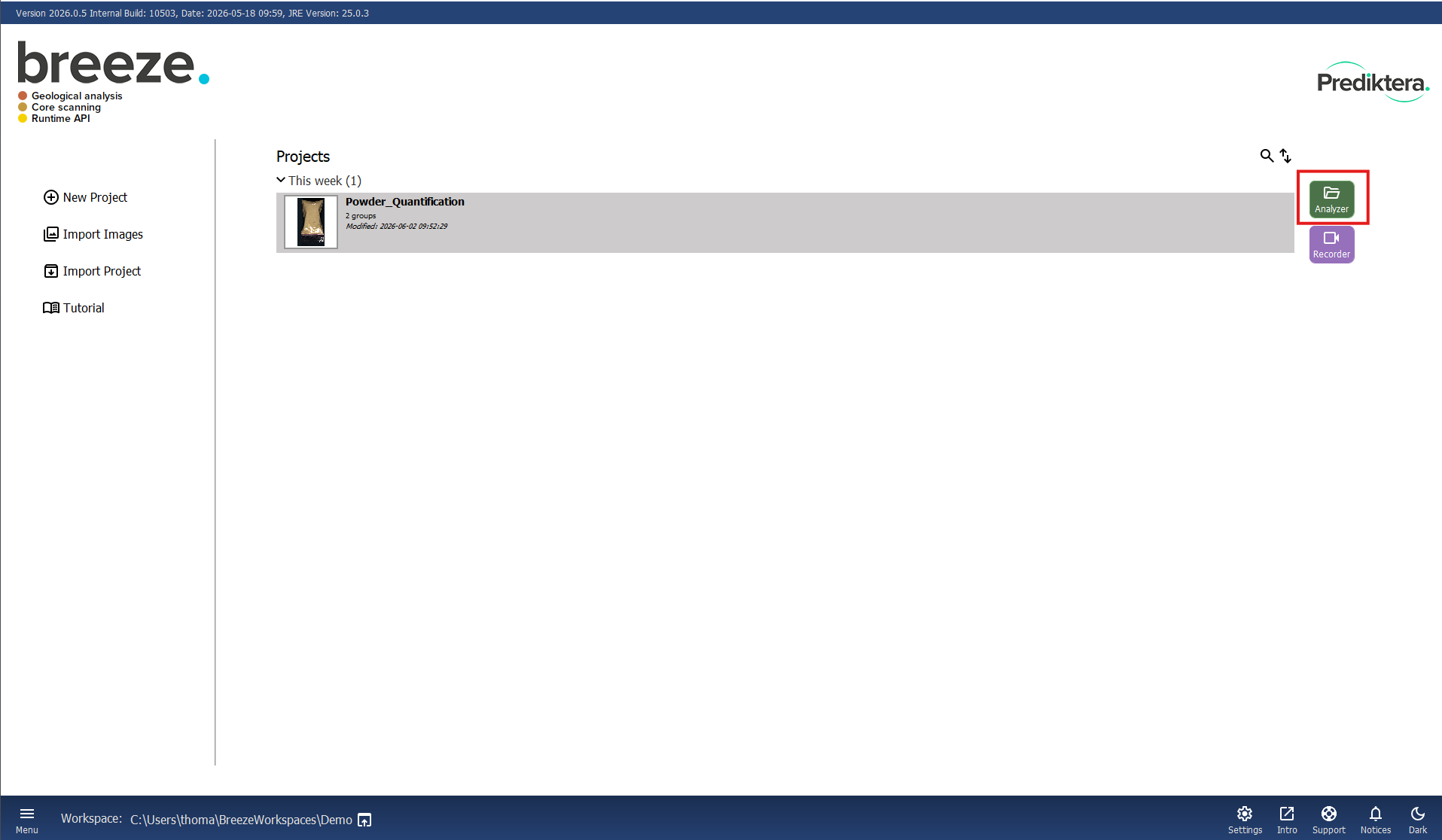
With the project open you see the following view:
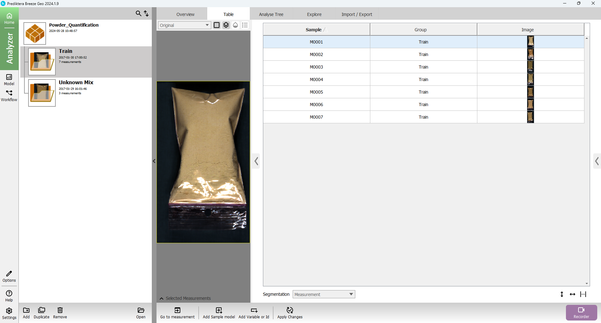
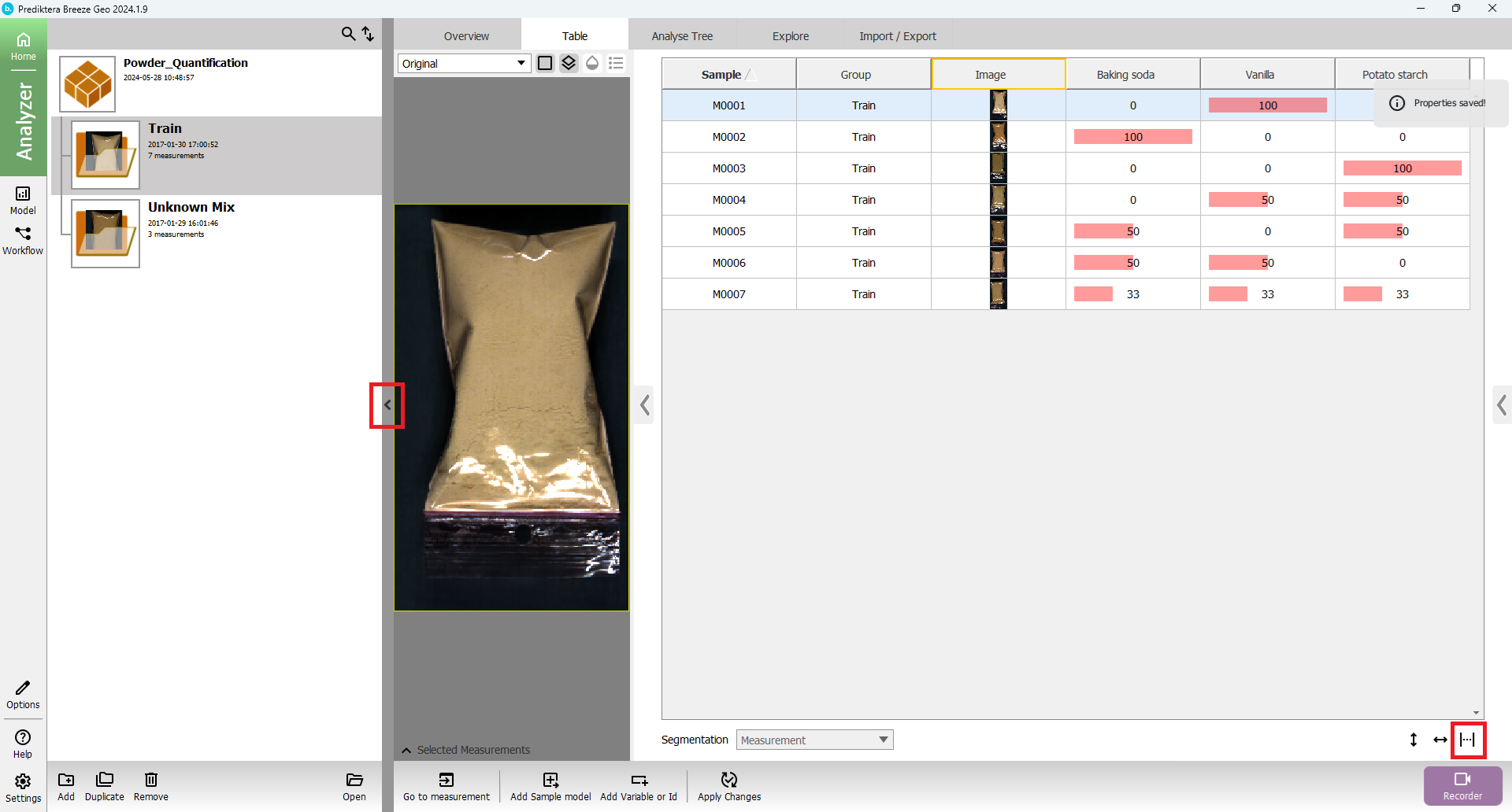
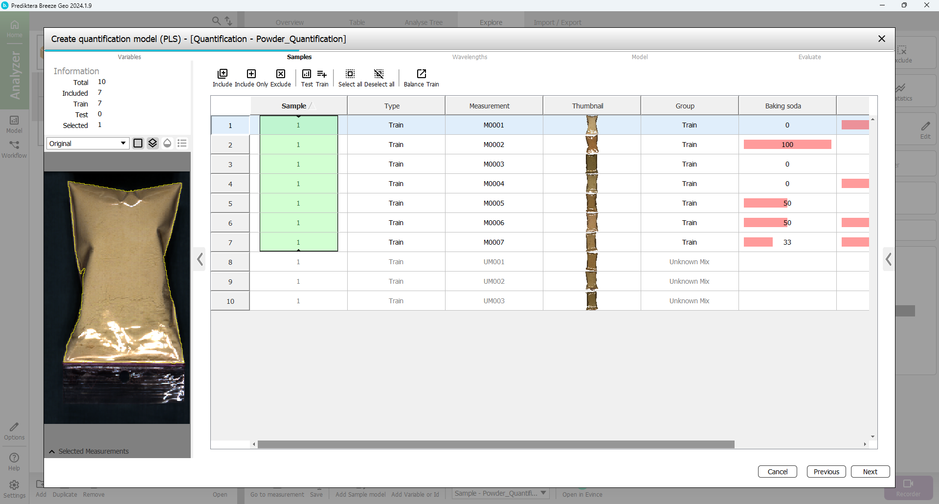
The project named “Powder_Quantification” has been created that includes seven training images with different, known, concentrations of powder and three test images with unknown concentrations.
The image data in this project is organized into two Groups called “Train” and “Unknown Mix”
You can click on a table row to see the preview (pseudo-RGB) for each image.
Double click the Train group, or select it and click Open to open the project.
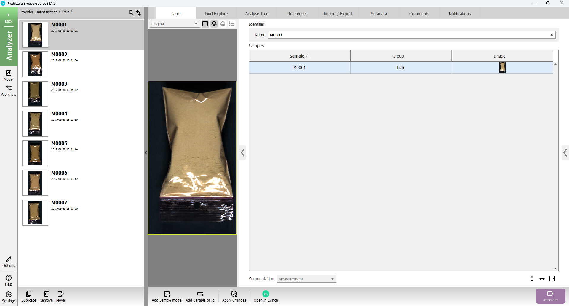
In the menu on the left side, you can now see all the individual images (called Measurements in Breeze) in this group.
Before continuing, in order to get the same output as in this tutorial, you must set the working spectra in the project to absorbance. To do this, go to the Analyse Tree tab, select the node called Measurement and in the menu on the right, under the label Conver to, select Absorbance from the drop-down menu, then click Apply Changes in the menu at the bottom of the window. This process is described in more detail in Changing spectra.
Open the Pixel Explore tab and select Create in the menu on the right under Model (PCA).
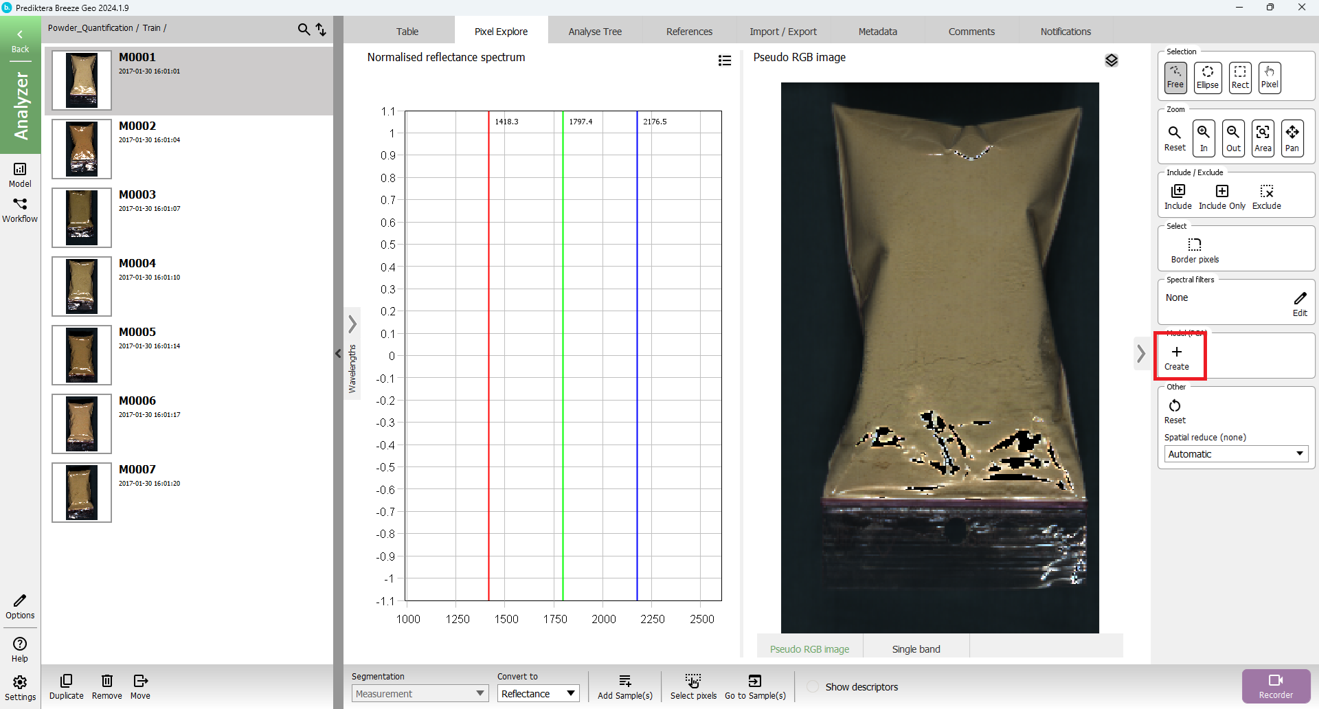
You should see this view:
If your image looks different, you can change the visualization to Reflectance by selecting it in the drop-down menu at the bottom of the window.
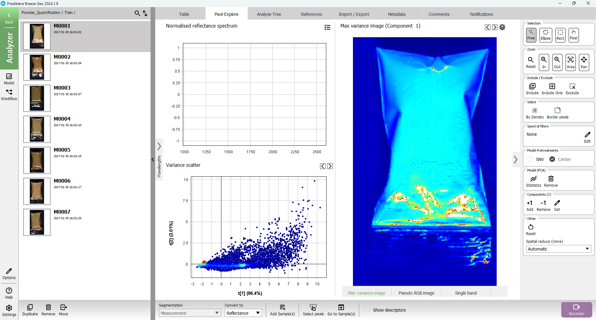
To do a quick analysis of the spectral variation in the image, a PCA model has been created based on all pixels in the image. Each point in the Variance scatter plot corresponds to a pixel in the image. The points in the scatter plot are clustered based on spectral similarity. The coloring of the points is showing how closely the points are clustered (red=tightly clustered points).
The Max variance image is colored by the variation in the 1st component of the PCA model (the X-axis in the scatter plot, i.e. “t1”), and visualizes the biggest spectral variation in the image. In this case this is the difference between the sample (blue) and the background (red).
Hold down the left mouse button, and drag to do a selection of a cluster of points in the Variance scatter plot. The corresponding pixels will be highlighted in the image. Move the cursor across the image to see the spectral profile for individual pixels or use the mouse to do a selection to see the average spectrum for the pixels within the selection.
Select the Back button in the upper left corner to return to the Group view.
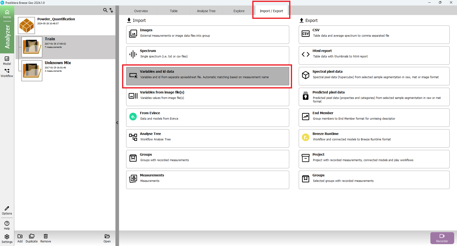
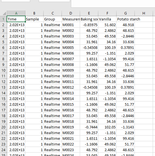
Import of values of powder content for the training set
With the “Train” group selected, open the Import/Export tab and select Variables and id data under Import.
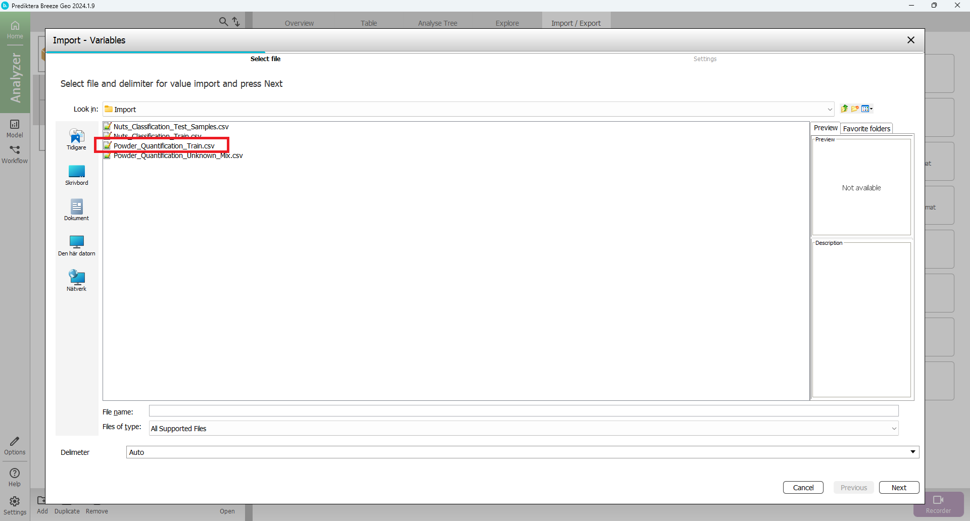
Select “Powder_Quantification_Train.csv” and select Next.
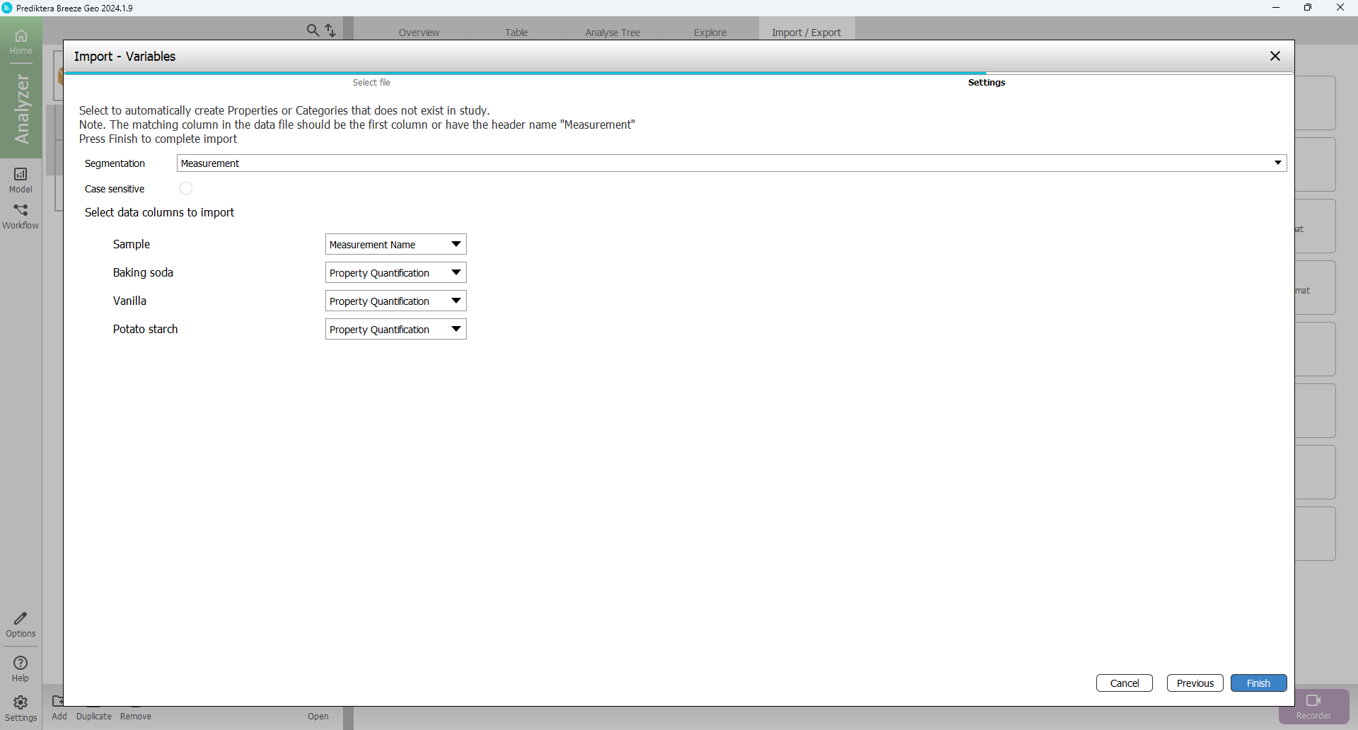
In the next step simply click Finish.
The view should then look like this with columns and values added for the three properties (% of each powder type) for all samples:
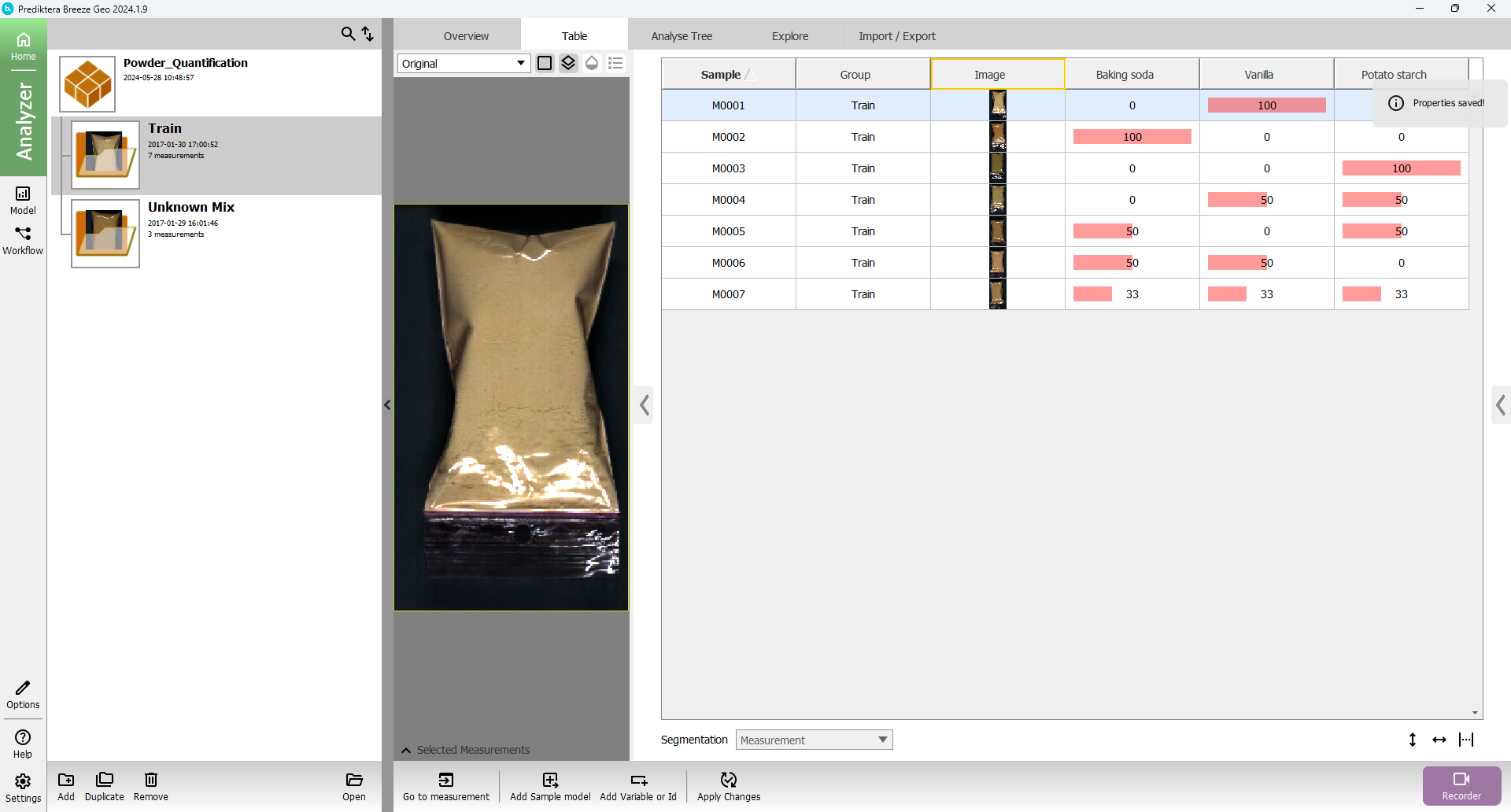
You can create more space by hiding the project list using the arrow. Click on auto adjust table width in the bottom right to show all columns.
If you need to delete variables or IDs, right-click on the header for the column you want to delete and select the Delete option from the context menu.
Create a sample model to remove background pixels
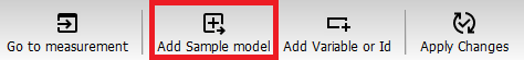
You will now create a sample model that will be used to remove the background pixels and automatically identify the objects (samples) in the images. In the bottom menu, select Add Sample model.
Enter a name for the sample model (or just use the default name) and click OK.
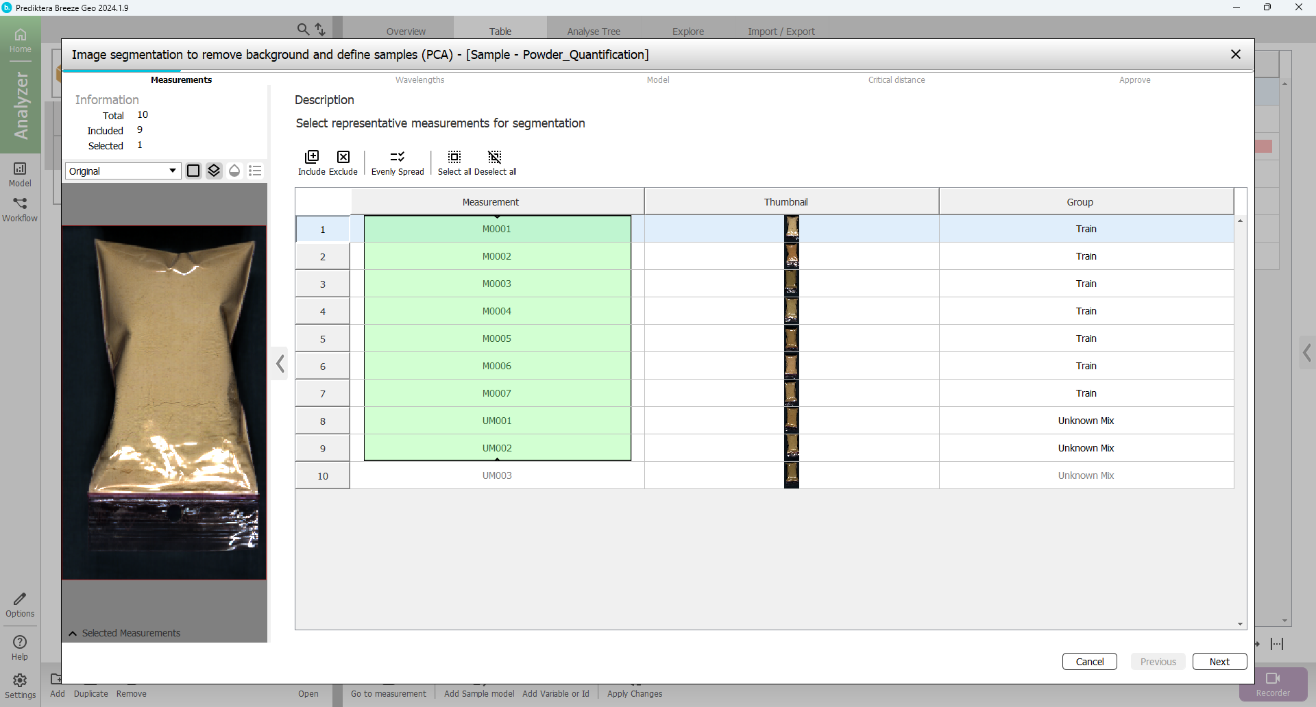
In the first step of the sample model wizard, you can select the images that you will use in the model. By default, 9 measurements are included, which is ok. click Next.
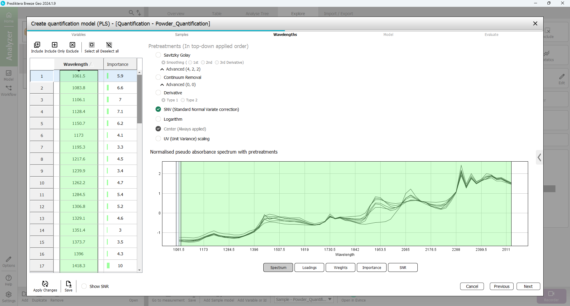
In the next step of the wizard, you can select spectral bands (wavelengths) to use in the model. By default, all wavelengths are included and SNV is used as the pretreatment.
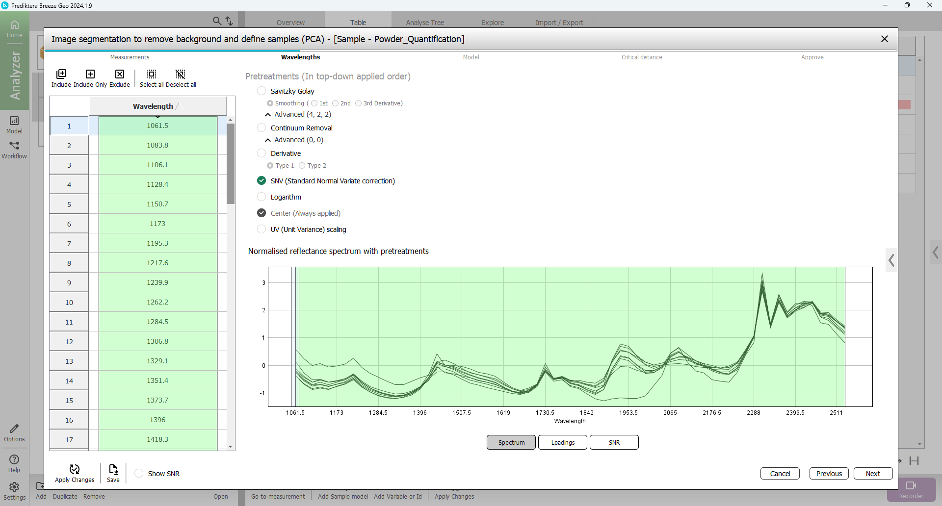
You can play around with different pretreatment choices and see how the spectrum changes when you click Apply changes.
The following picture is the same spectrum as the pretreatment first derivative from Savitzky Golay.
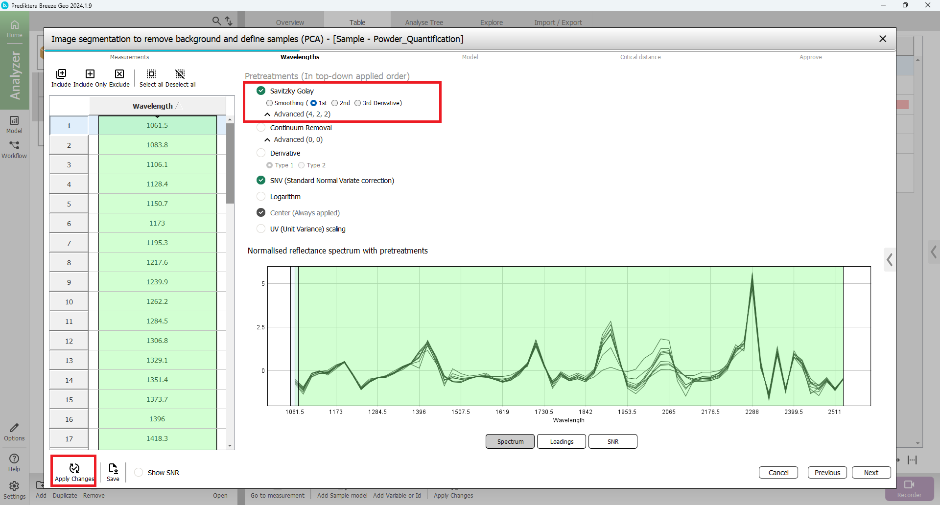
When you are done experimenting with the different pretreatments deselect all except SNV and select Apply Changes before you click Next.
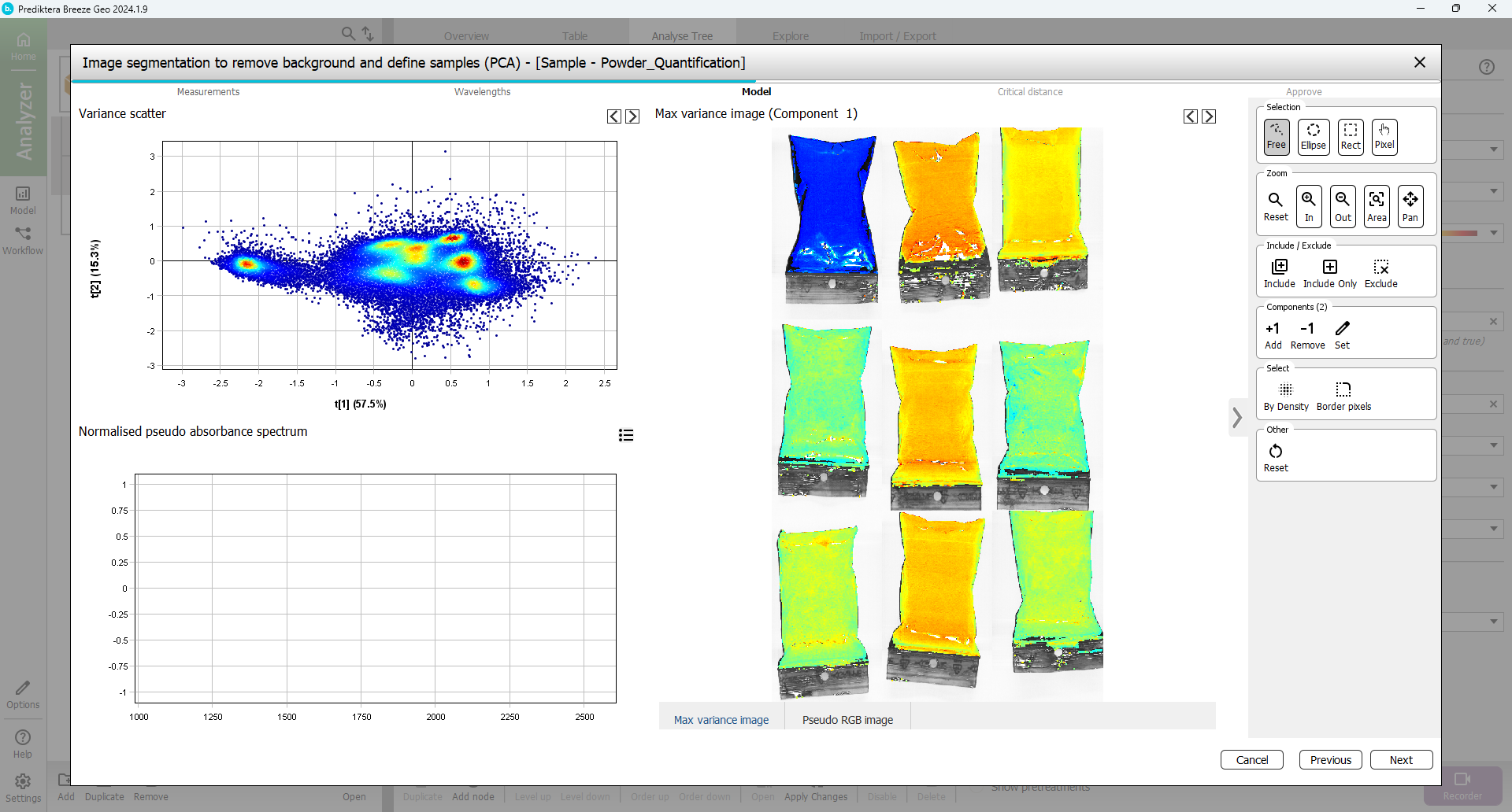
In the next step, you will select the pixels to use in the sample model.
A mosaic has been created of all images, and a PCA model has been created from all pixels in this mosaic. Select a region containing only bag sample pixels by holding down the left mouse button and outlining an area inside one of the samples. You can zoom in by using the mouse scroll wheel (or the Zoom tools that can be selected in the menu on the right).
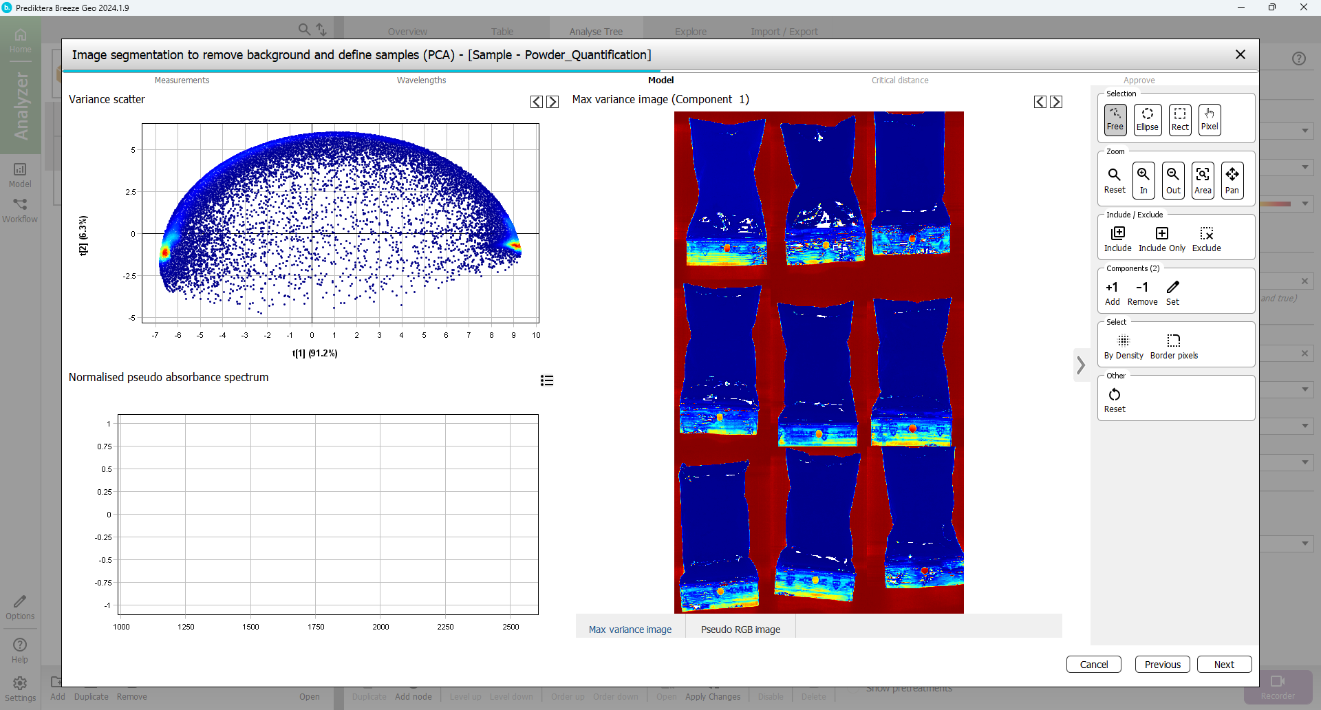
The corresponding pixels are selected on the Scatter plot to the left.
Now you know that the powder pixels are in the cluster on the left side of the Scatter plot. In the scatter plot, select all points in the cluster on the left side (use the pixel density coloring red, yellow, green, and light blue as help).
Now you can see that the selected pixels are highlighted in the image, and evidently these pixels belong to the samples.
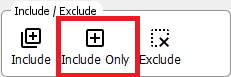
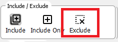
To include only these pixels in the model and exclude all other pixels,
Select Include only and wait for the model to be updated.
The plots are now updated and will contain mostly the powder sample pixels.
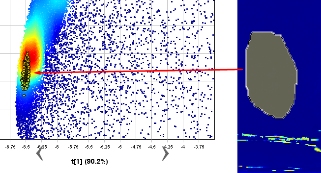
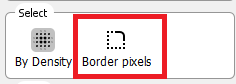
To clean up the sample pixels even more you can remove the pixels bordering the background around each sample object. Select the Border pixels button.
Use the default of 1 border pixel and select OK. The border pixels have now been selected.
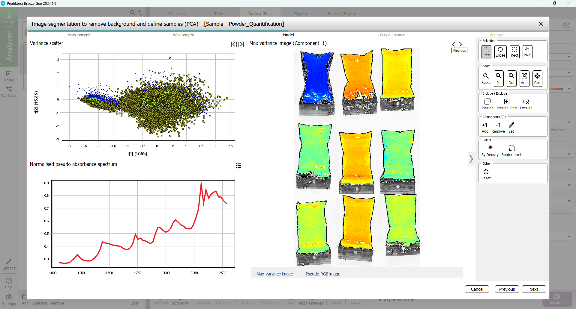
Exclude the border pixels by clicking Exclude.
Click Next.
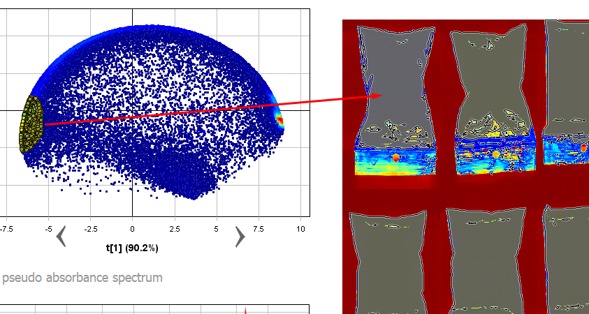
In the next step, you will set the Critical Distance threshold. This is the distance to the sample model and will be used to determine if pixels are sample or not. The histogram is showing the distance to the model for all pixels in the images. Pixels on the left side of the red vertical line (critical distance) are inside the threshold.
Drag the red line to the right to move the threshold. As you can see from the image, more pixels are included when doing this. The aim is to find a level that includes as many powder pixels, and as few background pixels as possible (As a general recommendation you can drag the red bar to the “valley” between the sample, and background bars in the histogram. Although in most cases the default threshold, shown by a black vertical line, is adequate).
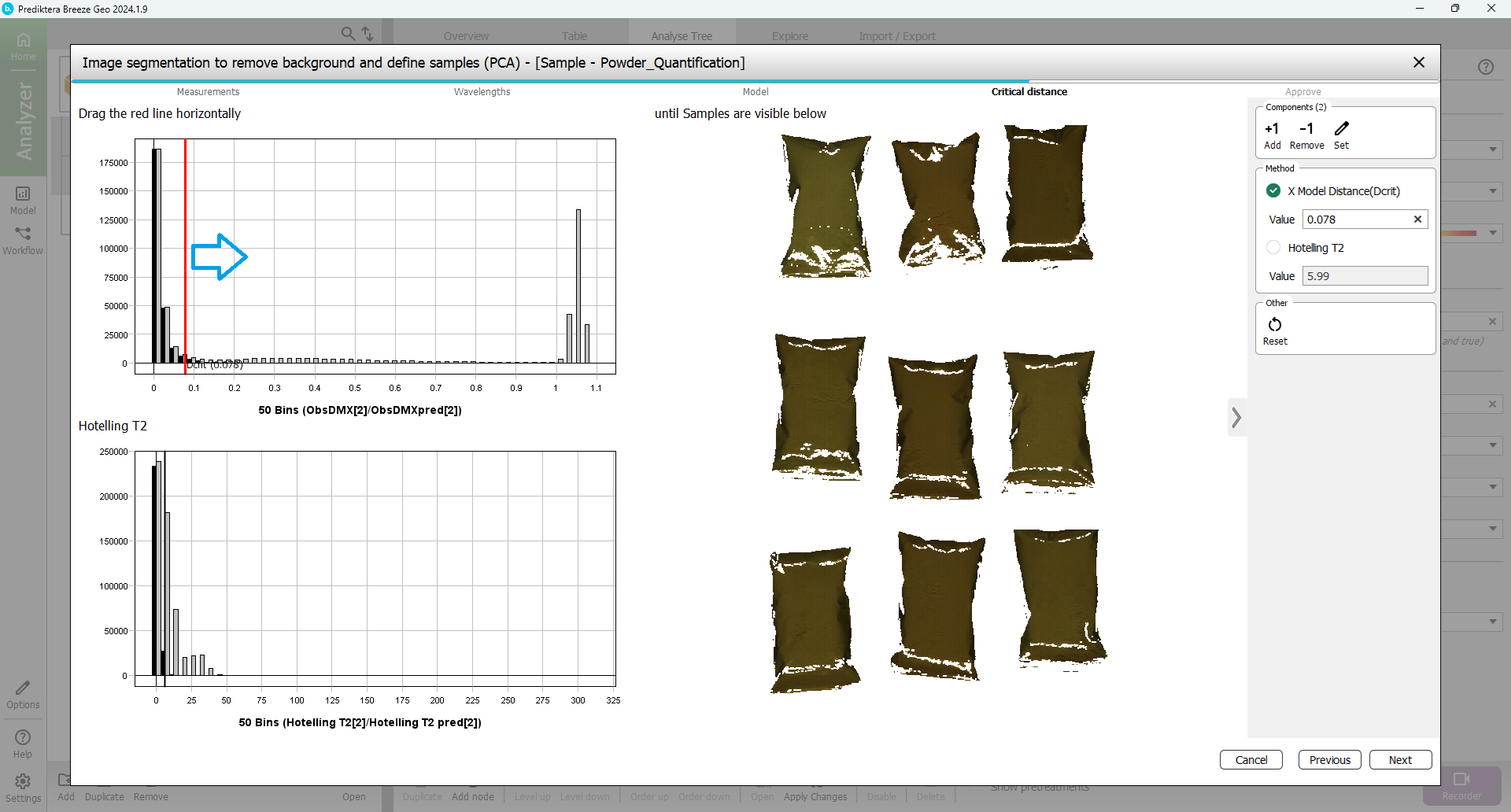
Click Next.
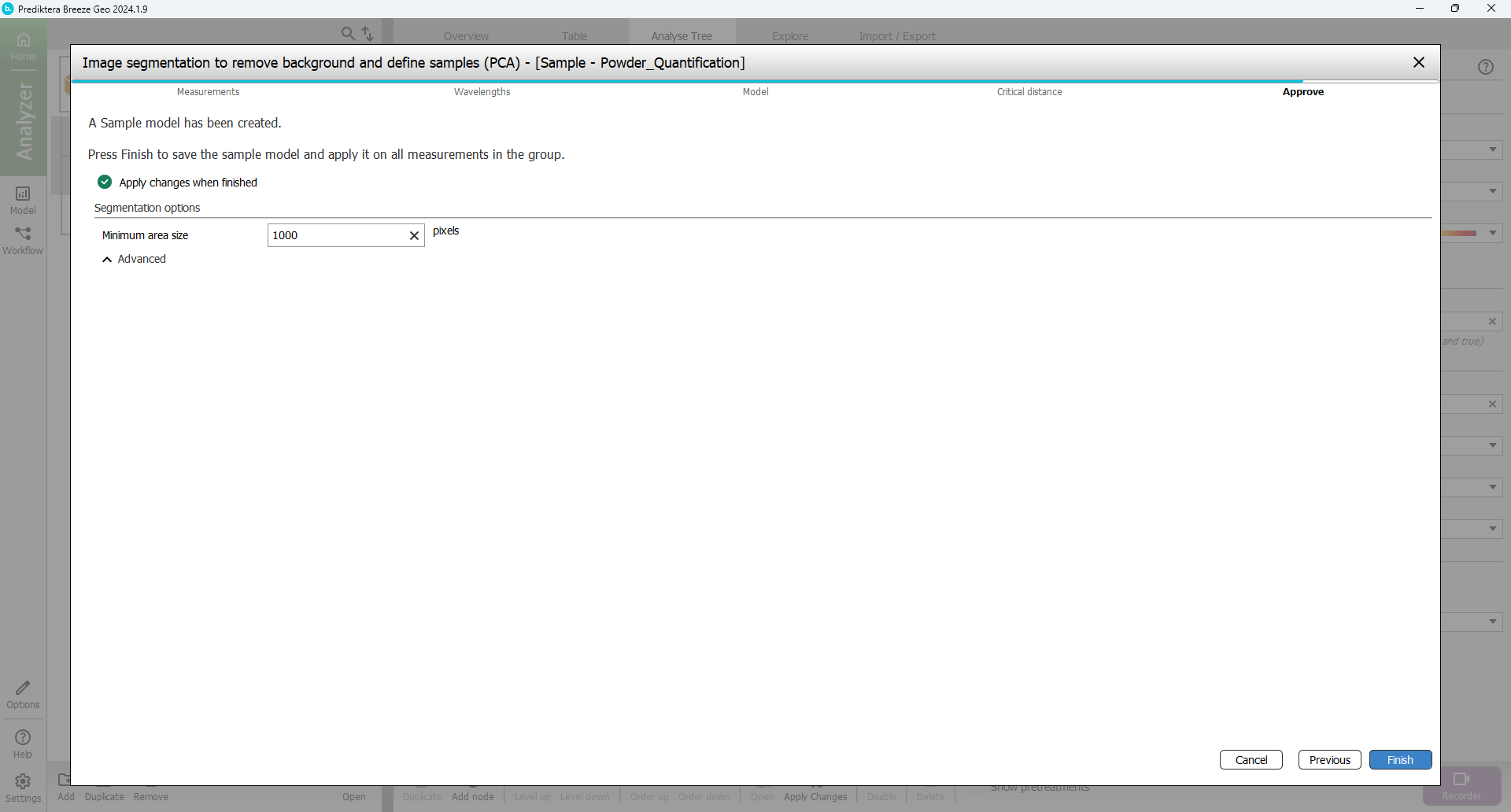
You are now at the last step of the sample model wizard. The Minimum area size is used to automatically exclude smaller unwanted objects (for example dust or dirt). Breeze calculates a suggested minimum area size for your data. In this example, any objects under 2000 pixels will be excluded from the image (depending on how you did the pixel selection this value might vary). A value around 1000-3000 should be OK.
Select Finish to create the sample model and apply this to all images in the project.
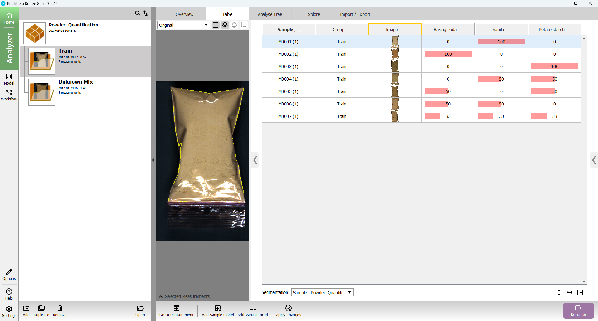
In the Table for the project, you can now see all the sample objects in the images after the sample model has been applied and the background pixels removed.
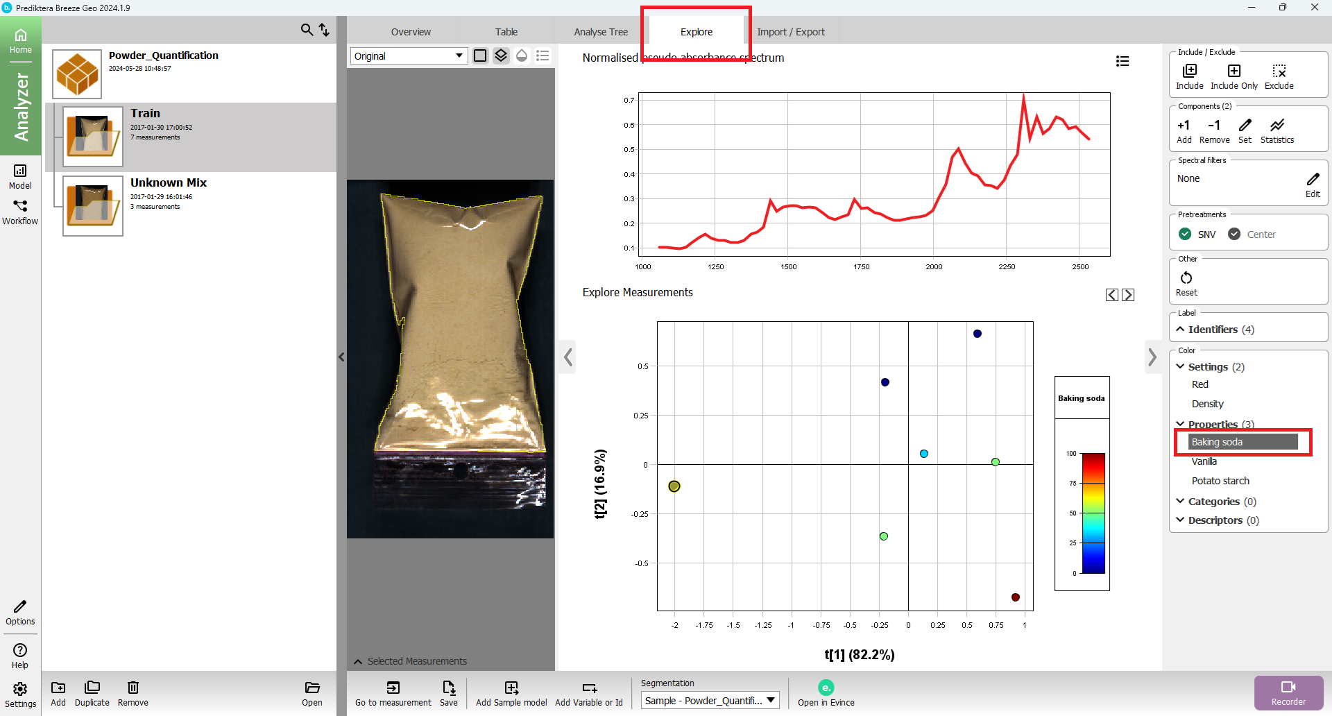
Open the Explore tab. A PCA model has been created based on the average spectrum for each sample. Each point in the scatter plot corresponds to a sample and the points are clustered based on spectral similarity. Select one or several points to see their average spectrum.
In the menu on the right, select the property name Baking soda to color the scatter plot based on the different property values.
Create a PLS quantification model
You will now use the average spectrum for each sample and the property values that you have imported (% of the three powders) to train a quantification model.
Click the Model button on the left side of the screen to move to the Model step.

In the menu on the left you can see the Sample model that you created before. To make an additional model select the Add button.
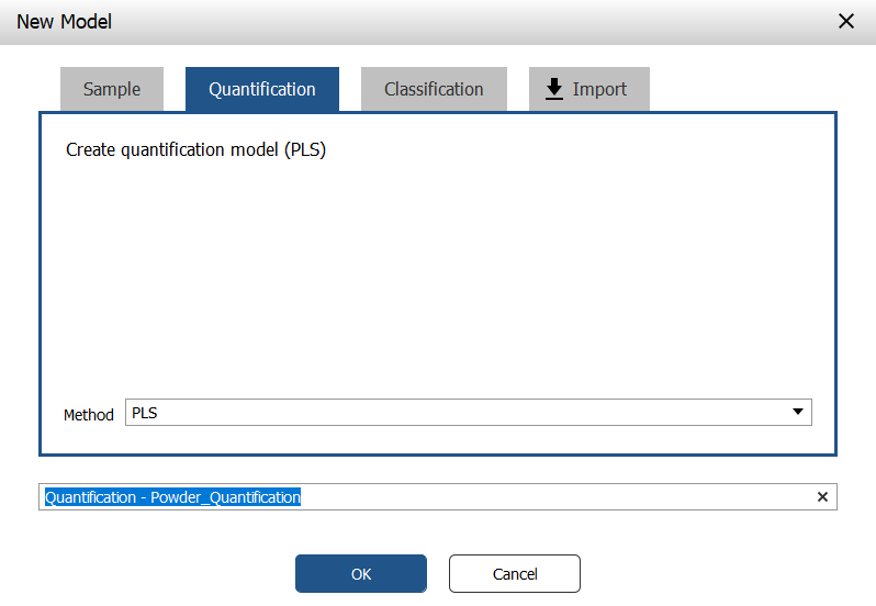
In the window that appears, open the Quantification tab.
Write a name for the model (or just use the default name) and click OK.
In the first step of the Quantification wizard, you can select the Properties (continuous Y-variables) that you will use to build the model. You can either model one Y variable at a time or include all Y in the same model. The results can vary depending on the data set. In this example, we will model all Y in the same model. Make sure that all three properties are selected and click Next.
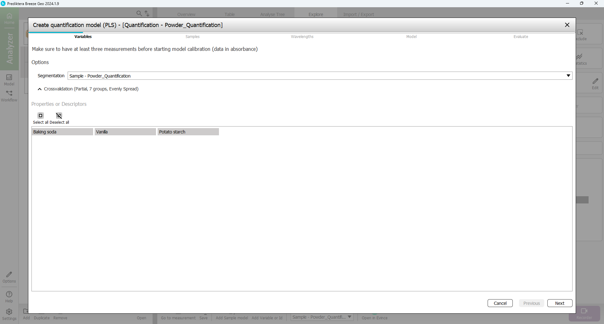
In the next step of the wizard, you can select the samples that you want to include in the model. By default, the “Train” group has been included and the “Unknown Mix” group has been excluded (since these samples do not have any entered data for % of powder they can not be used for the training). This is OK.
Click Next.
By default, all wavelength bands are included. The graph on the right is showing the average spectrum for each sample. Above this graph, there is an option to select different pretreatments of the spectral data. By default SNV is used. All default settings here are OK.
Click Next.
Read more on Pretreatments.
A PLS quantification model has now been calculated.
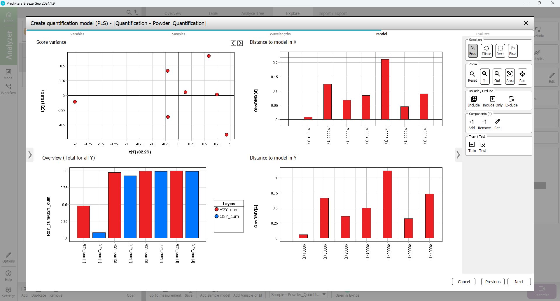
The Overview (Total for all Y) graph is showing how good the PLS model is. It also shows the number of components that were used for the model. In this case, the autofit used four components. The R2 (model fit) and Q2 (prediction from cross-validation) using four components are around 0.99 indicating a very good model. An R2 and Q2 value of 1.0 indicates a perfect model explaining all the variations. A value of 0 indicates that no variation can be explained. (In this case 3 components would be enough but for simplicity we will use the autofit of 4 components.)
The Distance to model in X and Y graphs show the distance to the model for each sample. A high bar indicates that the sample might be an outlier (for the X distance use the horizontal black line as a guide. The Model scatter plot and the Distance to model graphs can be used to identify and exclude outliers.
Since everything looks OK, click Next.
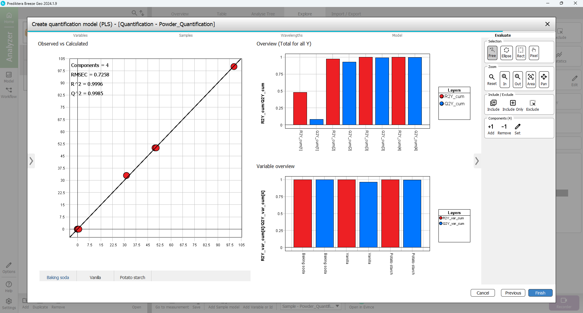
In the last step of the wizard, you can evaluate how good the model is. The Observed vs Calculated plot is showing how well the model can explain the variation in this variable. Under the plot are tabs to select the Y variable (Baking soda, Vanilla, Potato starch) to display.
The Variable overview is showing the R2 and Q2 for each variable. Everything looks OK so click Finish to complete the model.
Create prediction workflows to quantify new samples
In this step, you will use the quantification model to analyze the % of the three powders in images with samples of unknown content. Select the Workflow button in the left menu to move from the Model mode to the Workflow mode.

Select Add to make a new workflow.
In the window that appears, open the Record Data tab and select the “Unknown Mix” group. Enter a name for the workflow or just use the default.
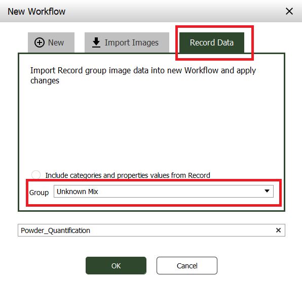
A new workflow will be generated based on the models you have created for this project (sample and quantification models). The images from the “Unknown Mix” group in Record will be imported and applied to this workflow.
Click OK.
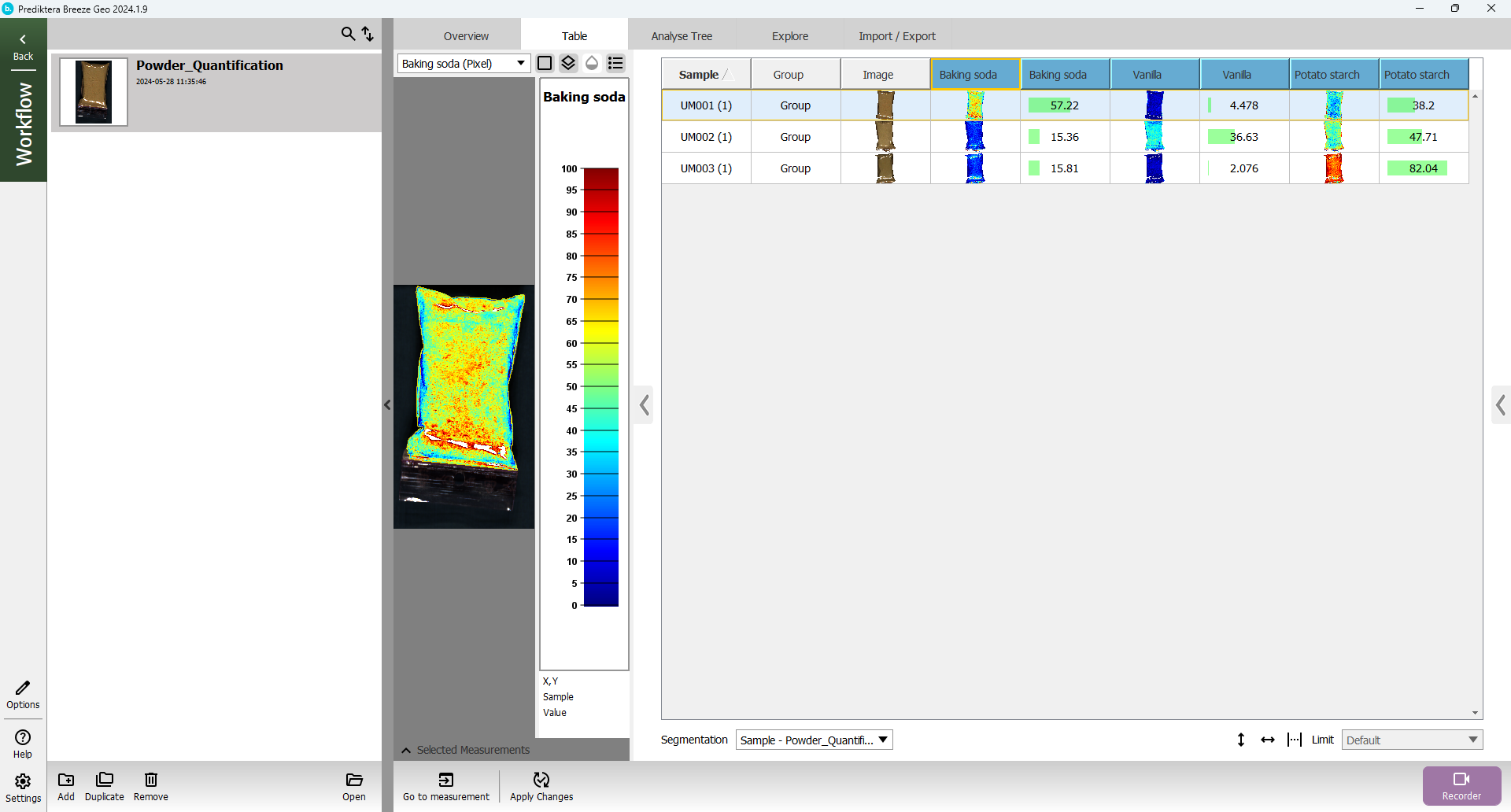
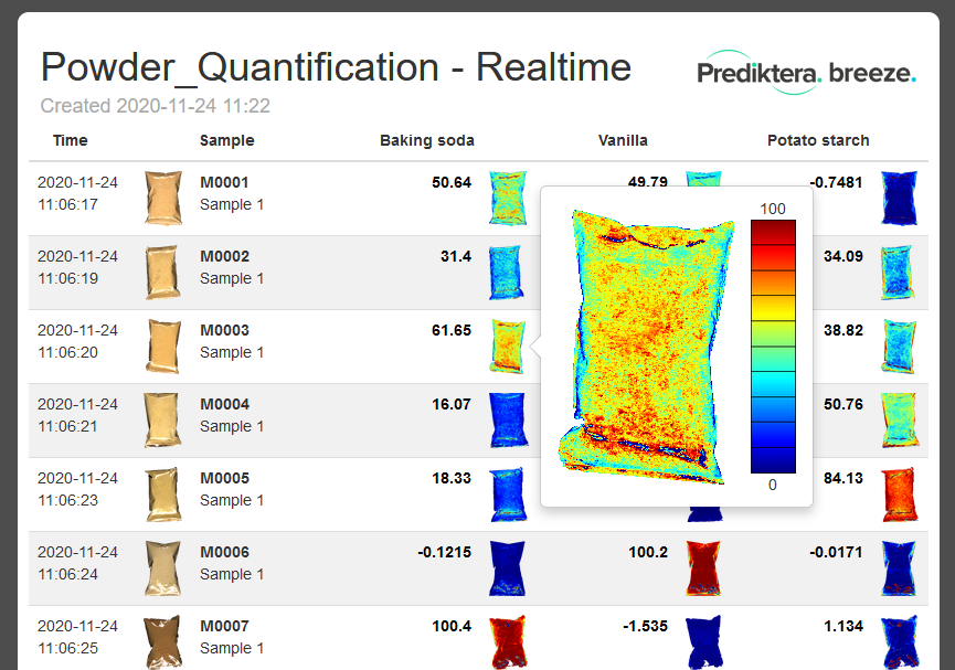
A table is generated with the predicted values (%) for the properties (Baking soda, Vanilla, Potato starch) for the three samples in the “Unknown Mix” images. Click on a sample in the Baking soda column to color the preview image by the predicted values.
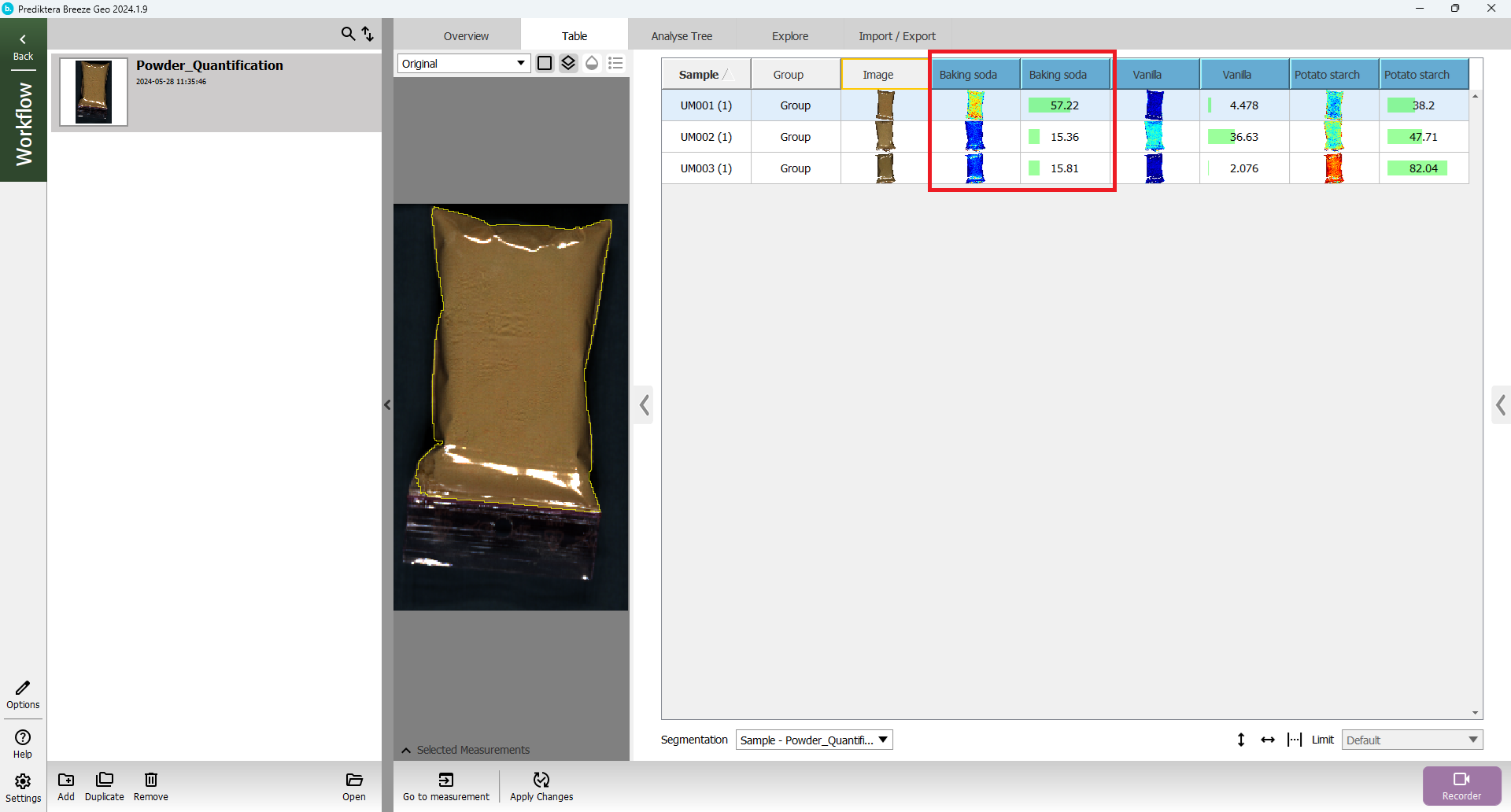
Click on the Legend button above the preview image to add a legend with the scale.
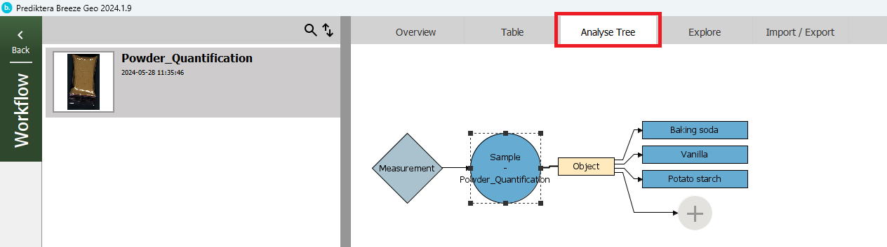
Open the Analyse Tree tab to see the steps in the Workflow. First, the Measurement (image) is analyzed by your sample model (Sample - Powder Quantification) to find the sample Object. For this object, it then applies your quantification model to calculate the variables (Baking soda, Vanilla, and Potato Starch).
Real-time predictions
In addition to analyzing images that are already recorded on your hard drive, you can also use Breeze to analyze images in real-time directly from the camera. If your computer is not connected to a camera, you can simulate this by using the simulator camera in Breeze. With this, it will read images from your hard drive and analyze them continuously. By default, it will use the measurements from the current project as input.
In workflow mode, with your workflow selected, click Recorder in the bottom right of the window.

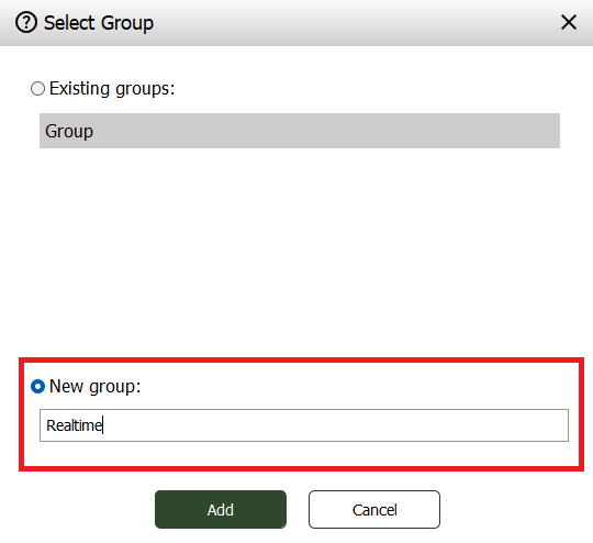
In the panel that appears select New Group, and give your new group a name, then click Add.
In the recorder, select Continuous recording mode. You can then select if you want to save the spectral raw data (spectral data for all pixels) for the images being analysed. If you are scanning many images you can uncheck this option to save storage space. Since these image files are small you can leave this checked.
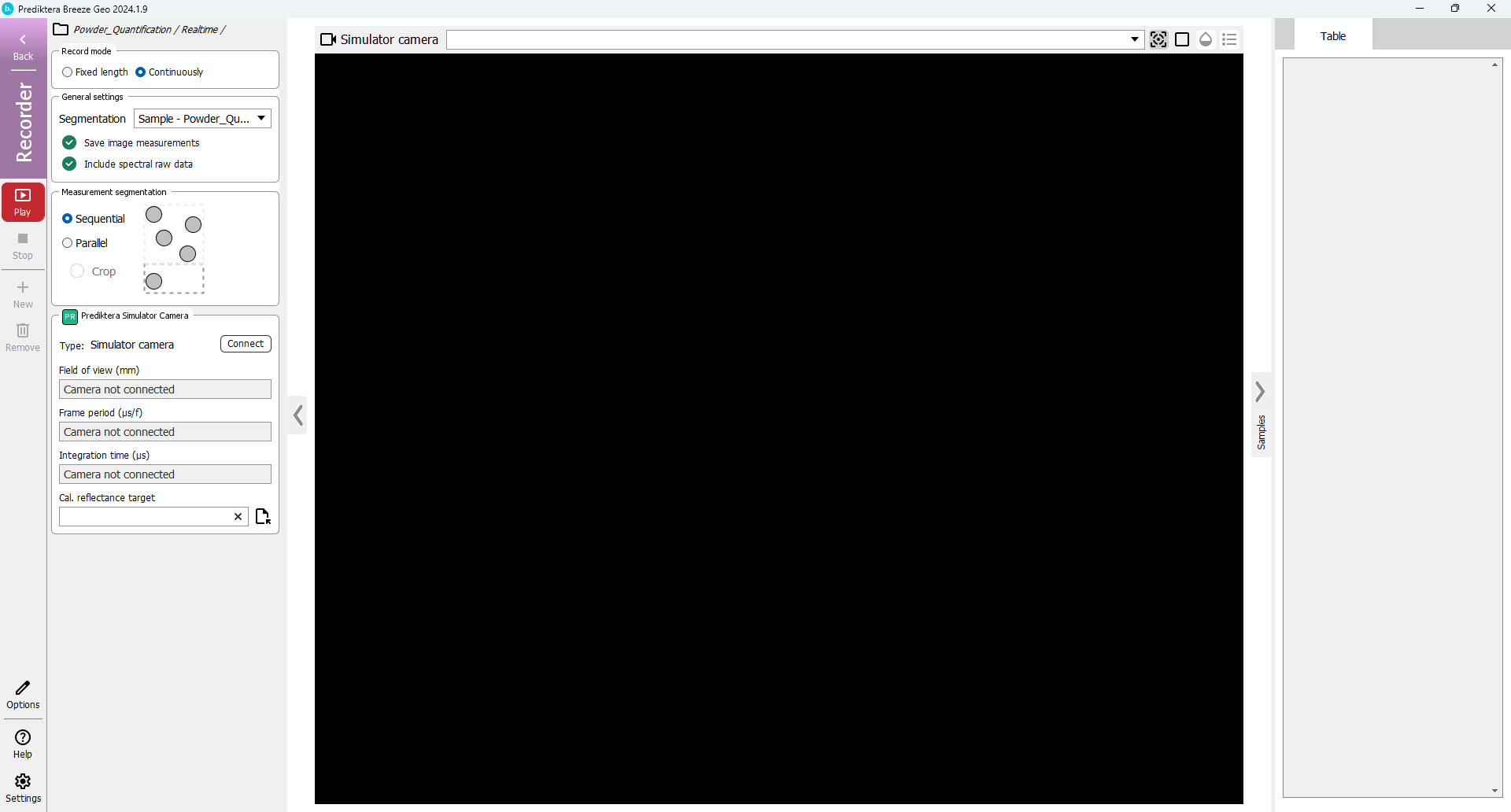
In order to start recording, you must connect to the simulator camera, this can be done by going to Settings > Camera and clicking Connect, or you can simply click connect in the Simulator Camera panel in the left menu of the recorder.
Once the camera is connected, you are ready. To start analyzing, click Play.

You may get a warning for about reference quality. This can be safely ingored for this example (just click Continue until the recording starts).
As you can see the image is analyzed in real-time and the results are displayed in the table to the right. It will loop the 10 images from your Project.
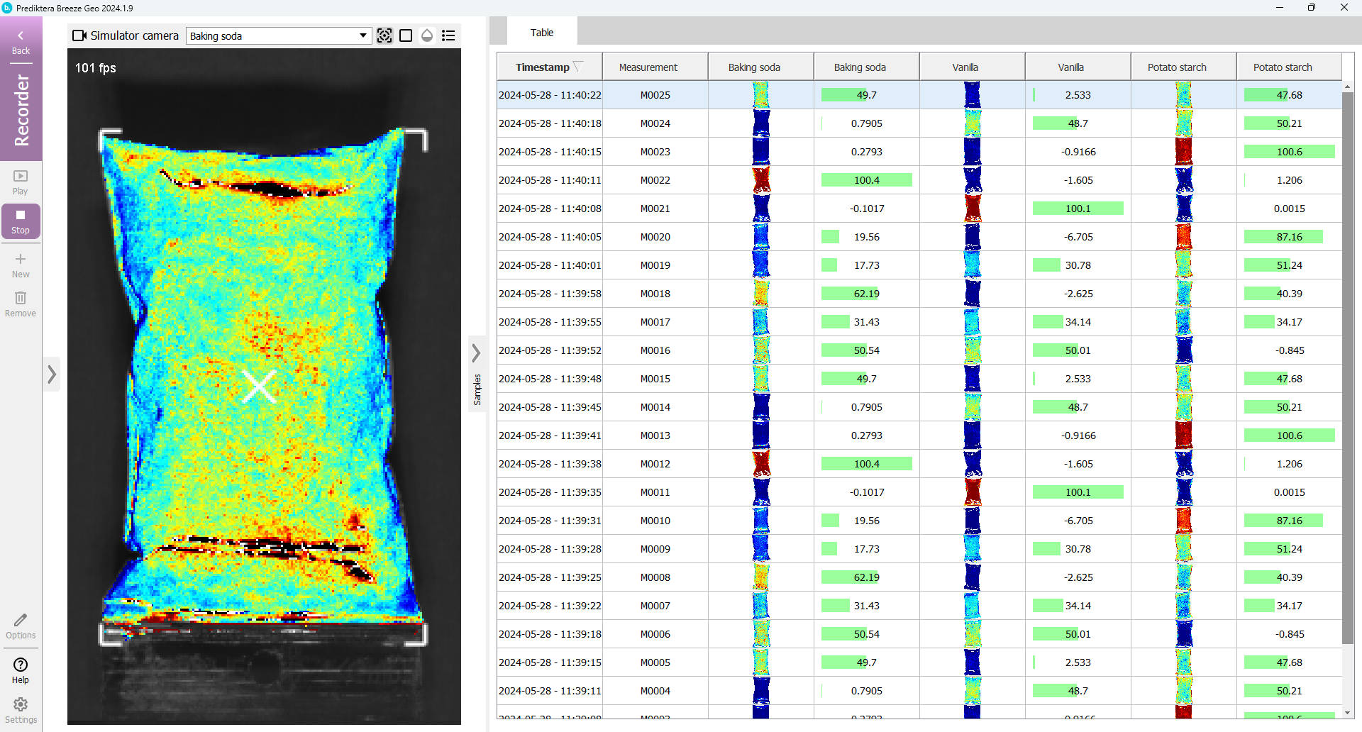
You can change the variable that is displayed by using the drop-down menu above the image, and clicking the button to add a legend.
Select Stop to stop the analysis.
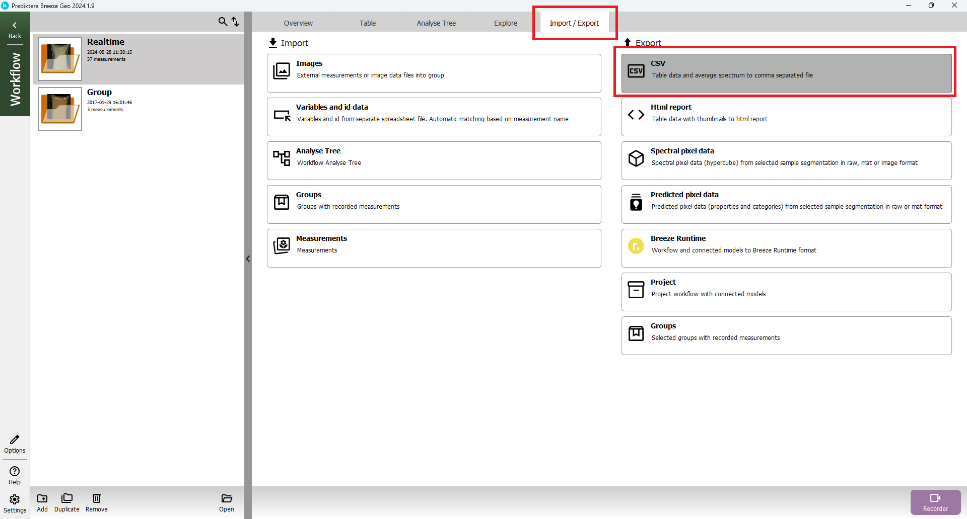
Export to CSV and HTML report
At the group level select the Import/Export tab. Here you can for example select to export the results from the Table to a .CSV spreadsheet (with the object spectral data) or to an HTML report. You can also export the spectral and predicted pixel data.
Nice job! You have reached the end of step 1 of the “Quantification of Powder” tutorial.
If you would like to learn more please try:
Intro to Breeze: Classification of nuts step 1 or Segmentations and Descriptors