Welcome to this tutorial on Breeze! In this session, you'll become familiar with Breeze's user interface and workflow. We'll work with an example dataset to create a classification model that distinguishes between different classes in a hyperspectral image.
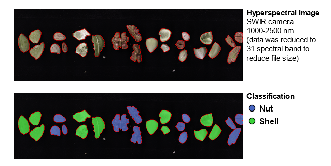
You will analyze hyperspectral images with samples of nuts (almond, hazelnut, pecan, and walnut) and shells for each nut type. The tutorial images contain samples of known nut types that will be used as a training data set and an image with a mix of samples that will be used as a test dataset.
The steps in the tutorial are:
Installation of Breeze
To install Breeze, see the step by step instructions in Installation and getting started | installation.
That page also explains where to obtain Breeze, system requirements, and how to license it.
Download tutorial image data
After starting Breeze for the first time a pop-up will appear with links to our Help site with tutorials.
Select OK to close it.
When the help pop up is not visible, you can find the tutorials on the Breeze Home view.
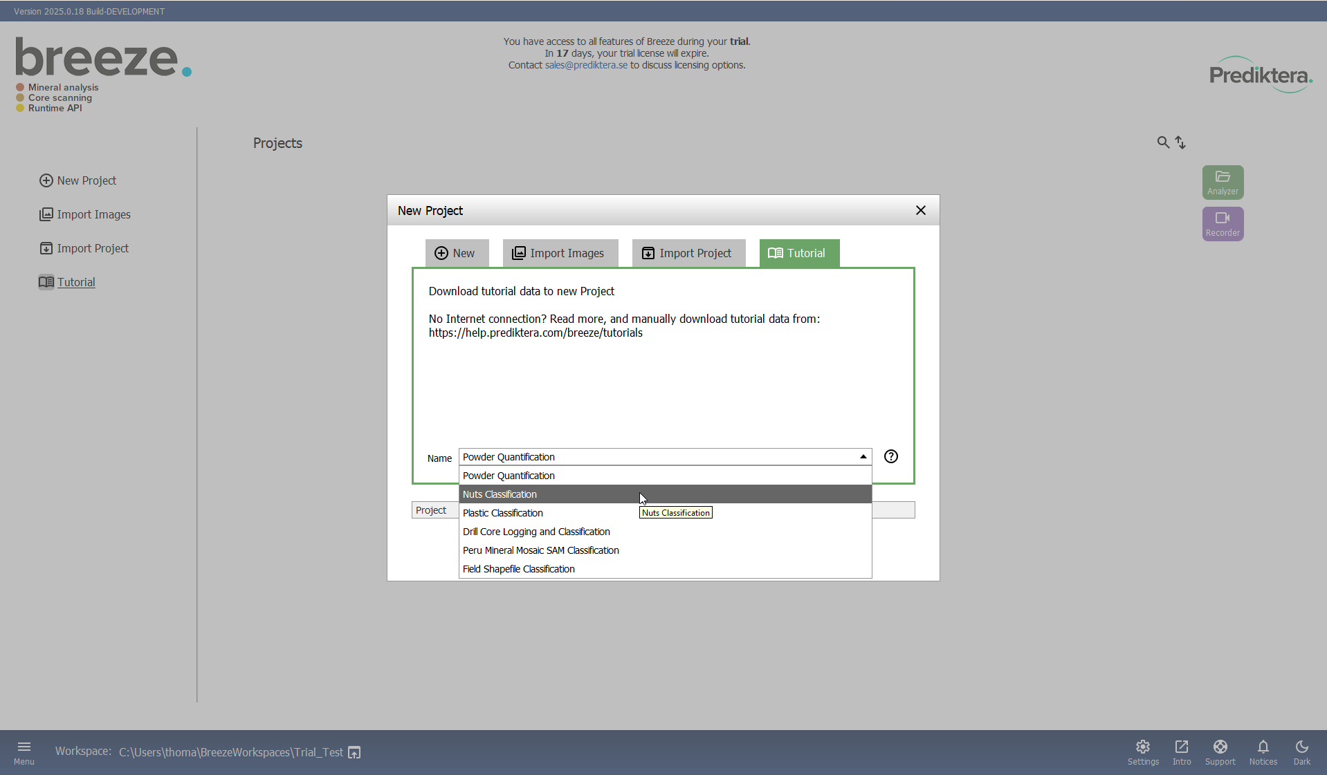
Select Tutorial to start.
Select “Nuts Classification” in the Name drop-down menu.
Select OK to start downloading the image data.
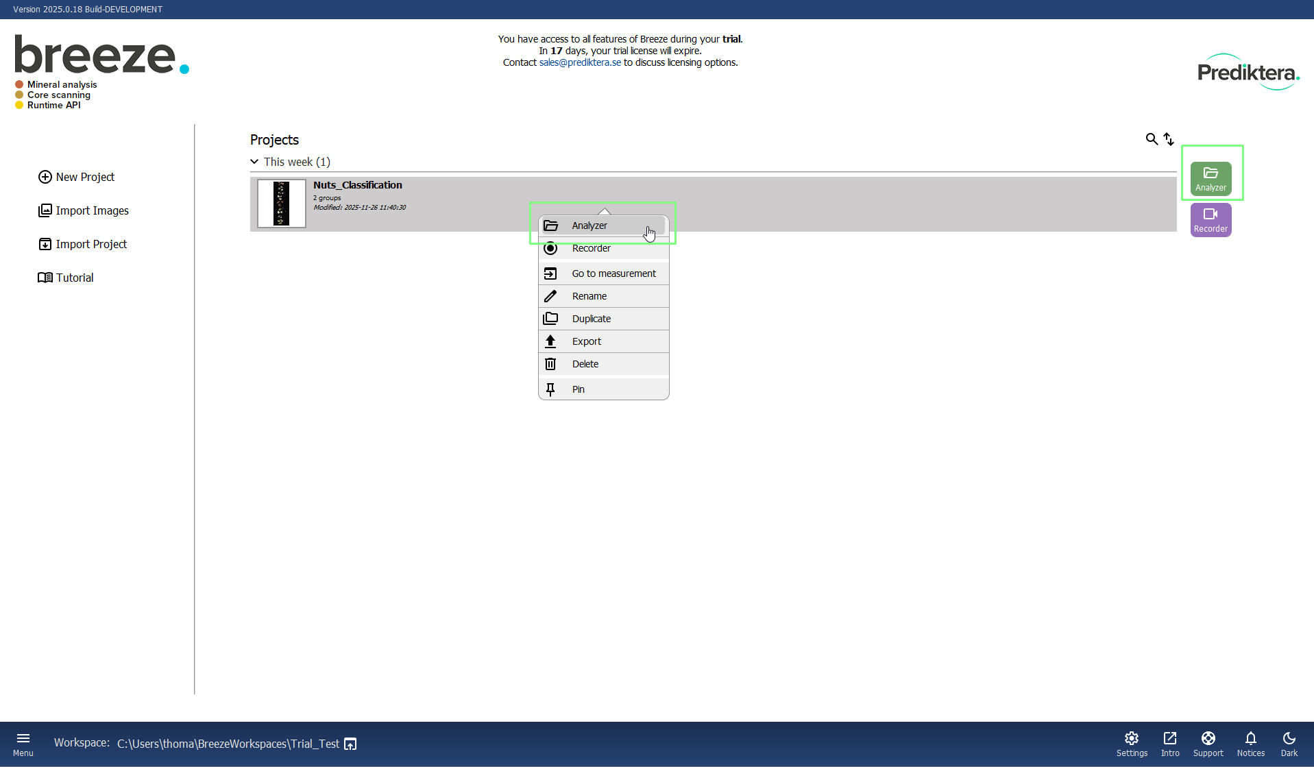
Choose which project to work on here in the home view of Breeze.
There are three different ways to open the project:
-
Double click on the project.
-
Select the project and click Analyzer.
-
Right click the project and choose Analyzer.
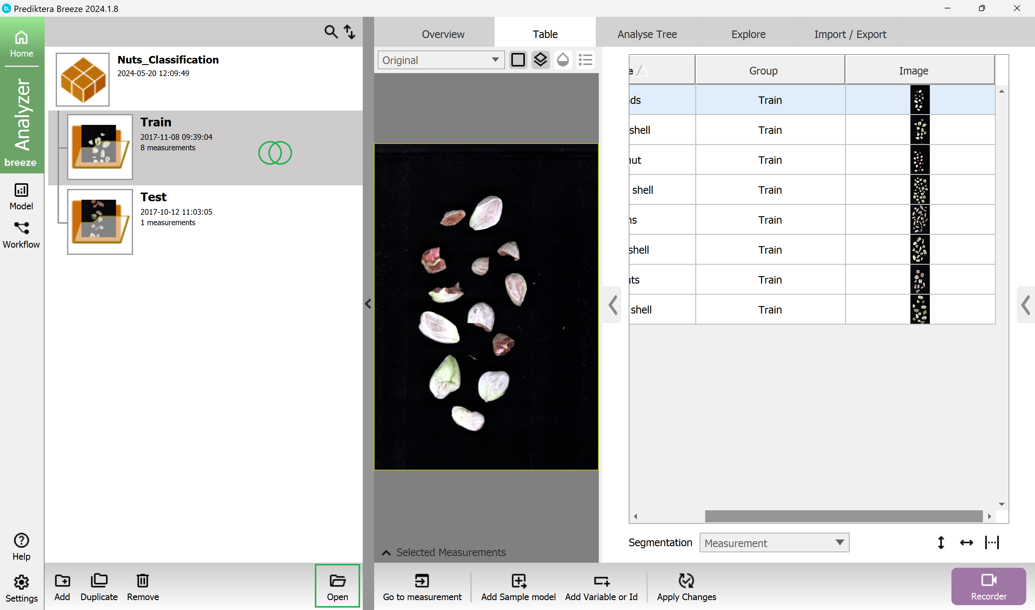
The image data in this Project is organized into two Groups (folders) called Train and Test and includes eight training images, with either nuts or shells, and one test image.
You can click on a table row to see the (pseudo-RGB) preview for each image in the center panel.
Double click on the Train group to open it.
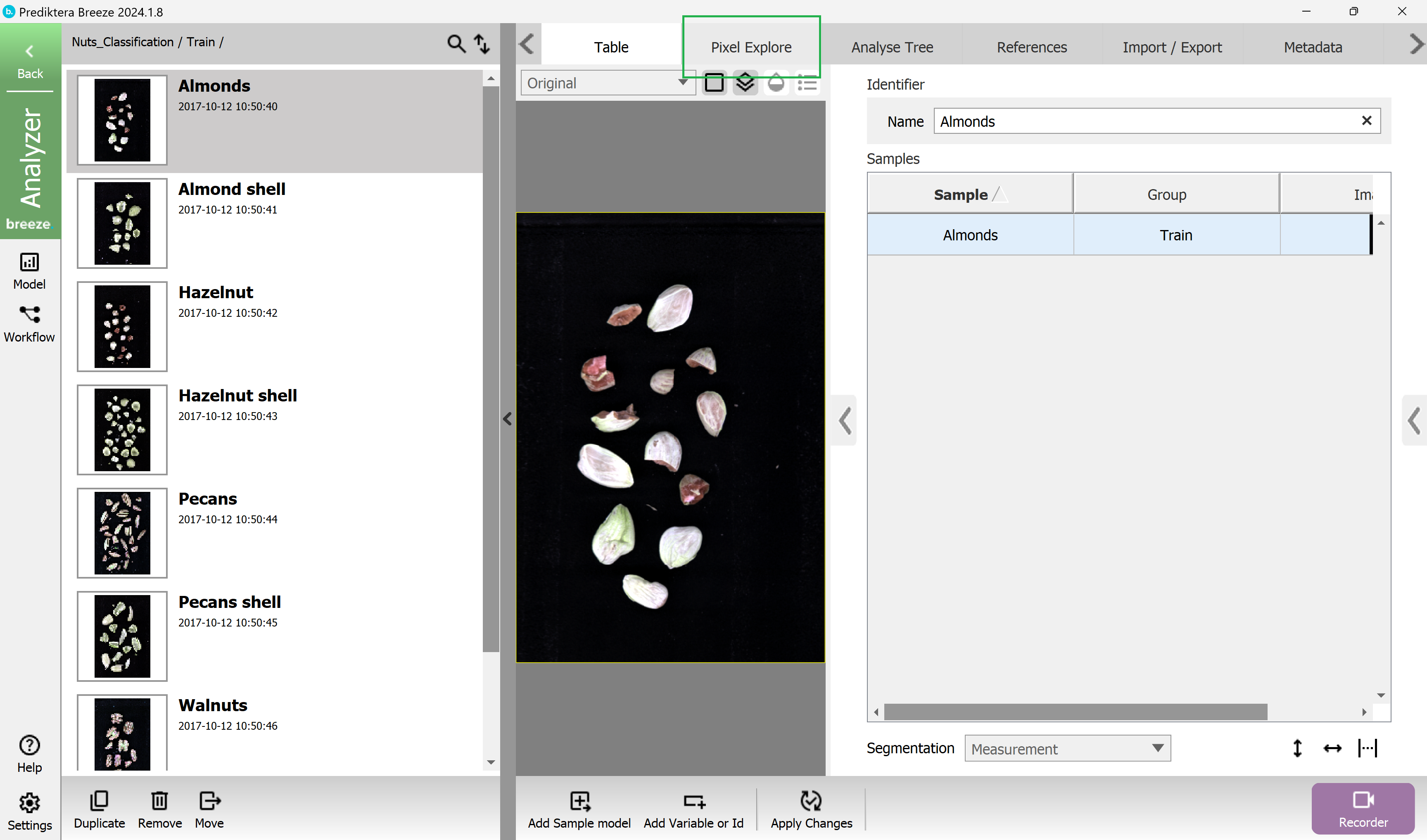
In the menu on the left side, you see all the individual images (called Measurements), in this group.
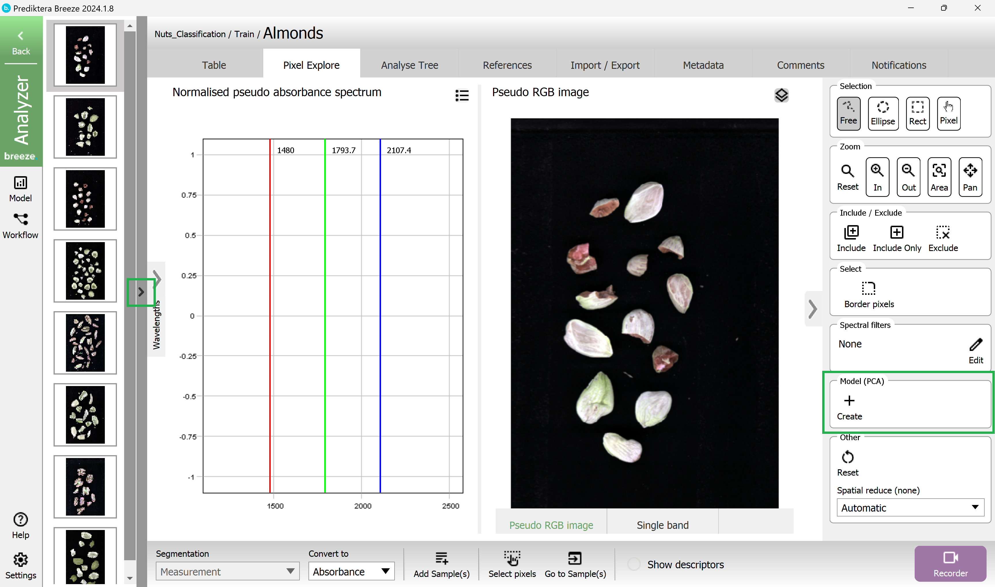
Click on the Pixel Explore tab to look closer at an individual image and its spectral data. In this example we have selected the first image Almonds.
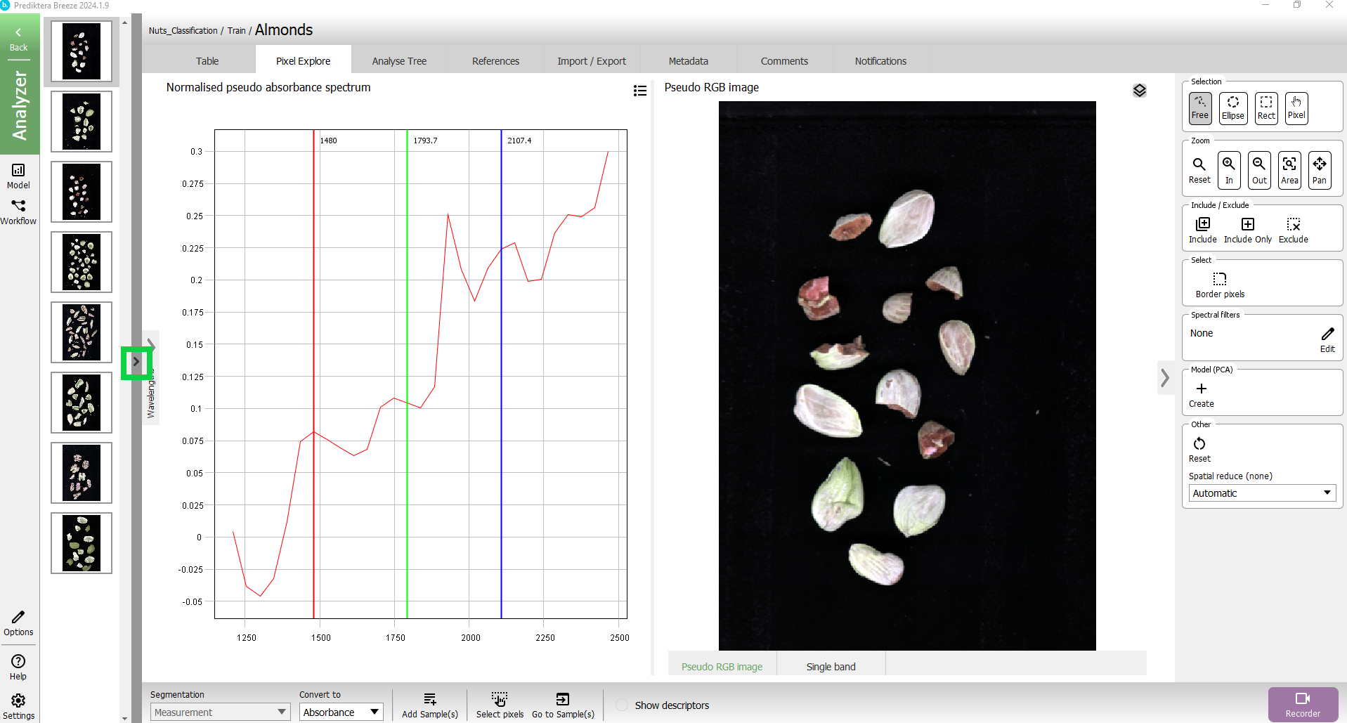
Collapse the left menu using the small arrow to expand the Pixel Explore view.
By hovering the cursor over the image you can see the spectrum for the pixel at the position of the cursor.
Hold down left mouse button and drag to make a selection of an area in the image. The average spectrum for this area will be shown in the spectrum plot.
You can compare different areas by making additional selections.
In the menu on the right side are options for different selection and zoom tools. You can also zoom by using the scroll function on your mouse.
The spectral plot has 3 vertical lines showing the spectral bands used to generate the pseudo-RGB image. You can modify this by sliding the lines using your mouse.
Now let’s do a quick analysis of the spectral variation in the image, by selecting Create + in the Model (PCA) panel.

A PCA model has been created based on all pixels in the image. In order for your images to match those in this tutorial, you must go to the Analyse tree tab, select Measurement and choose Absorbance in the Convert to drop-down menu. This is described in more detail in Changing spectra.
Each point in the Variance scatter plot corresponds to a pixel in the image. The points in the scatter plot are clustered based on spectral similarity. The color of the points in the scatter plot is based on density (i.e. red = many points close to each other).
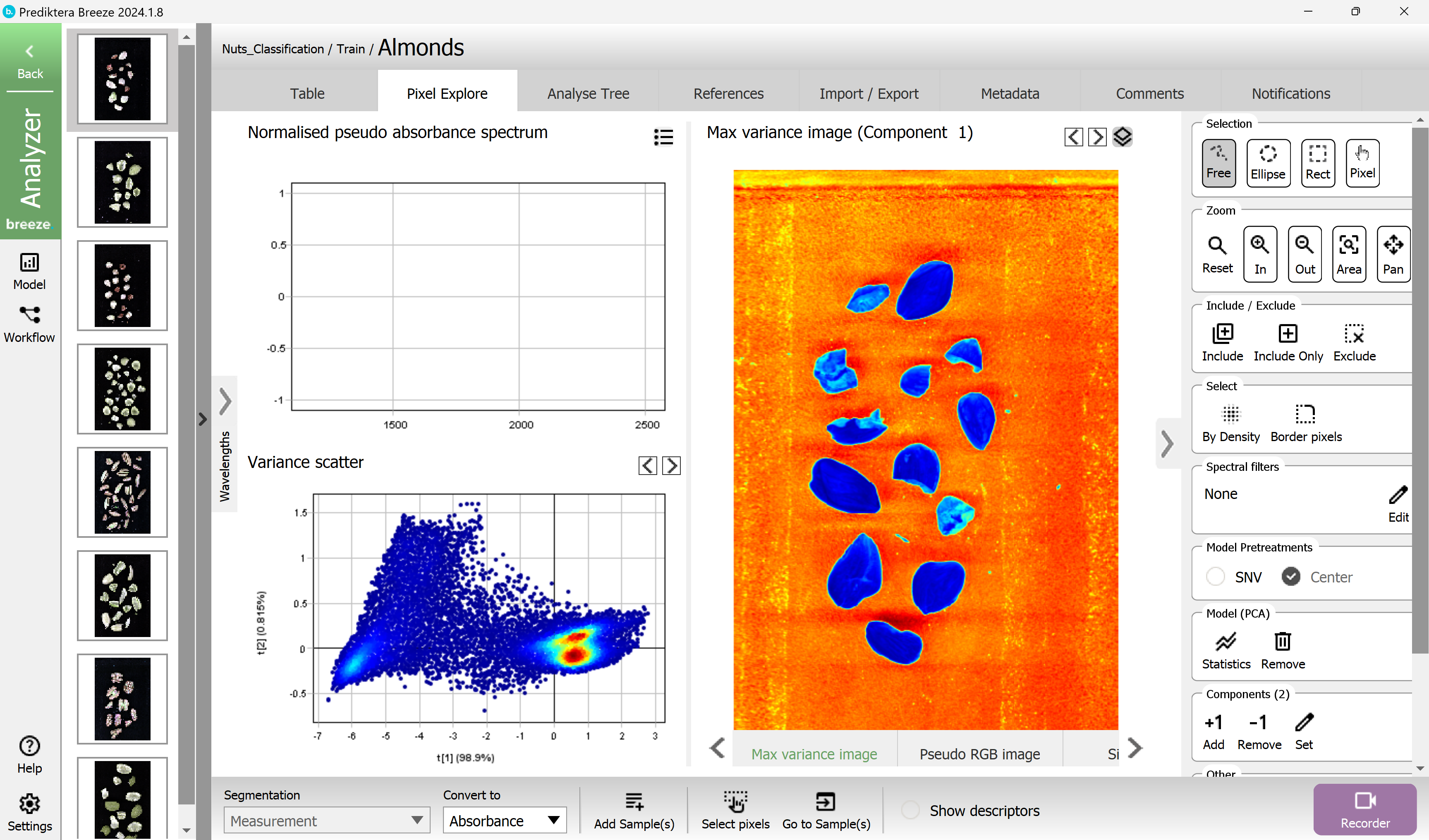
The Max variance image is colored by the variation in the 1st component of the PCA model (the X-axis in the scatter plot, t1), and visualizes the biggest spectral variation in the image. In this case, this is the difference between the sample (blue) and the background (orange).
Do a selection of a cluster of points in the scatter plot. These pixels are automatically highlighted in the image.
Go back to the project level by selecting the Back button in the upper left corner.
Label your training data for classification of models
Select “Nuts-Classification” from the menu in the left panel to select the project. This will enable you to see all images from both the Train and Test groups in Table.
We will now add a new class variable to the training data set so we can define the true values. This is done by creating a new column in the table.
Select Add variable or Id at the bottom of the window.
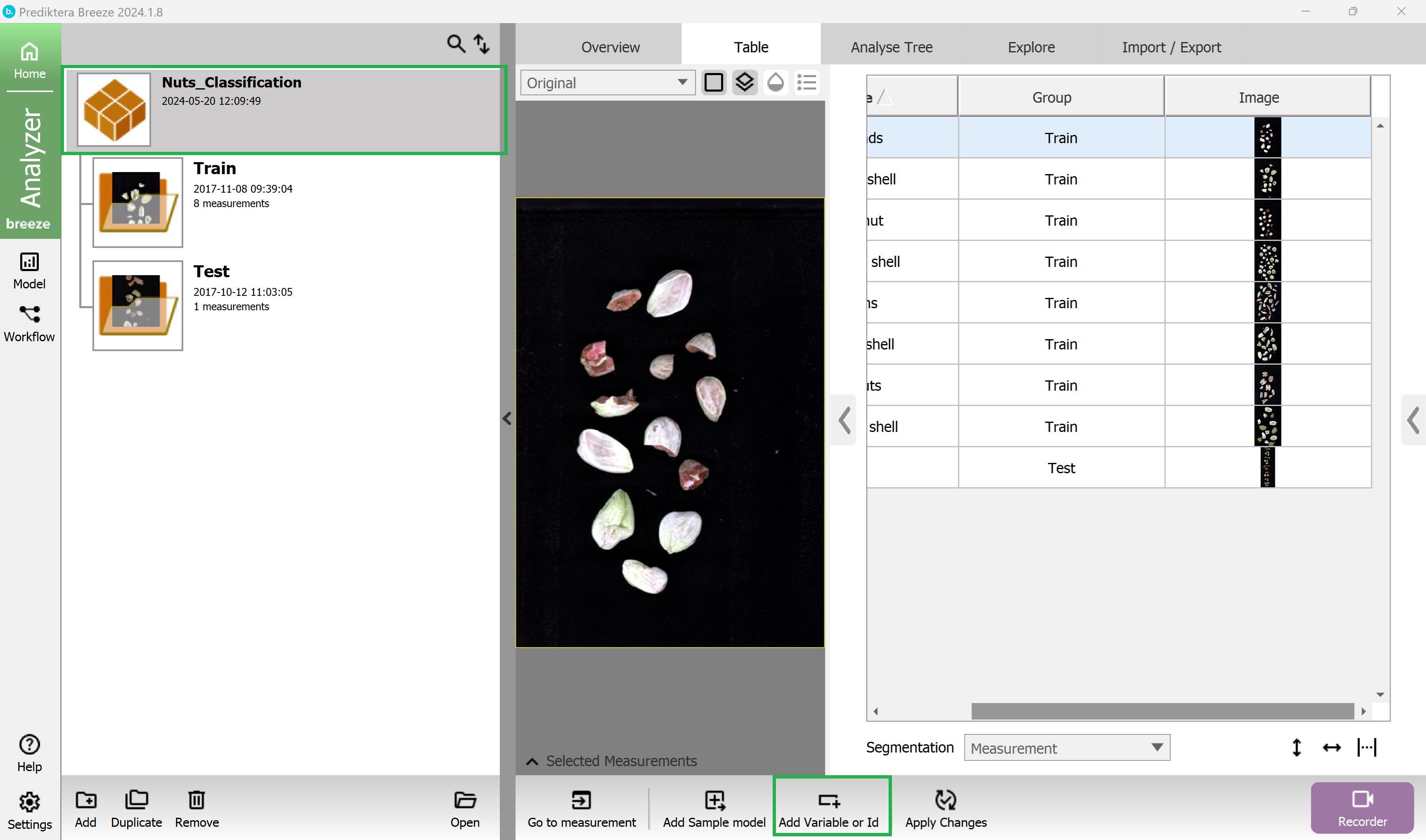
Select type Category (Classification variable) and write the name “Nut or shell” then select Add.
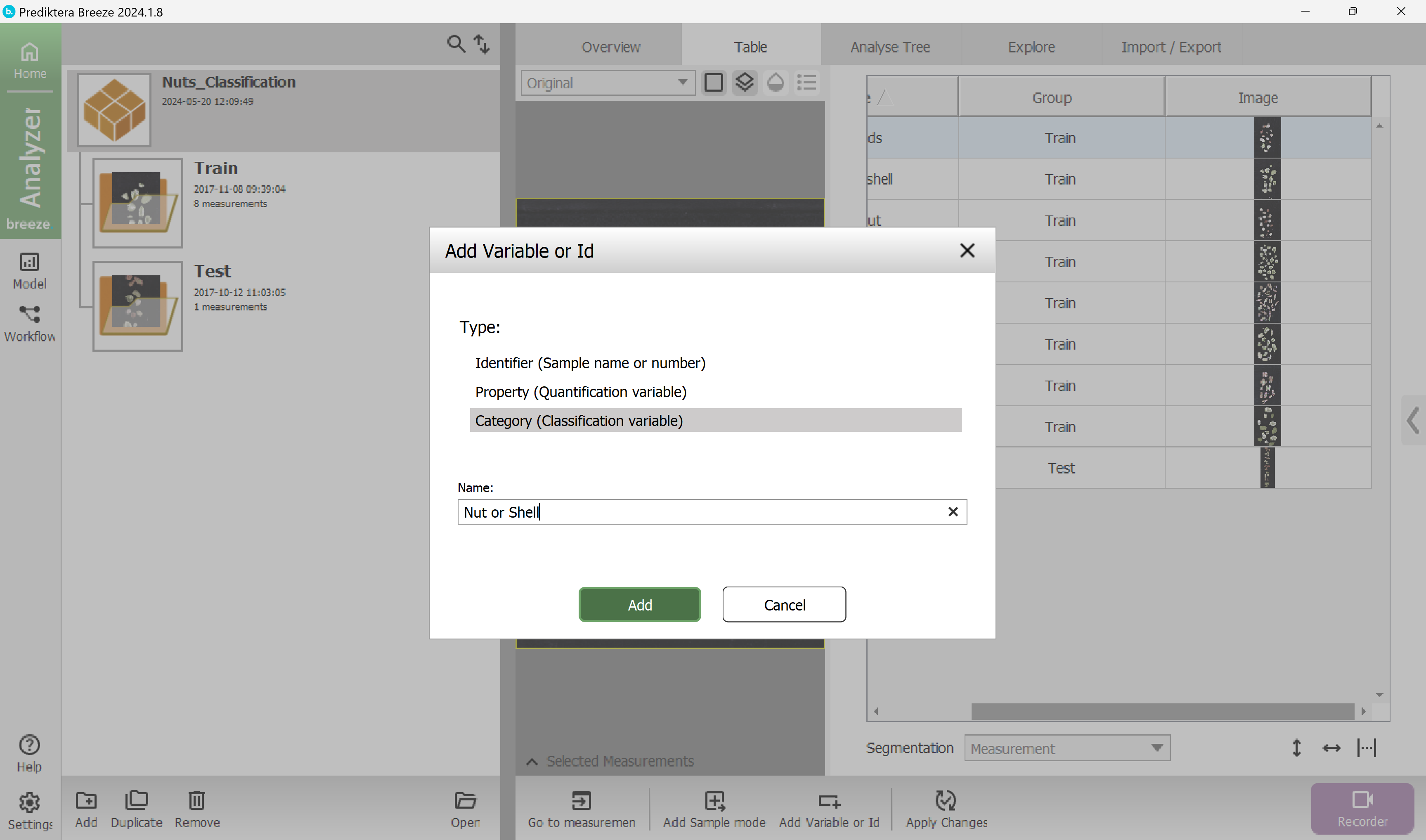
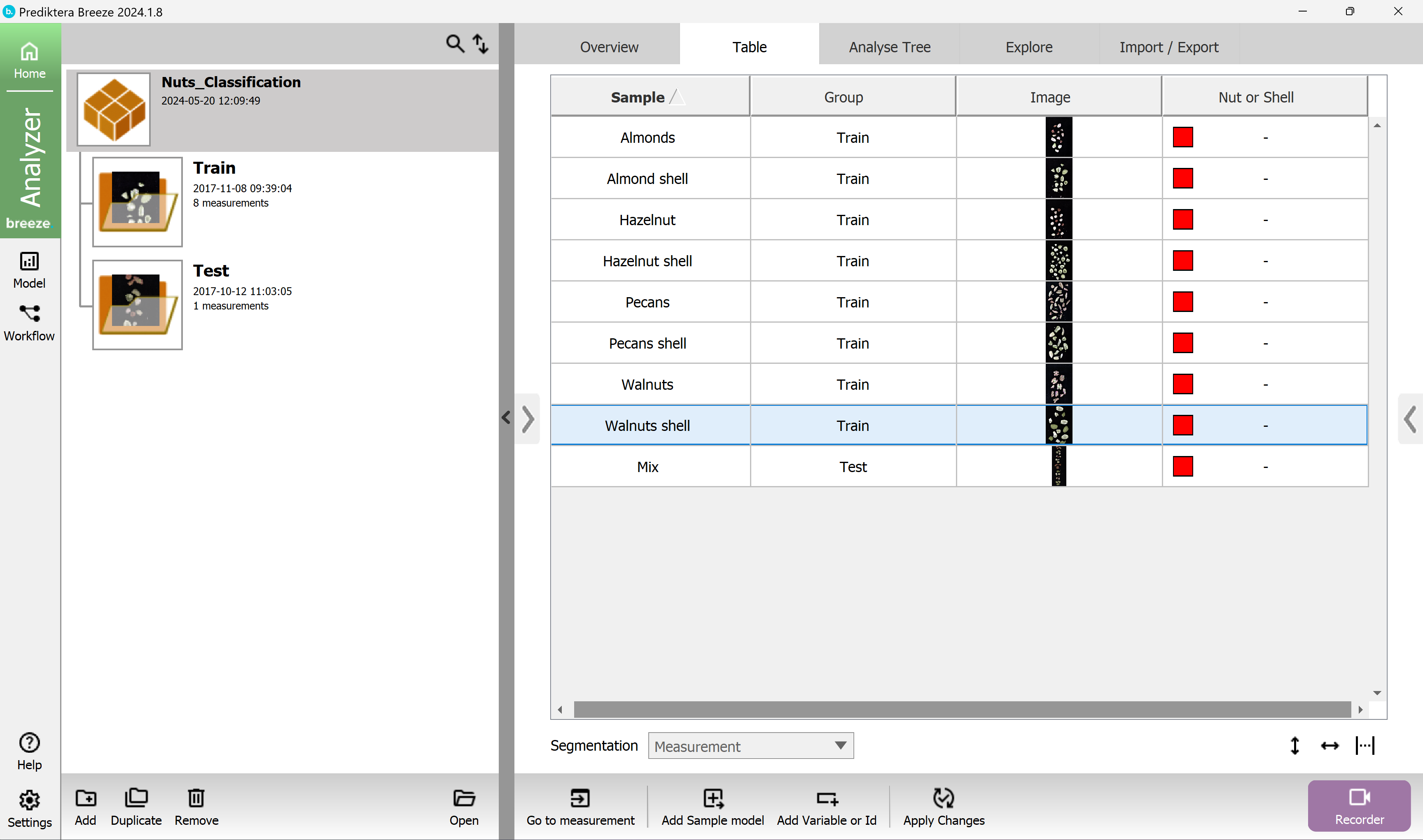
A column named “Nut or shell” has now been added to the table.
tip If you need to delete a column like Variables or IDs, right-click on the header for the column you want to delete and then press the Delete option that will appear.
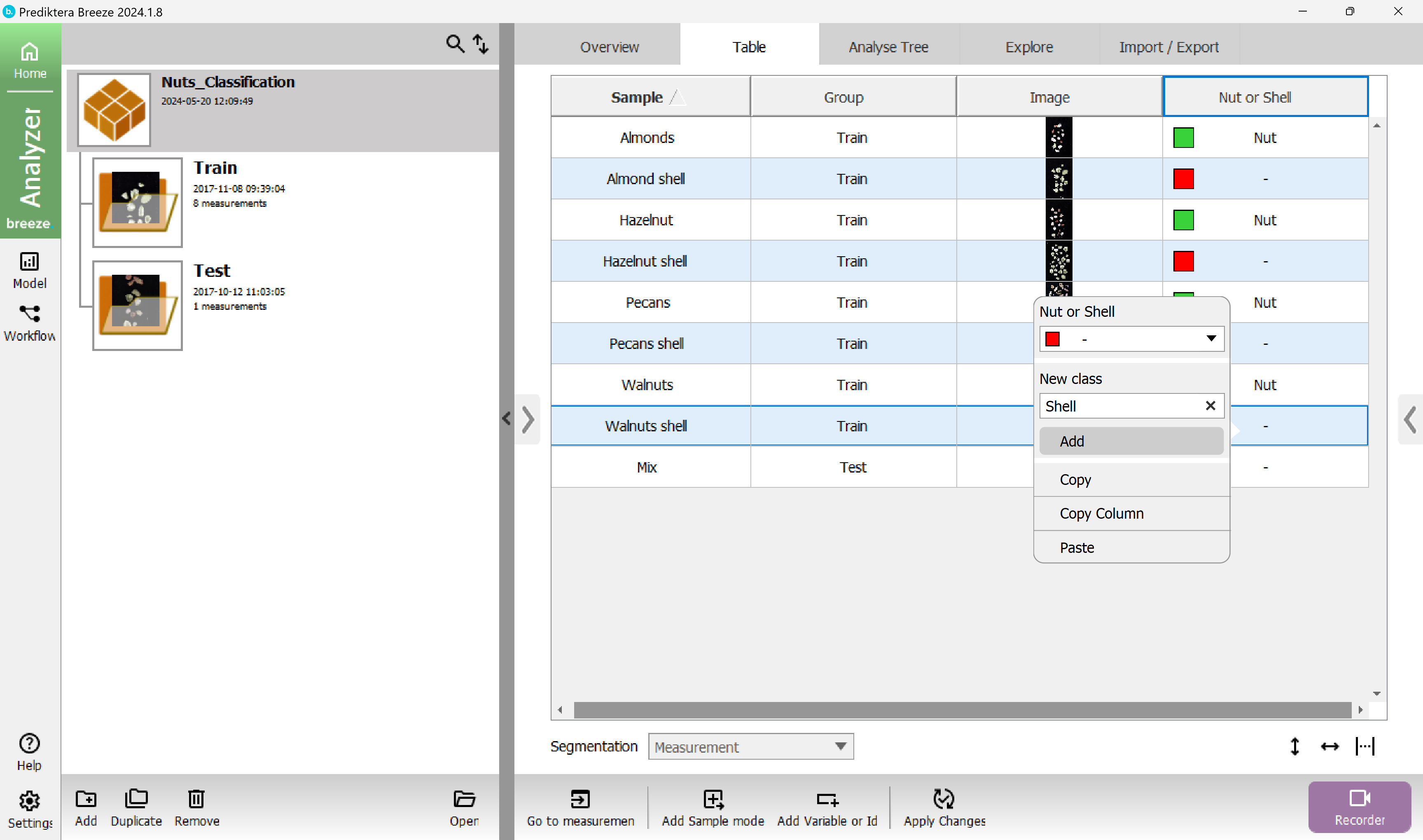
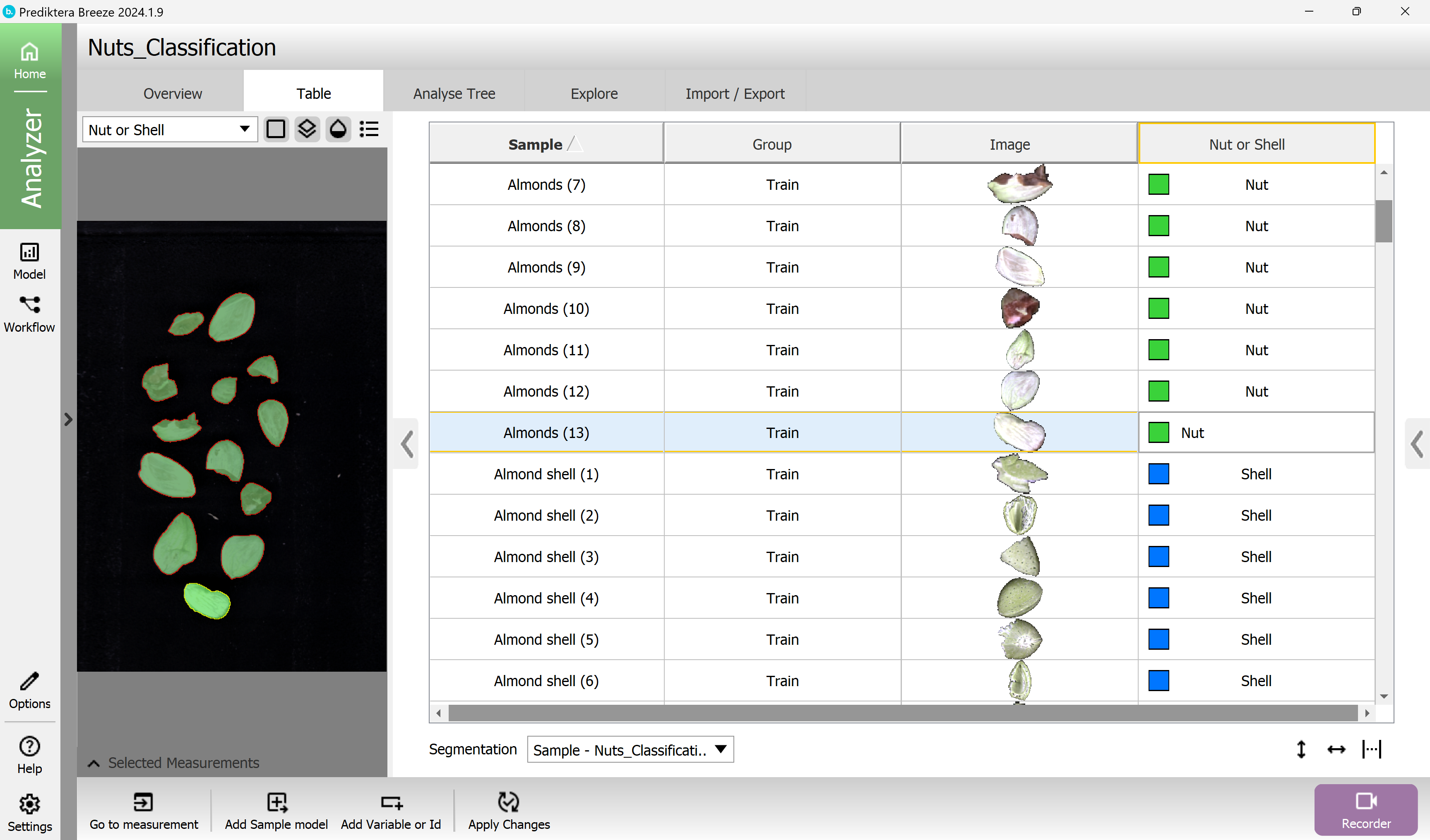
Categorize all of the nuts, by holding the Ctrl-key and using the mouse cursor to select the “Almonds”, “Hazelnut”, “Pecans” and “Walnuts” samples.
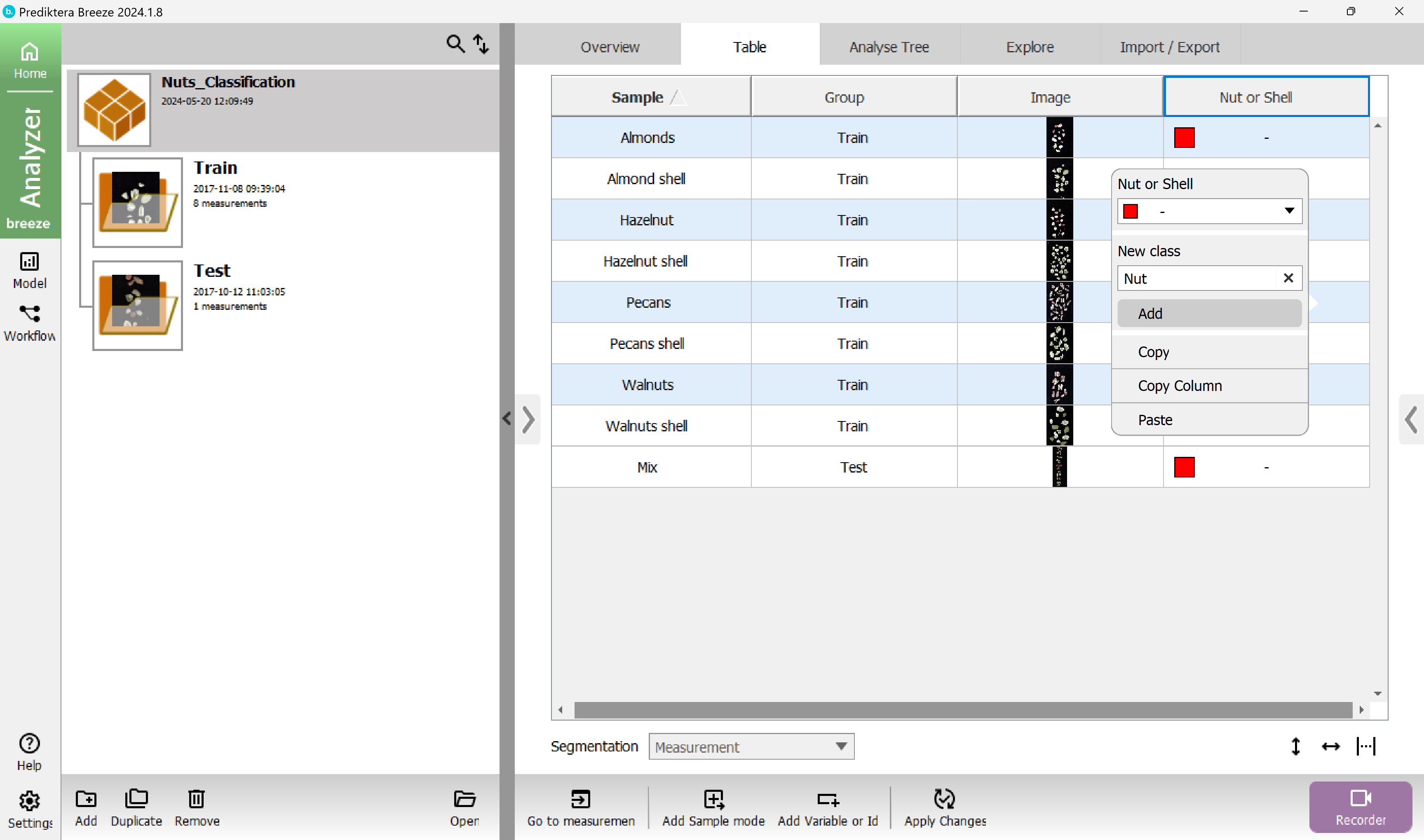
Right-click on one of the selected rows in the “Nut or Shell” column and write the class name “Nut” in the New Class field, then select Add.
Do the same thing again for the shell samples and categorize them with the new class “Shell”.
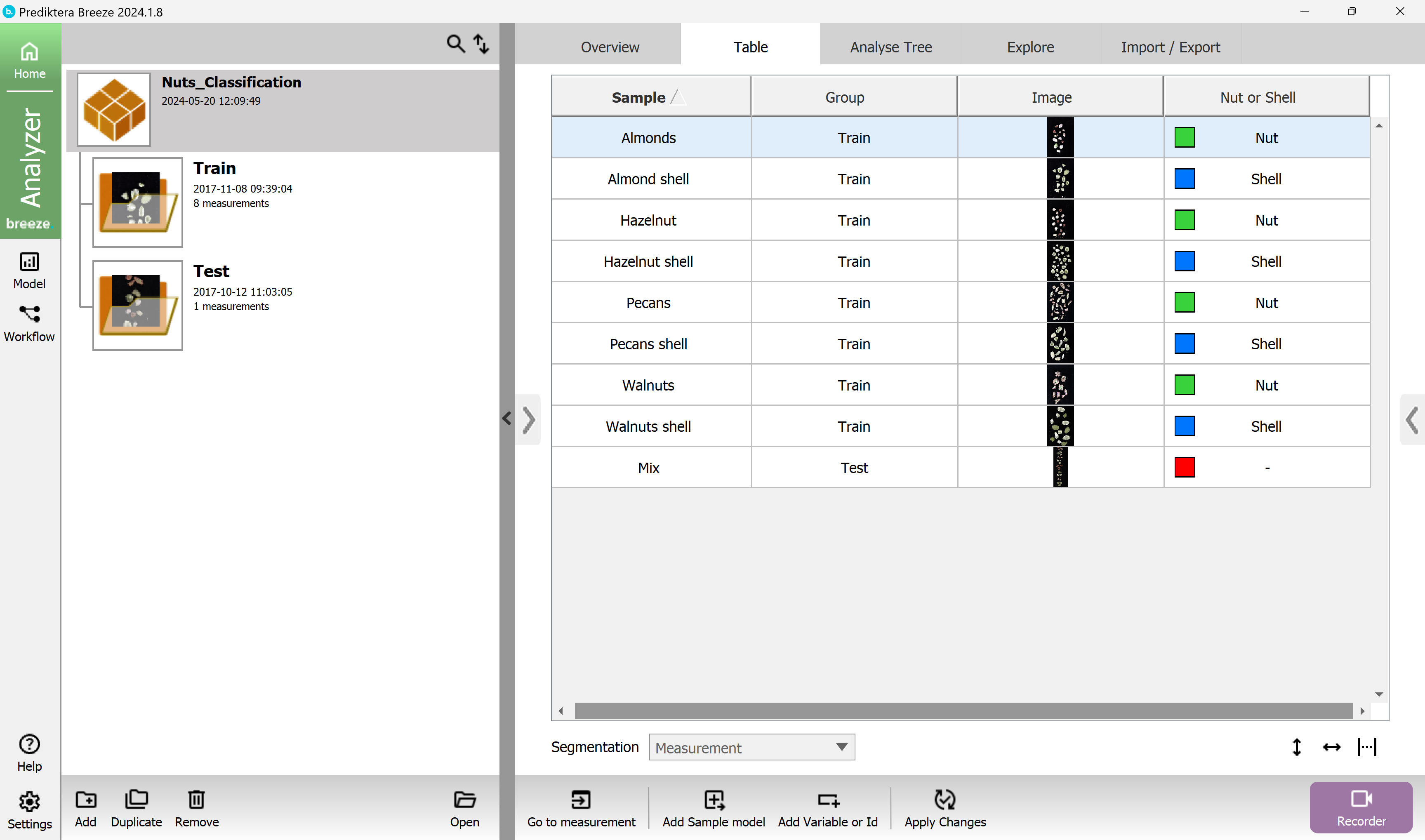
Your table should look like this now.
You do not need to set a class to the Test image.
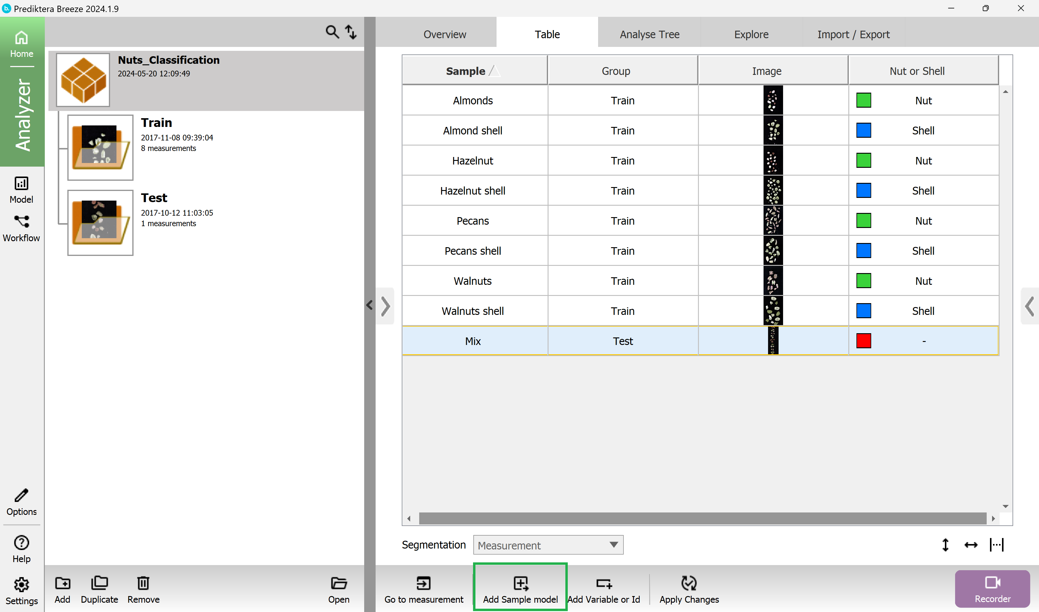
Create a sample model to remove background pixels
You will now create a sample model that will be used to remove the background pixels and to automatically segment out the objects (nut and shell samples) in the images.
This sample model will be applied to all images in the project and will make it easy for us to train a classification model in next step.
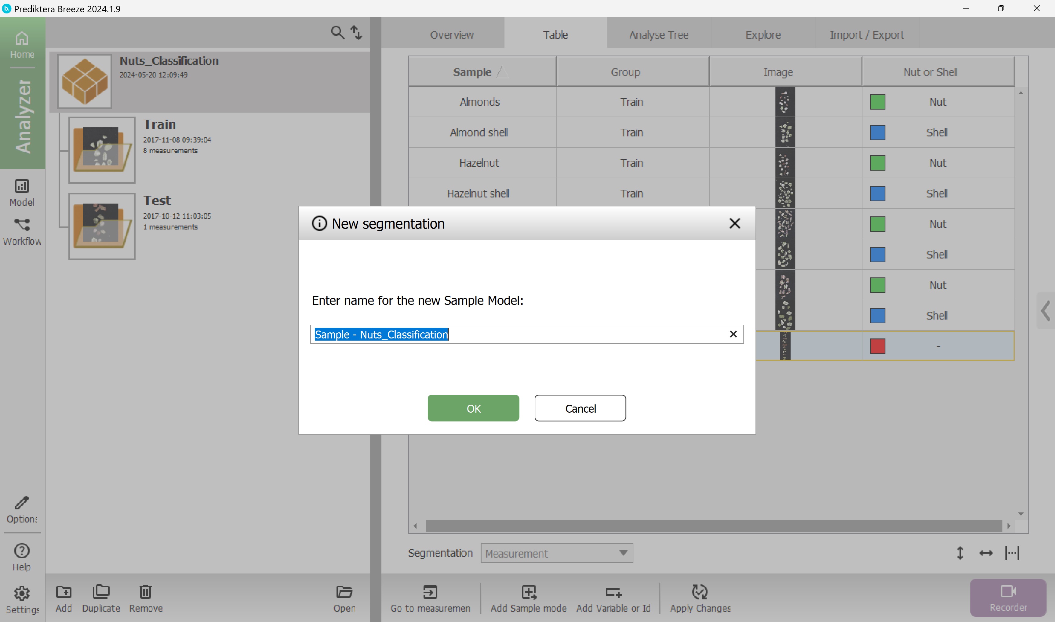
Select the Add Sample model button at the bottom of the window:
Choose a name for the sample model (or use the default name).
Select OK.
A model wizard will appear.
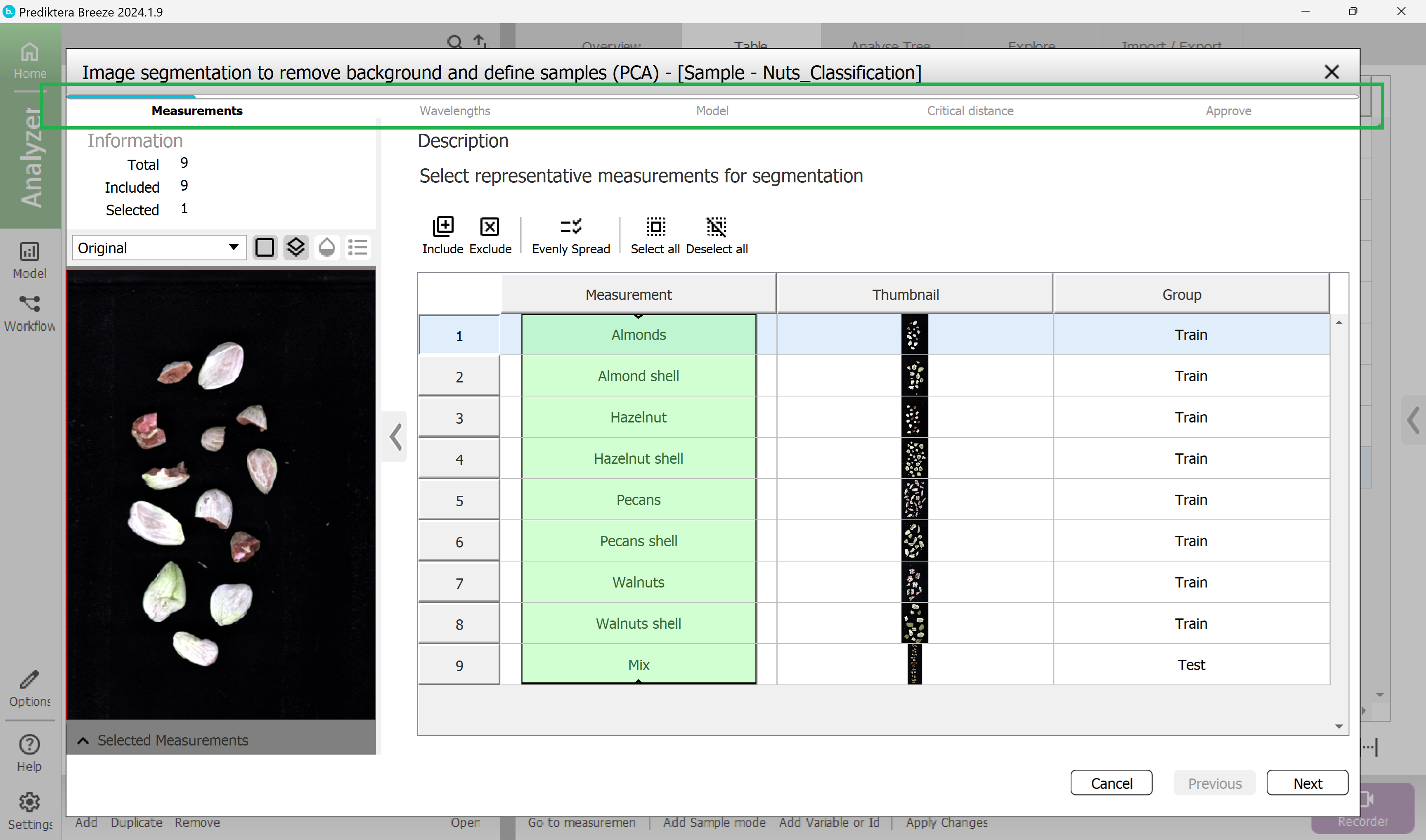
Step 1 - Measurements
Select the Measurements (images) to use in the model.
By default all measurements are included, which is ok.
Select Next.
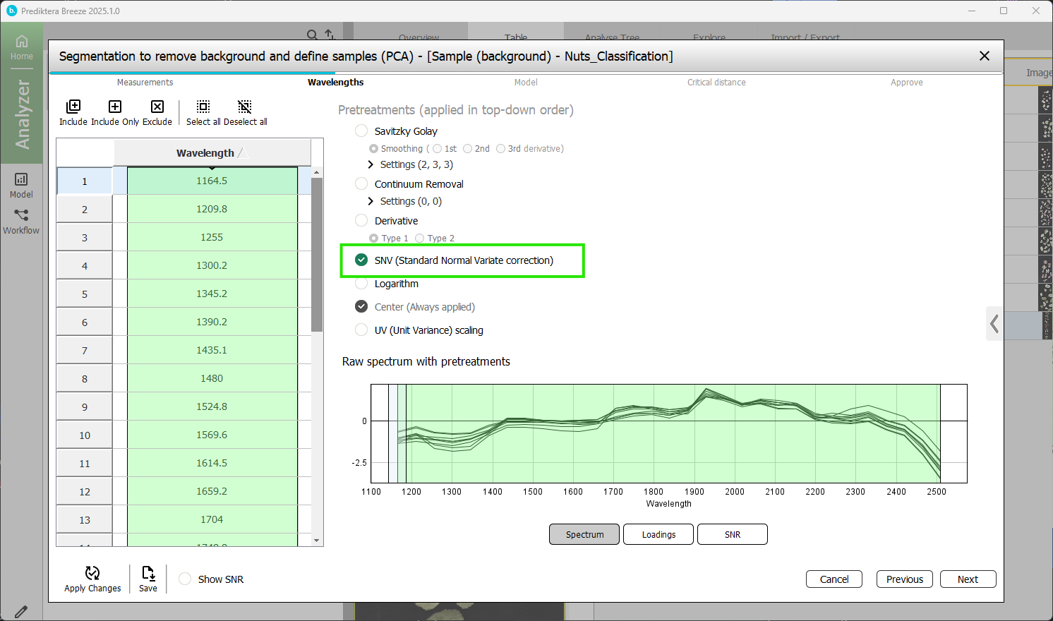
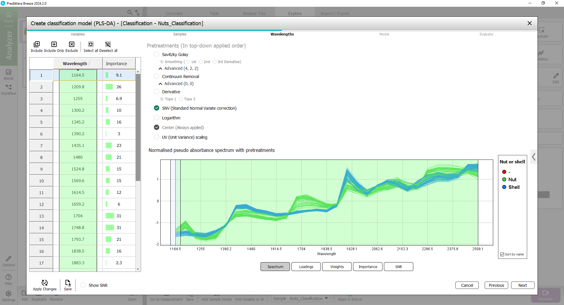
Step 2 - Wavelengths
Select the Wavelengths (spectral bands) to use in the model.
On the left side is a table of all spectral bands. On the right you have a spectral plot showing the average spectrum of each image. By default, all wavelengths are included. This is shown by them being highlighted in green.
You can also see the Pre-treatment steps that can be applied to the data. By default SNV (Standard Normal Variate correction) is selected (see Pretreatments | SNV (Standard Normal Variate correction) for more information).
Select Next.
Step 3 - Model
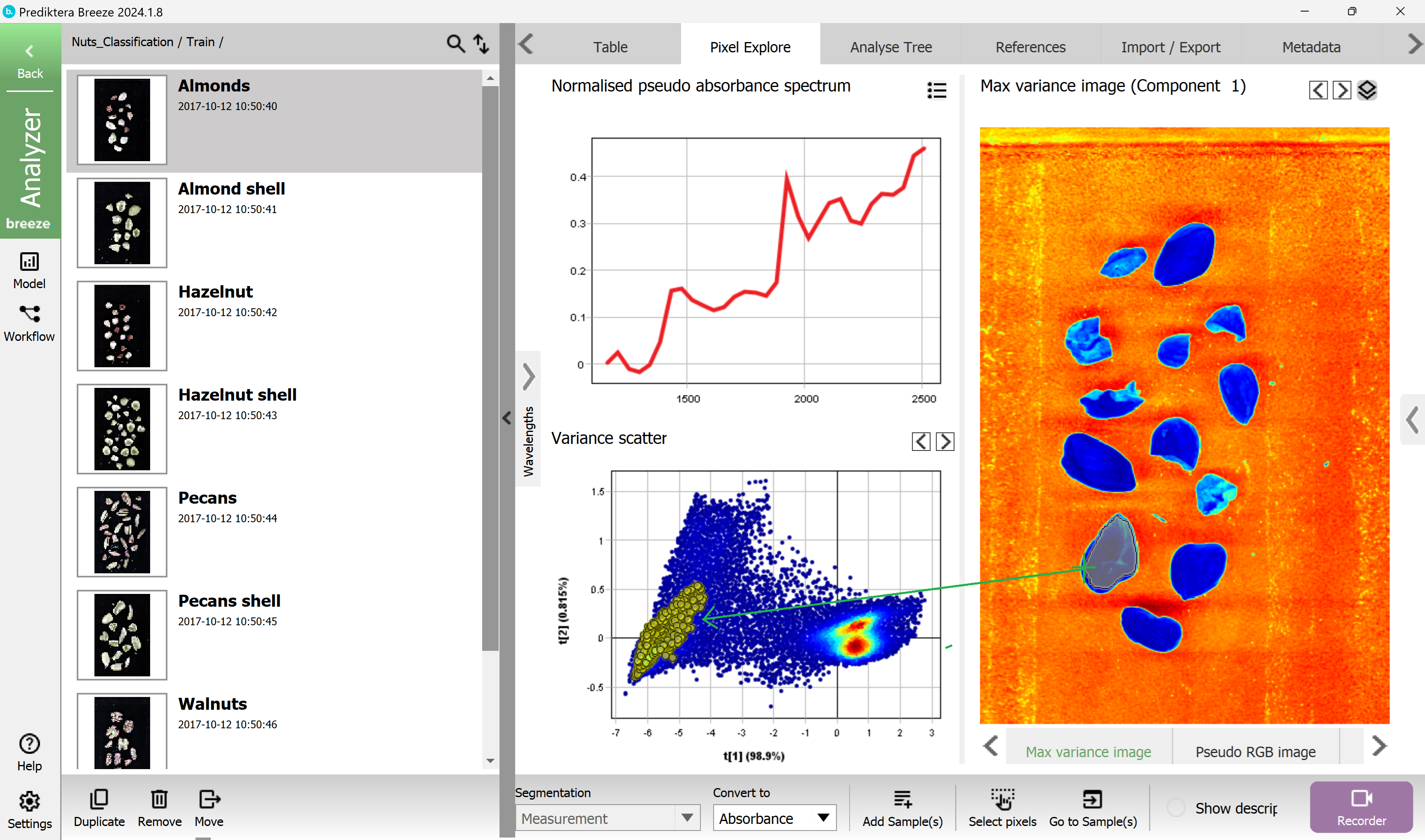
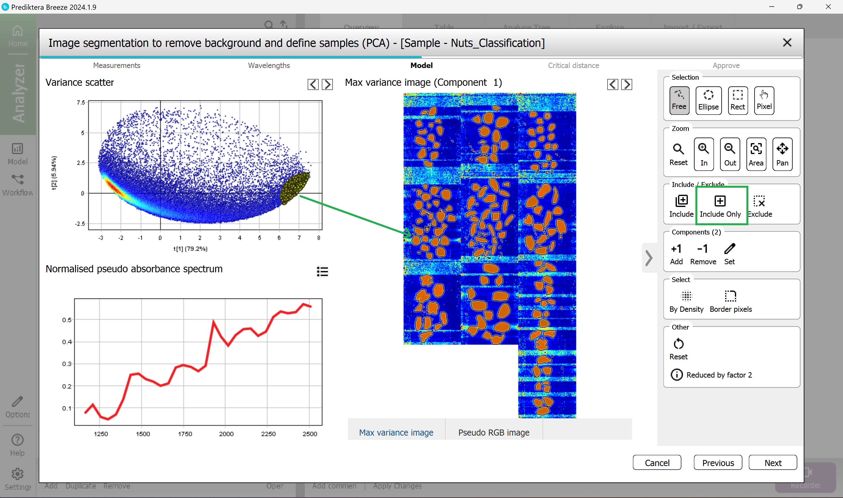
Select the pixels to use for training the sample model.
A mosaic has been created of all images, and a PCA model has been created from all the pixels in the mosaic.
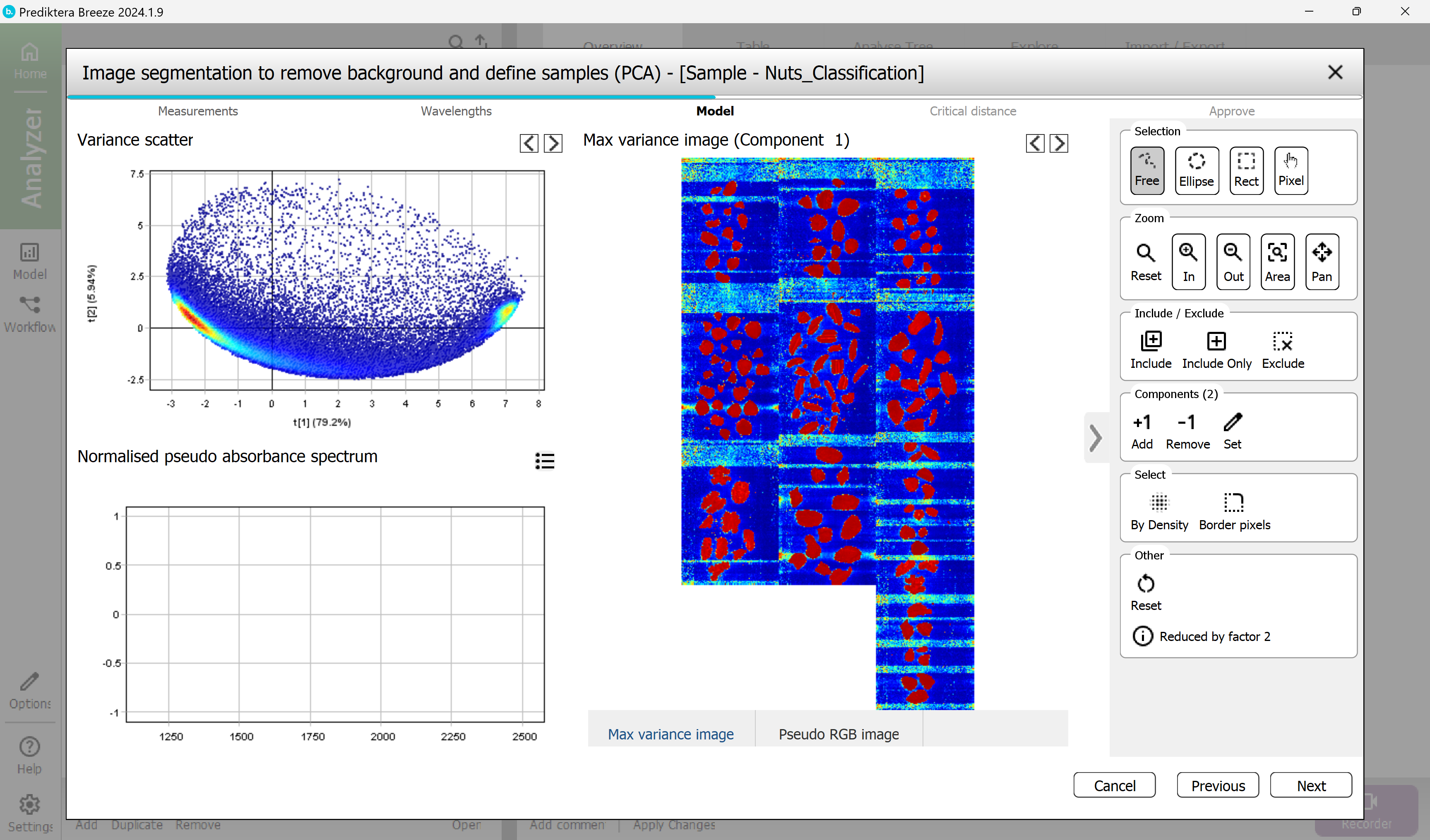
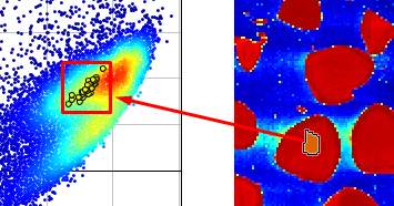
Select a region containing only nut or shell pixels by clicking and dragging to mark an area inside the object.
To make this easier you can use the mouse scroll function to zoom in.
The corresponding pixels are then selected in the scatter plot to the left.
Now you know that the nut and shell pixels are in the cluster on the right side in the Scatter plot.
In the scatter plot, select all pixels in the cluster on the right side (use the pixel density coloring red, yellow, green, and light blue as help).
The corresponding pixels are then selected in the image on the right side and should correspond to all nut and shell pixels.
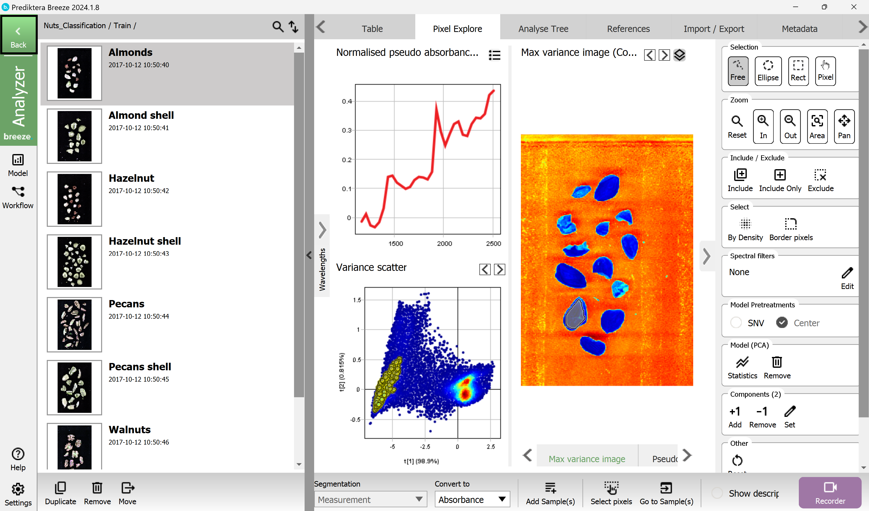
Select Include Only in the menu to the right.
The plots are now updated and will contain mostly the nut and shell pixels.
To clean up the pixel selection even more you can remove the pixels bordering each sample object.
Under Select, press Border pixels.
In the pop-up - Use the default of 1 border pixel and select OK.
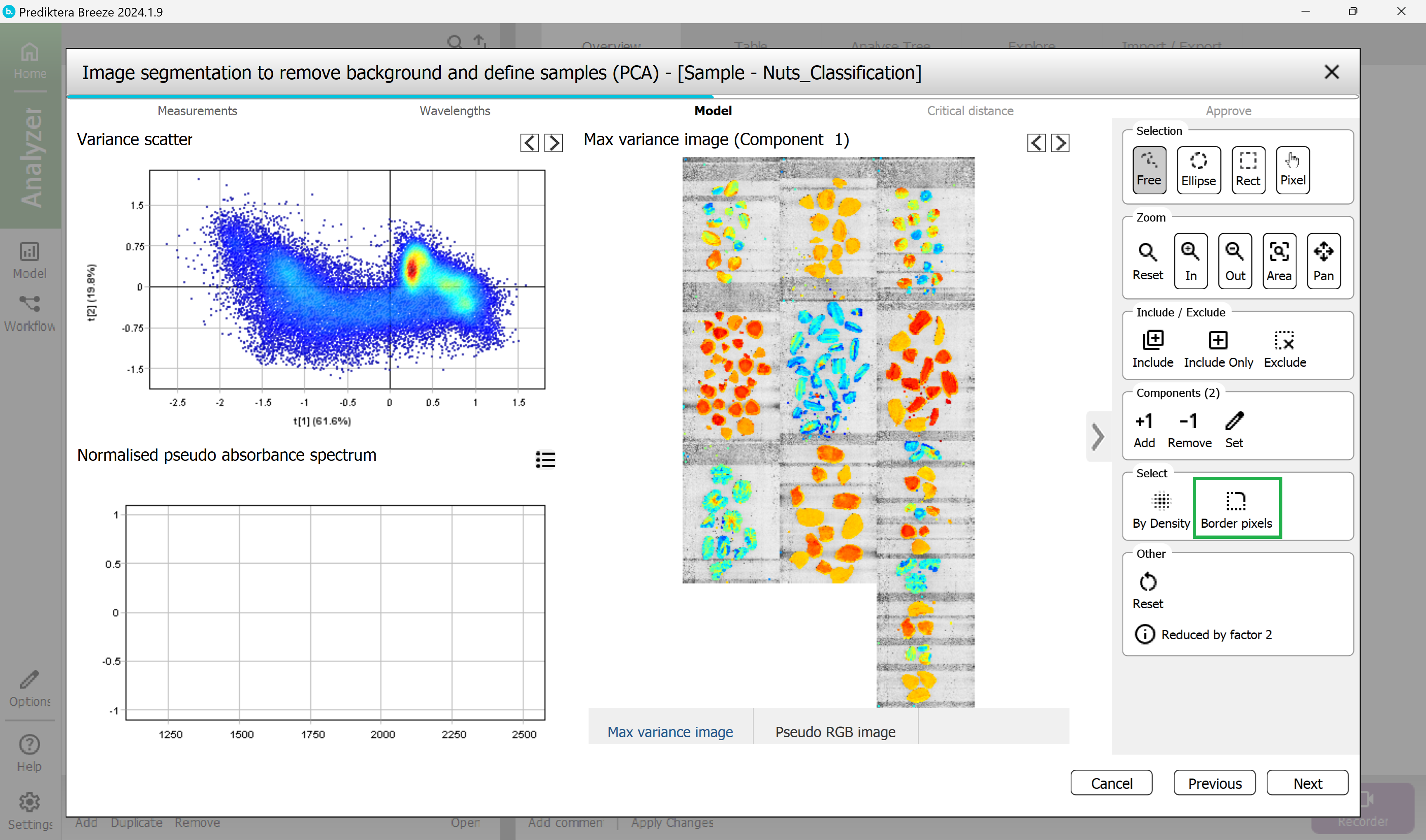
The border pixels have now been selected.
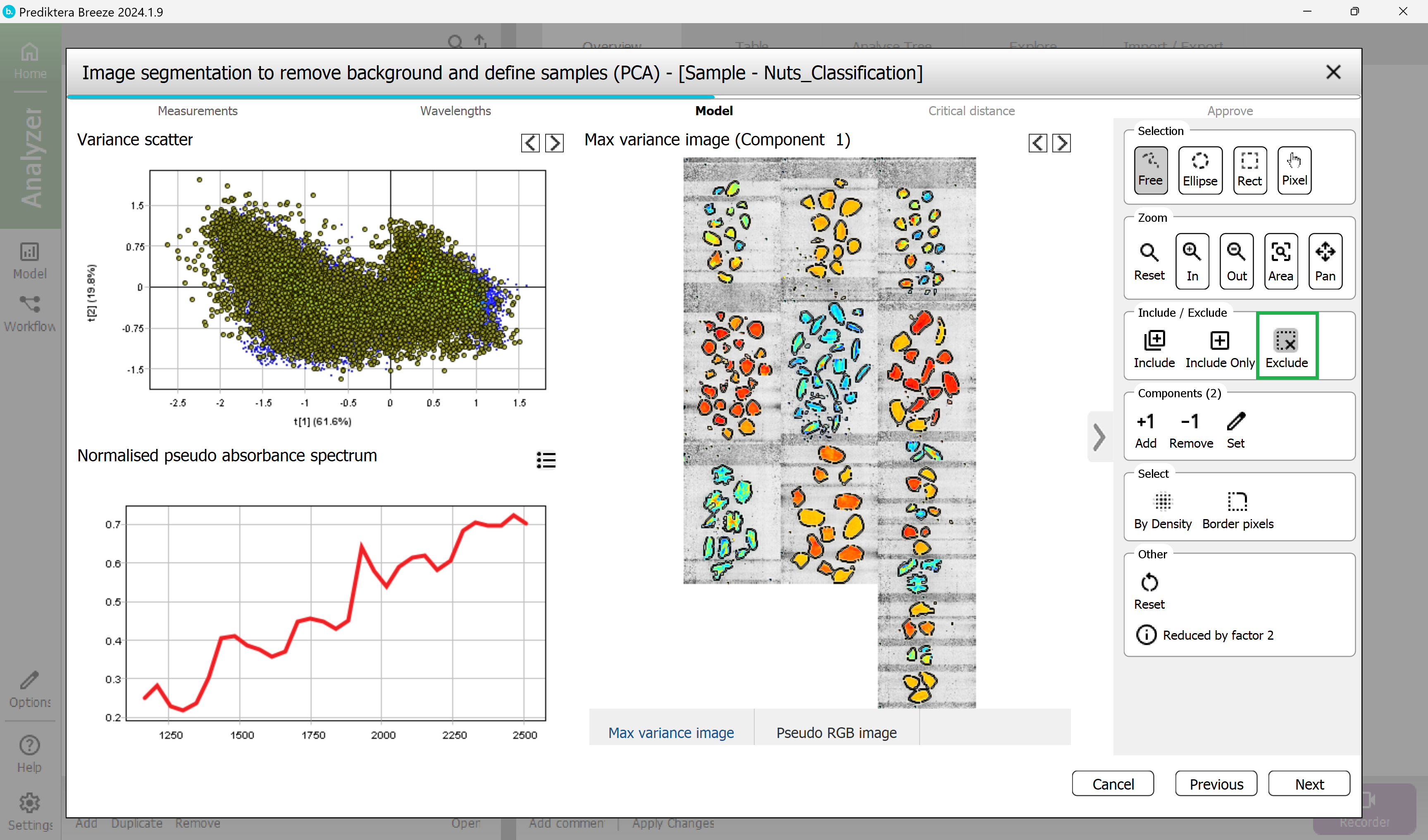
Exclude the border pixels by pressing Exclude.
Select Next.
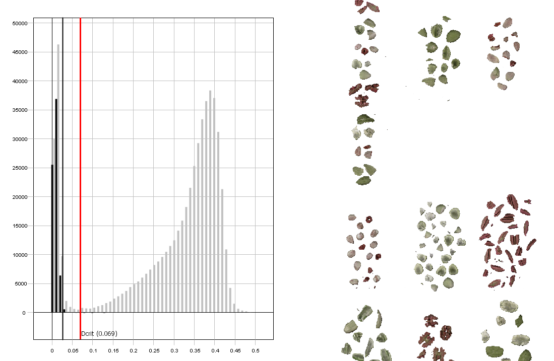
Step 4 - Critical Distance
Set the Critical Distance threshold.
This is the distance to the sample model and will be used to determine if pixels are sample or not. The histogram is showing the distance to the model for all pixels in the images. Pixels on the left side of the red vertical line (critical distance) are inside the threshold.
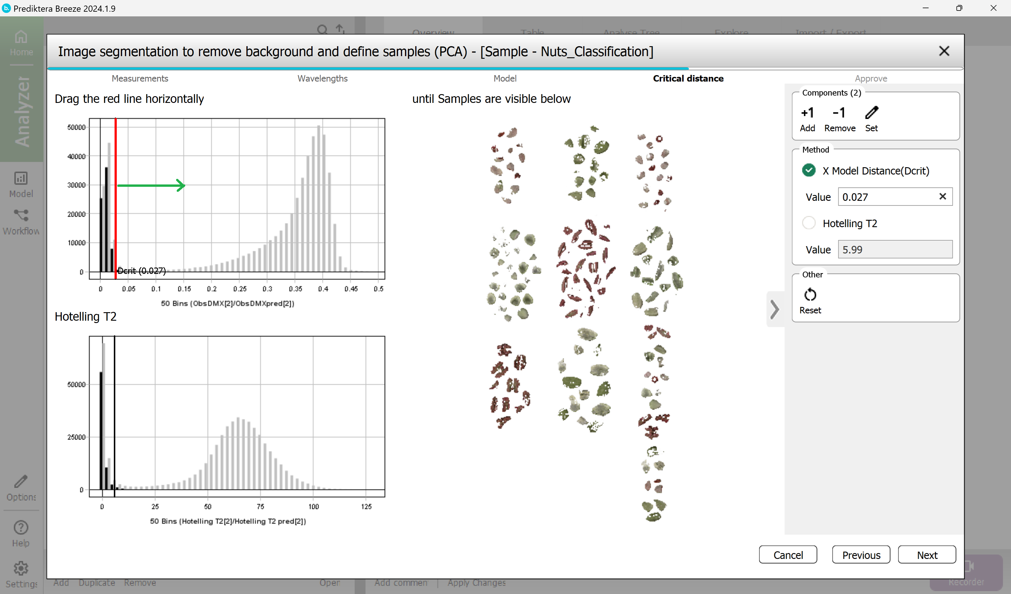
Drag the red line to the right to move the threshold. As you can see from the image to the right, more pixels are included when doing this.
The aim is to find a level where all nut pixels are included but no pixels from the background are.
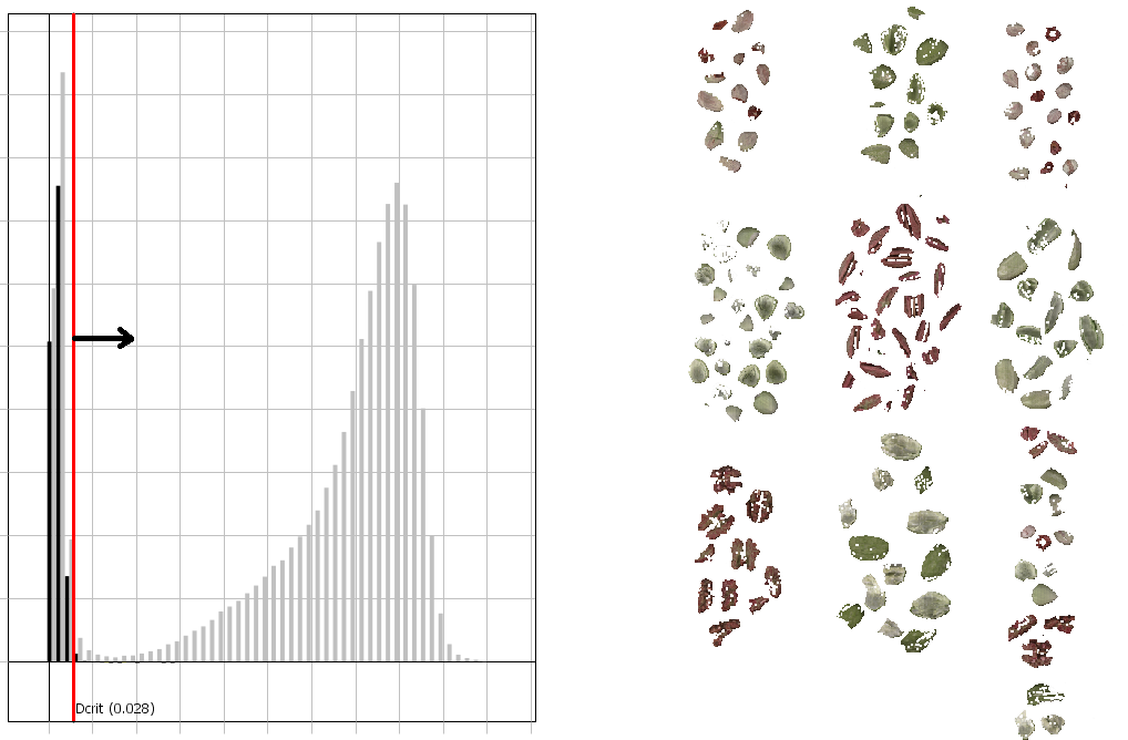
As a general recommendation, you can drag the red line to the bottom of the “valley” between the sample and the background bars in the histogram as shown below.
Select Next.
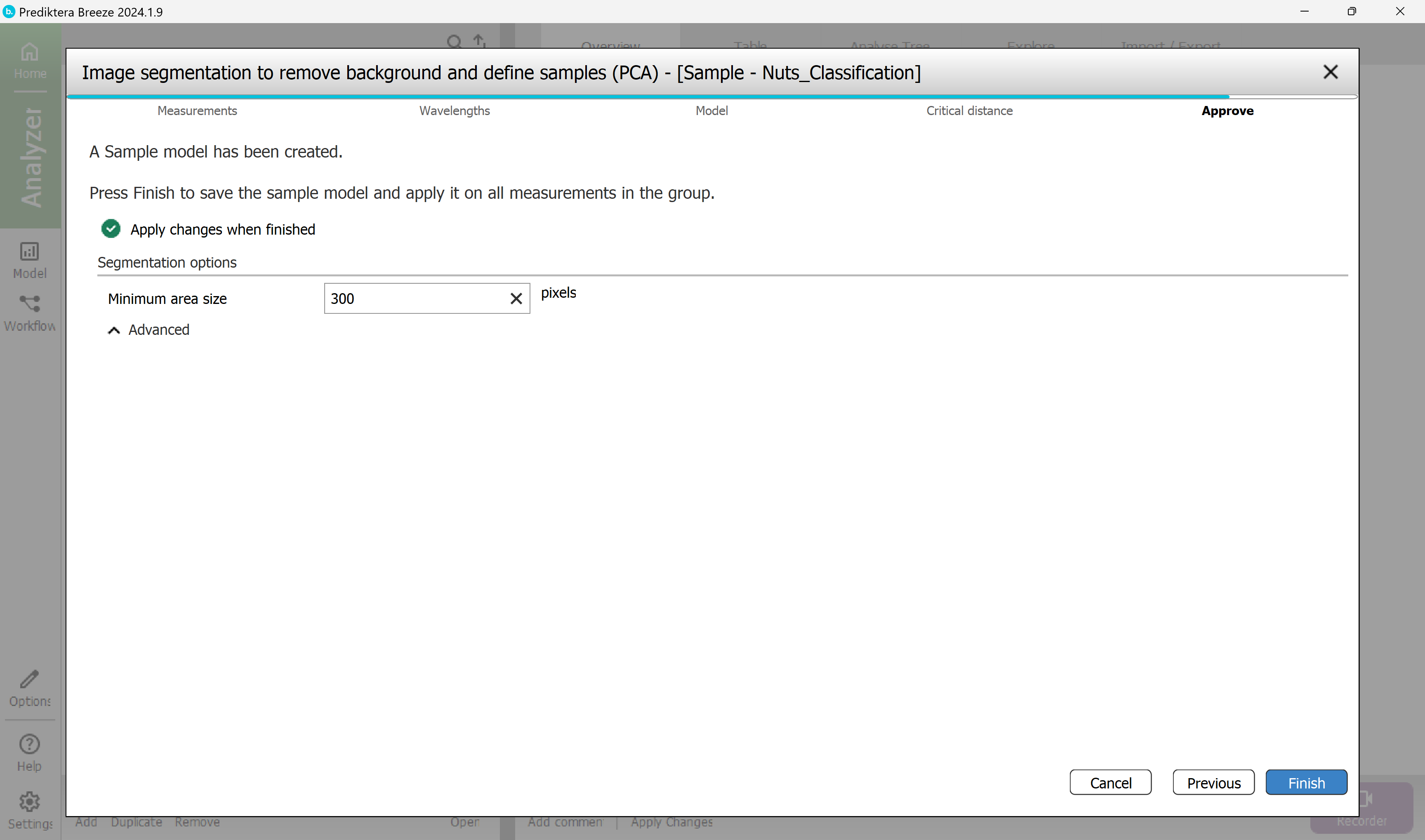
Step 5 - Approve
Approve the Minimum area size used to automatically exclude smaller unwanted objects (for example dust or dirt).
Breeze calculates a suggested minimum area size for your data. In this example, any objects under 300 pixels will be excluded from the image. Depending on how you did the pixel selection in the previous step this value might vary. A value around 300 should be OK.
Select Finish to create the sample model and apply this to all images in the project.
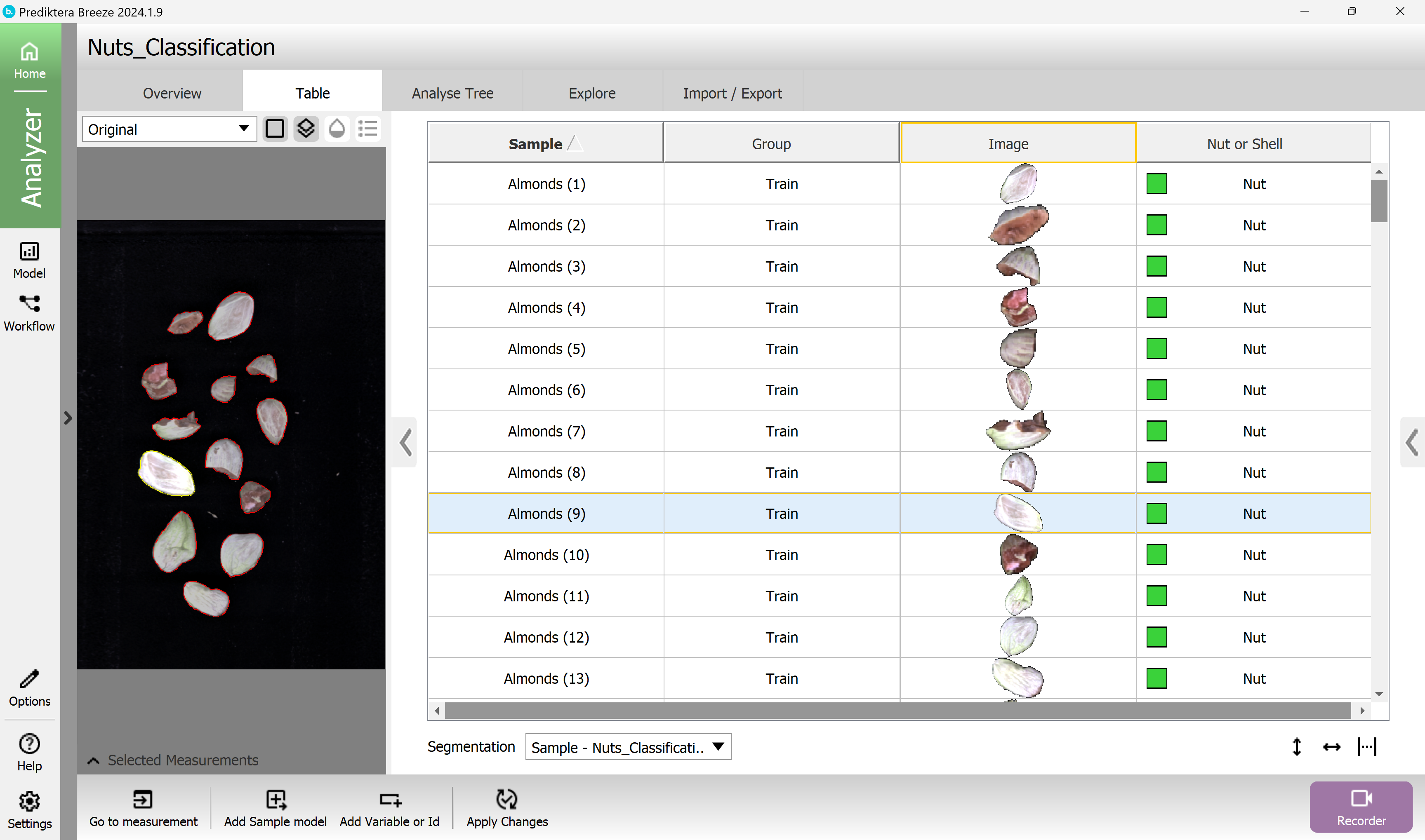
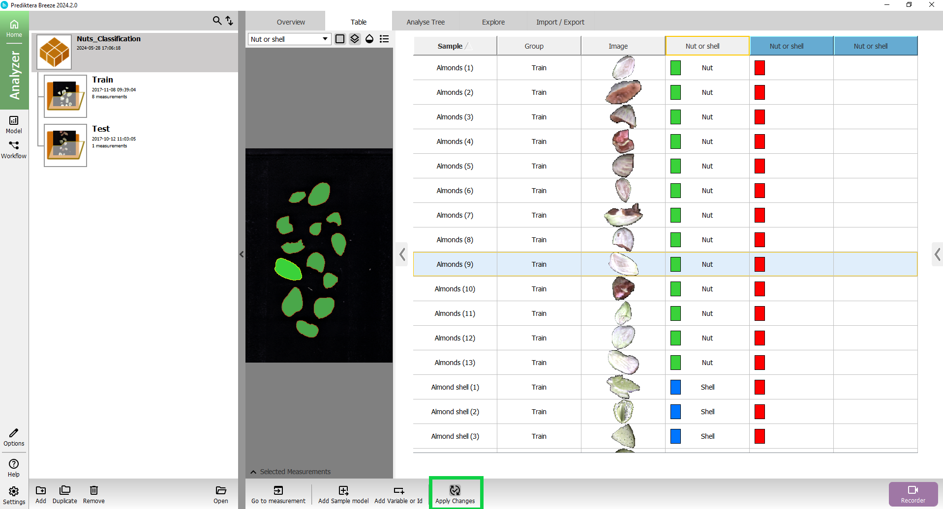
In the Table for the project Nuts_Classification, you can now see all the unique sample objects in the images after the sample model has been applied and the background pixels have been removed.
Collapse the left panel to view the results better.
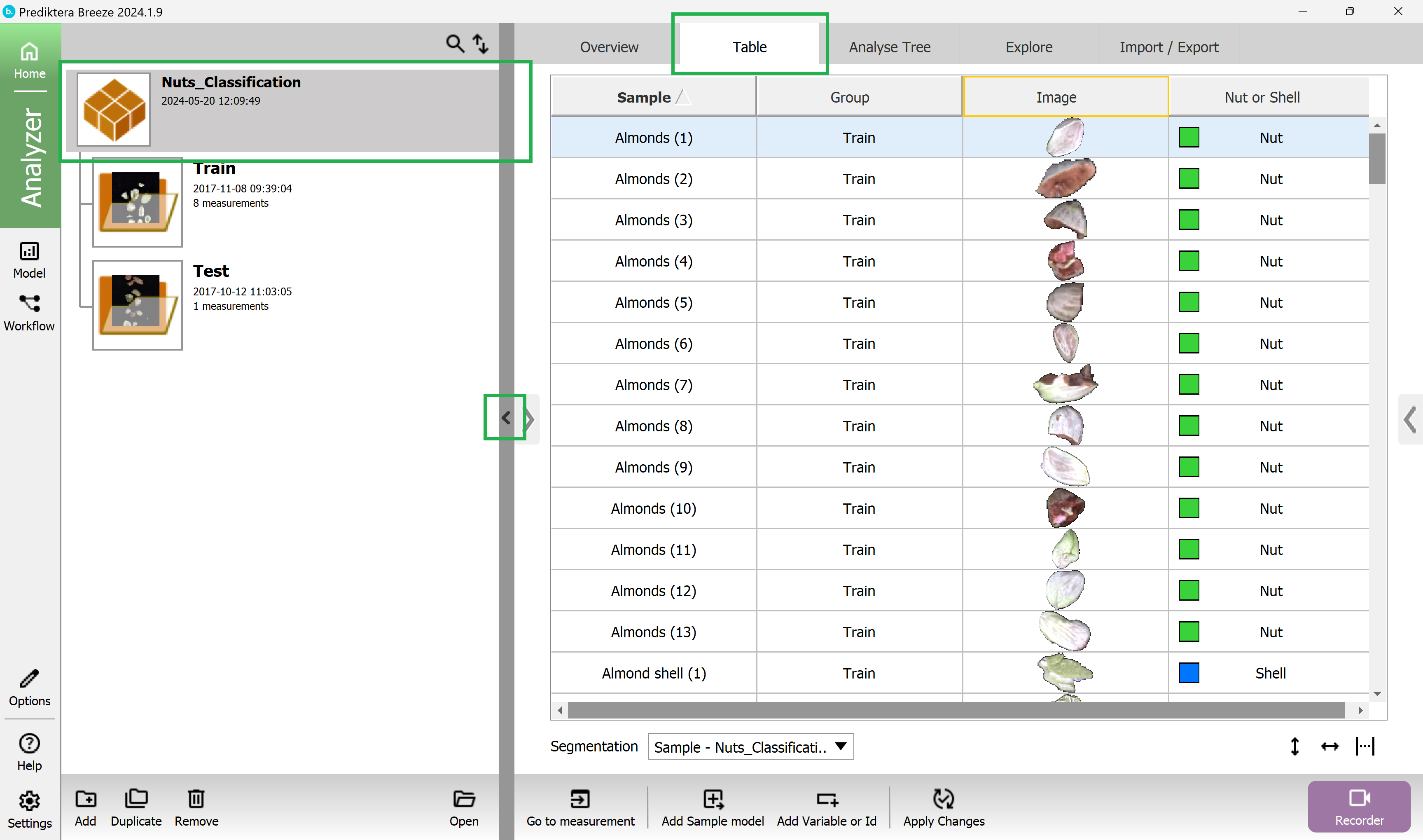
Click on a sample in the Nut or shell column in the table to color all objects in the preview image based on the class.
You can also click on the objects in the preview image to see where they are in the table.
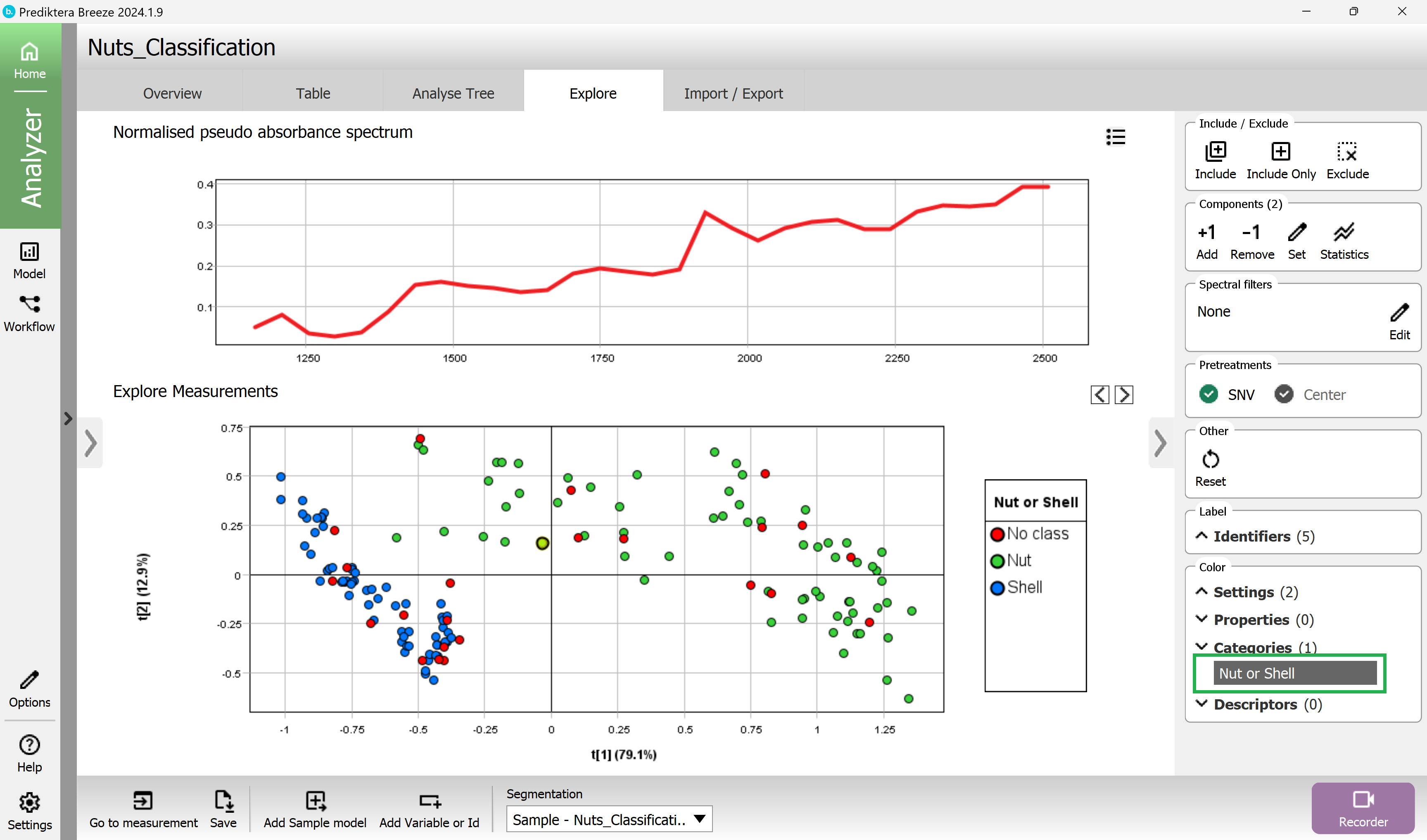
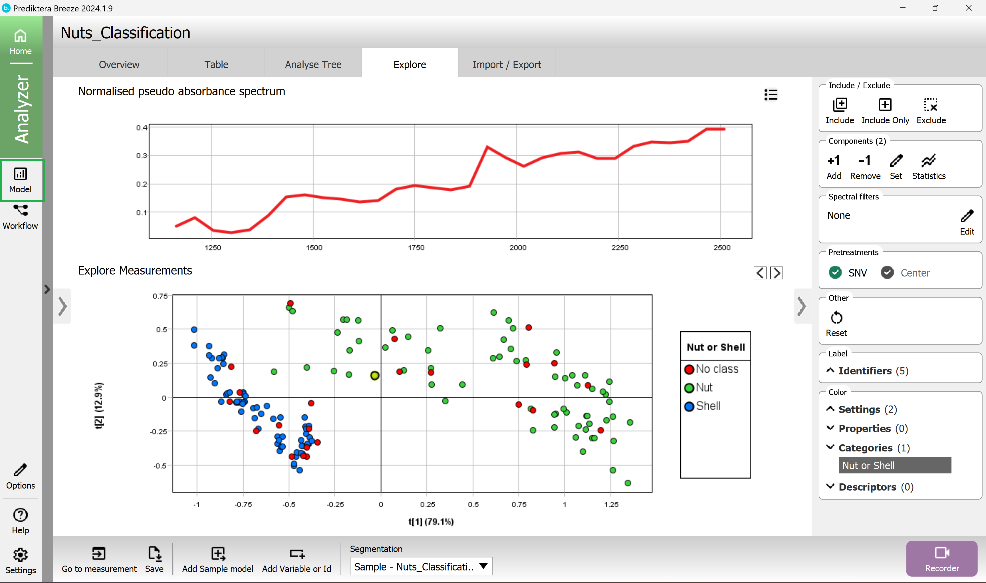
Select the Explore tab. A PCA model has been created based on the average spectrum for each sample. Each point in the scatter plot corresponds to a sample and the points are clustered based on spectral similarity. Select one or several points to see their average spectrum.
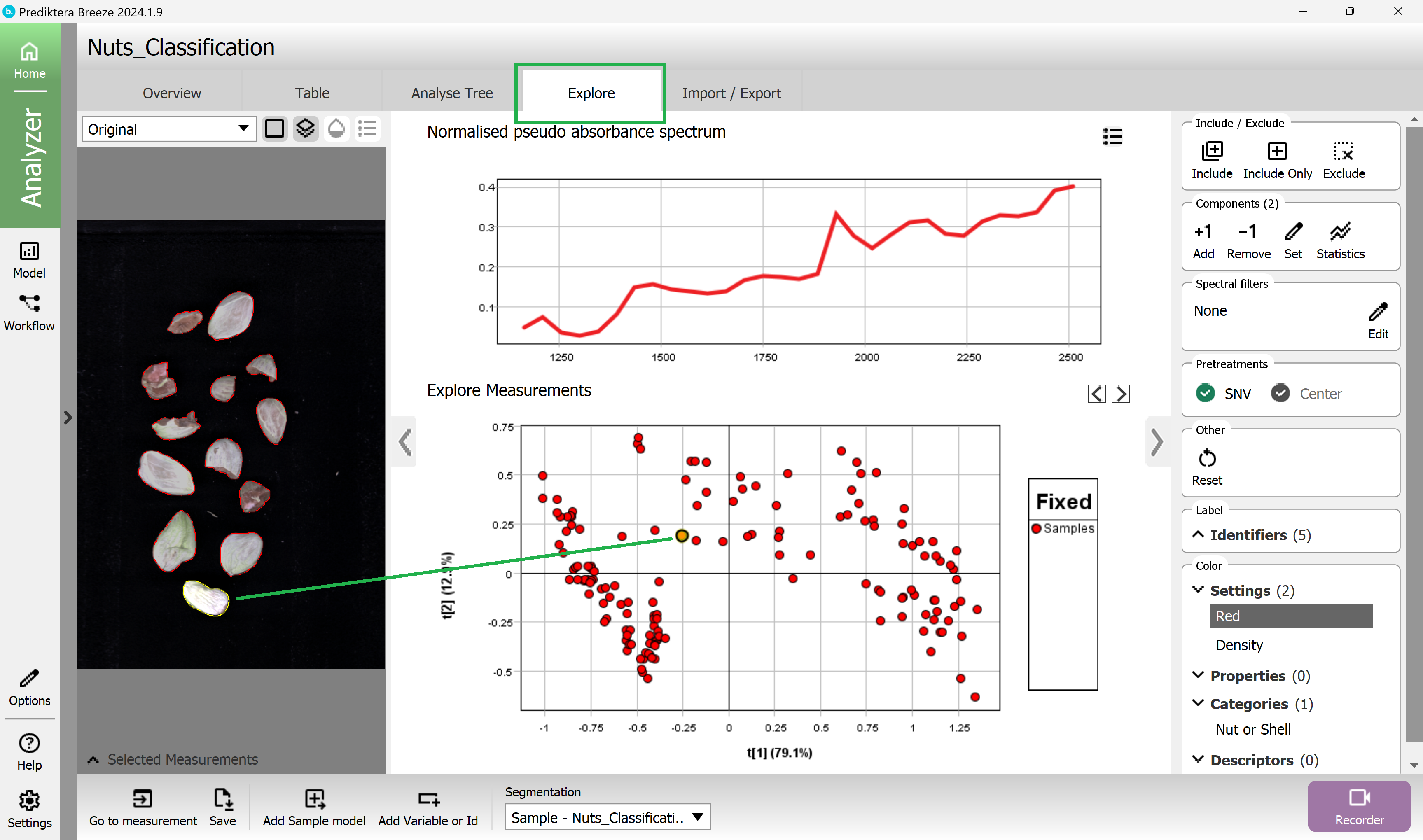
In the menu on the right select the category name Nut or shell to color the scatter plot and preview the image based on the different classes (the red dots are the Mix samples where we had not entered any class).
(you can close the preview image with the arrow to make more space for the plots and graphs).
Create a PLS-DA classification model
You will now use the average spectrum for each sample and the class type that you have set to train a classification model.
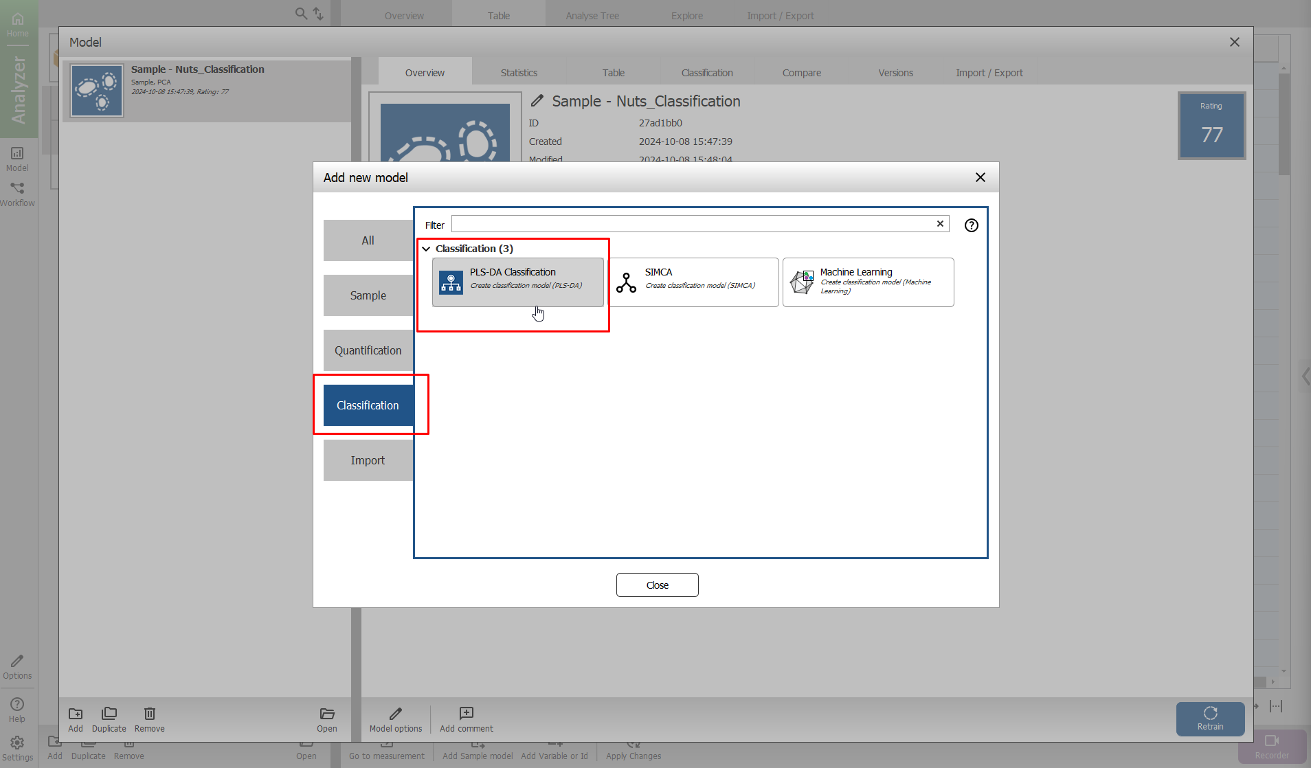
To create another model, go to the Model view by clicking the Model button on the left side of the screen.
In the menu on the left, you can see the Sample model that you created before.
To make an additional model select Add in lower left corner.
On the window that appears, select the Classification tab, and then select PLS-DA Classification.
Write a name for the model (or use the default name).
Select OK.
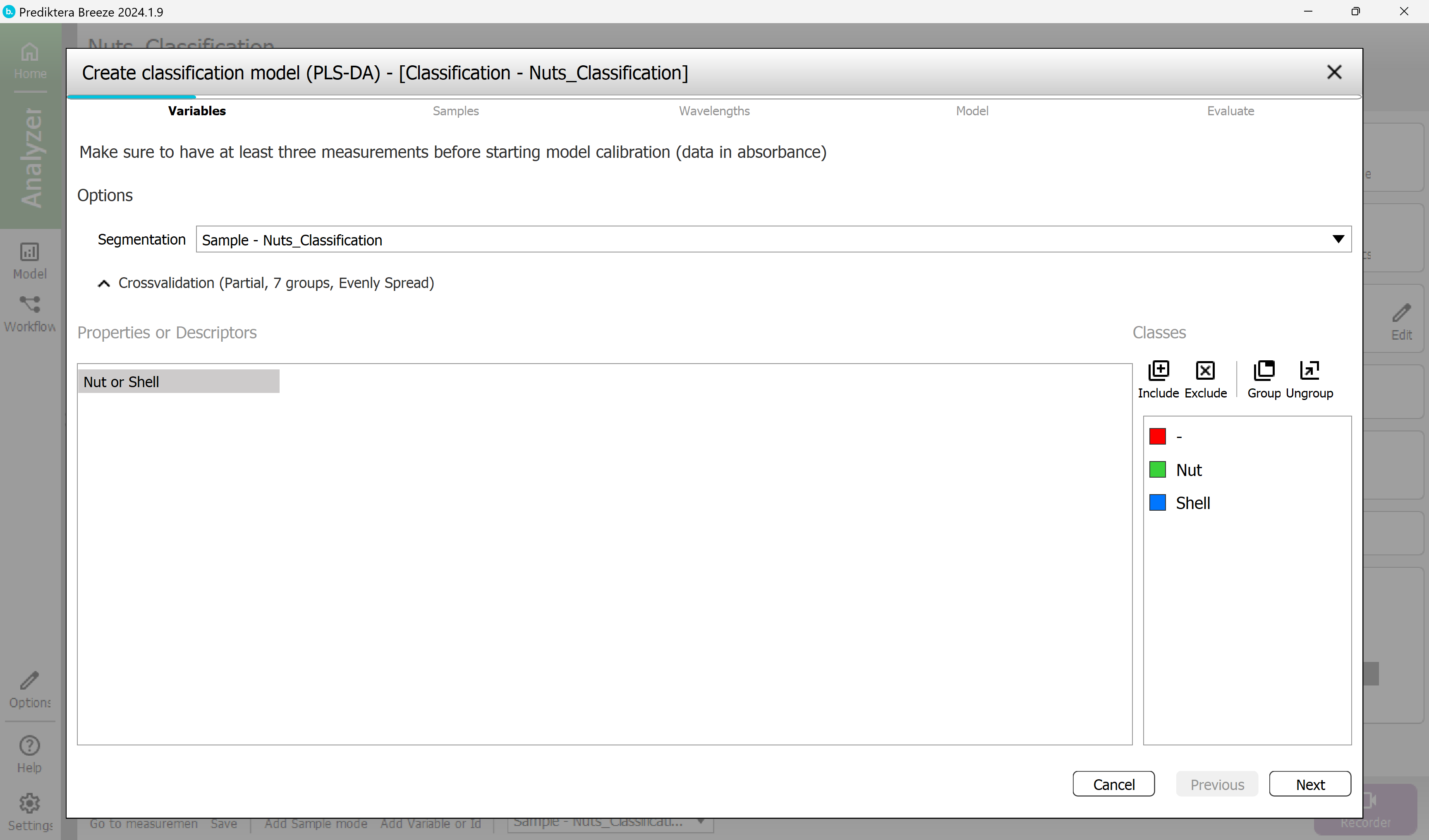
Step 1 - Variables
Use your previously created Sample model for Segmentation.
The Nut or shell variable is selected and will be used to build the model.
Select Next.
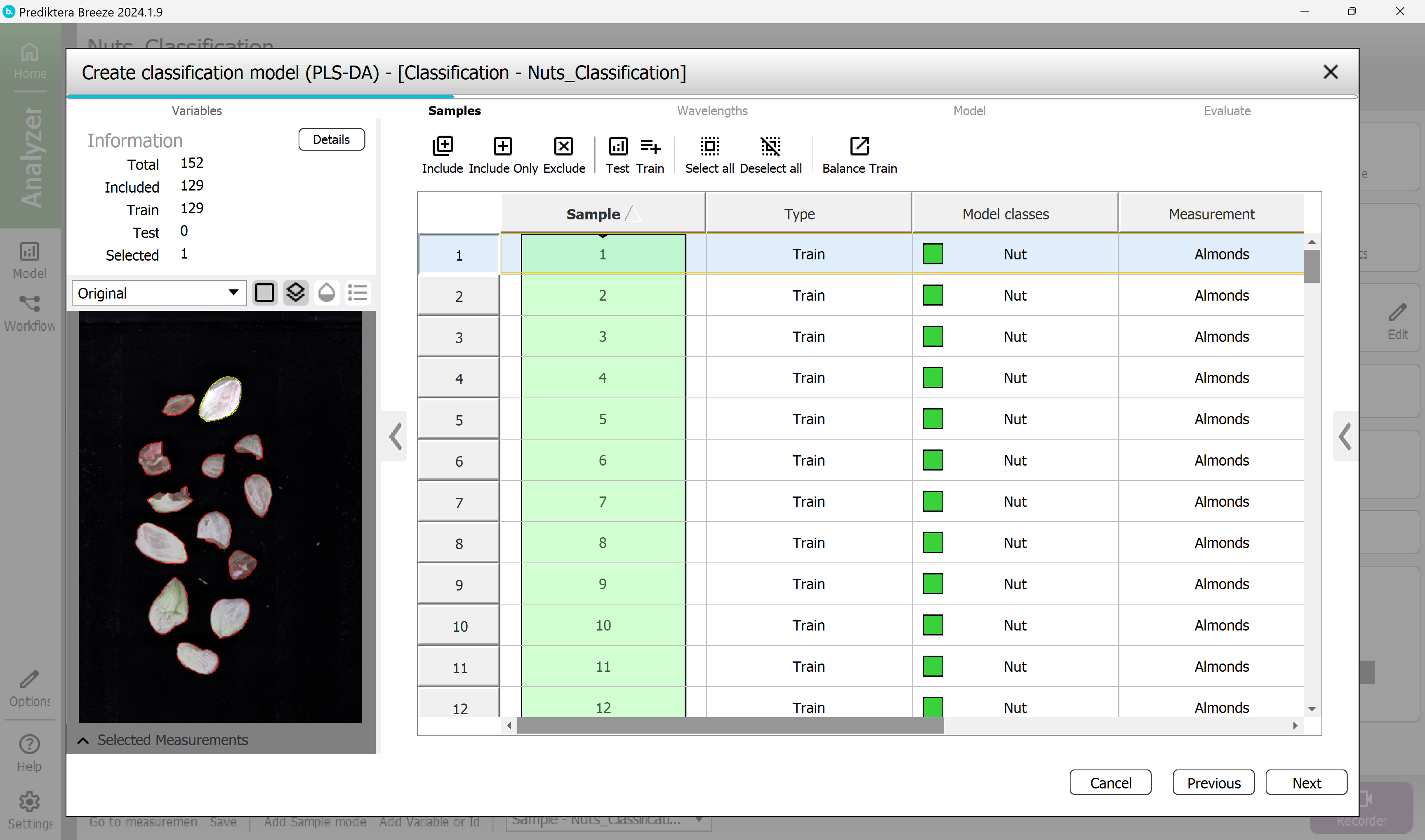
Step 2 - Samples
Select the samples that you want to include in the model.
By default, all the measurements from the Train group have been included since class information has already been entered for them. The column on the left side of the table named “Sample” is highlighted in green for included data.
The measurement Mix in the Test group has been excluded since there was no class information entered. This is OK.
Select Next.
Step 3 - Wavelength
By default, all wavelength bands are included. The graph on the right is showing the average spectrum for each sample.
By default SNV (Standard Normal Variate correction) is used. (see Pretreatments | SNV (Standard Normal Variate correction) for more information).
Select Next.
Step 4 - Model
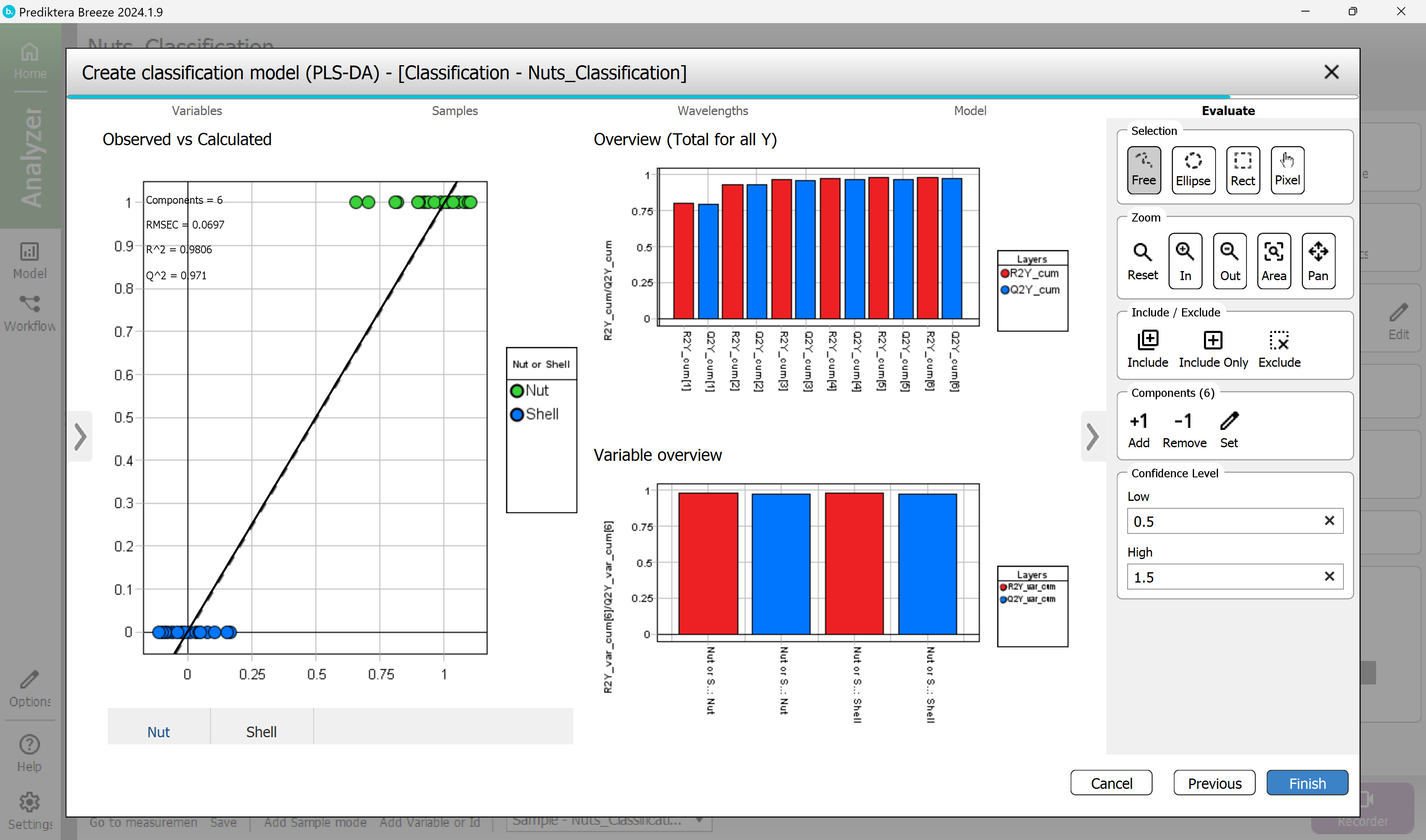
A PLS-DA classification model has now been calculated.
The results on your screen might vary slightly from the result seen here due to how you set the Critical Distance threshold in the previous segmentation.
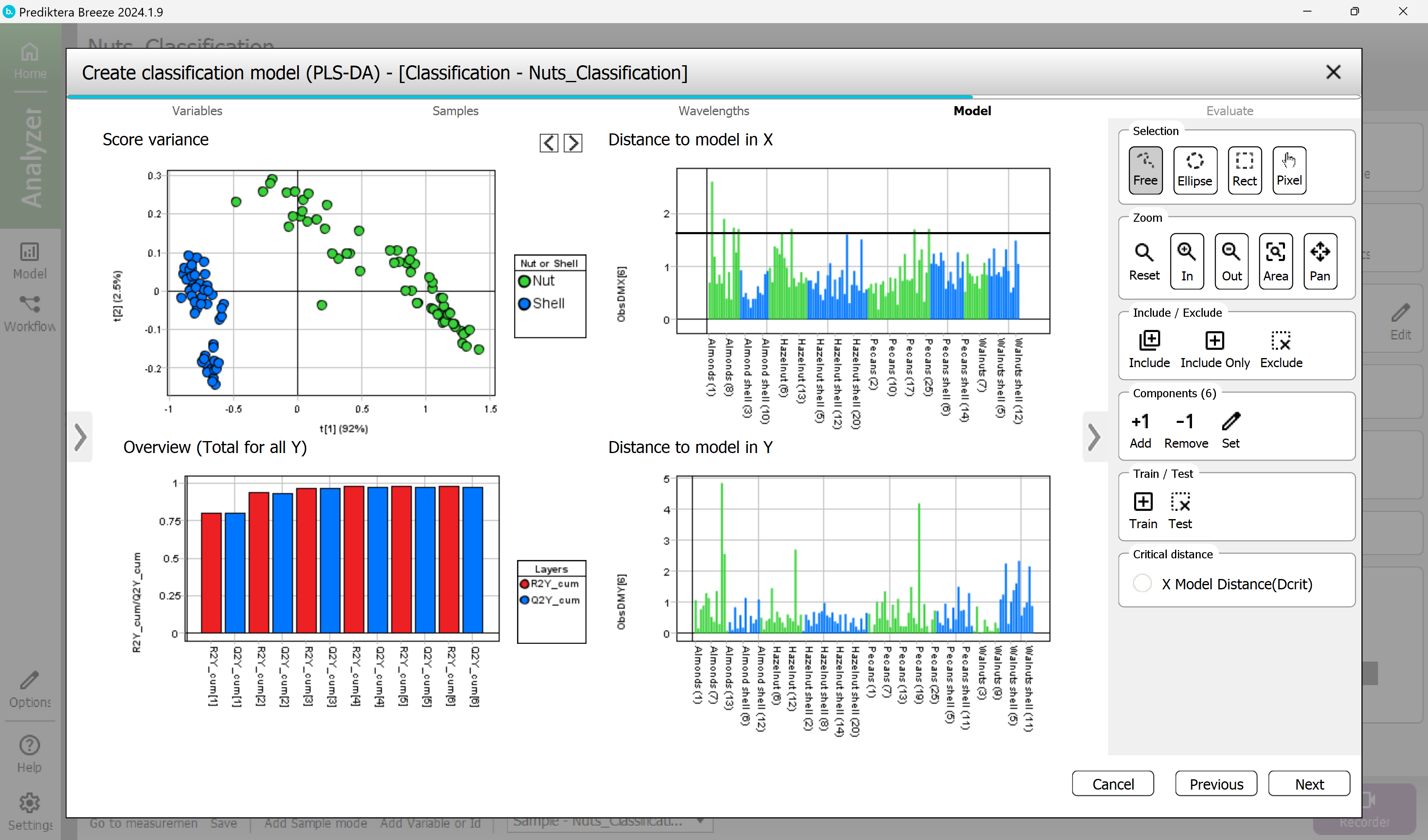
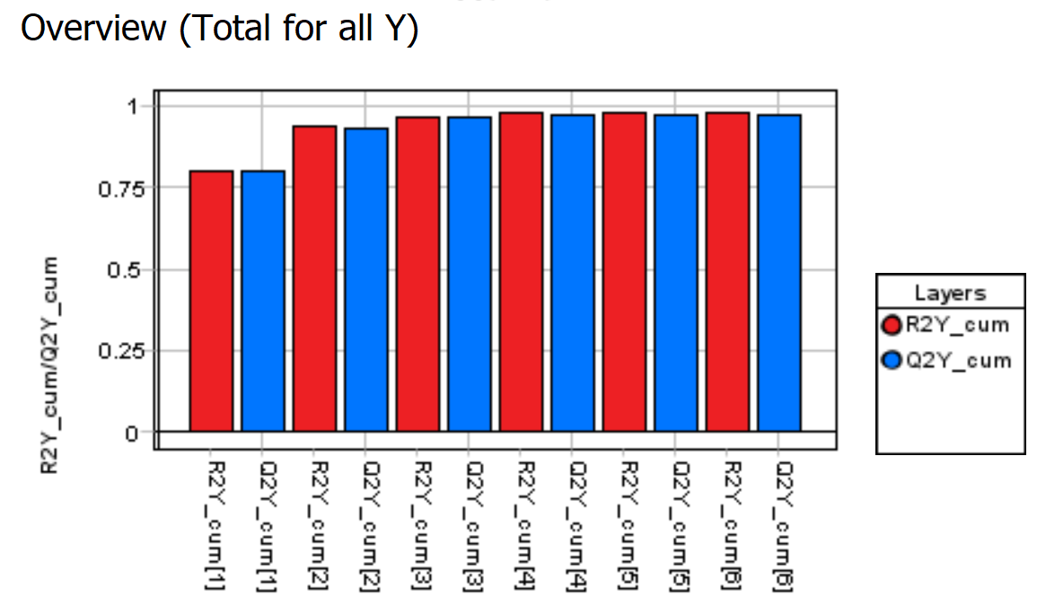
The Overview (Total for all Y) graph is showing how good the PLS-DA model is.
It also shows the number of components used for the model. In this case, the autofit used six components. The R2 (model fit) and Q2 (prediction from cross-validation) using six components are around 0.98/0.97 indicating a very good model.
An R2 and Q2 value of 1.0 indicates a model explaining all the variation. A value of 0 indicates that no variation can be explained. In this example it looks like the R2 and Q2 do not increase much after the 3rd component so we could choose to only use 3 components.
But for the sake of simplicity will use the autofit model of 6 (or 5) components.
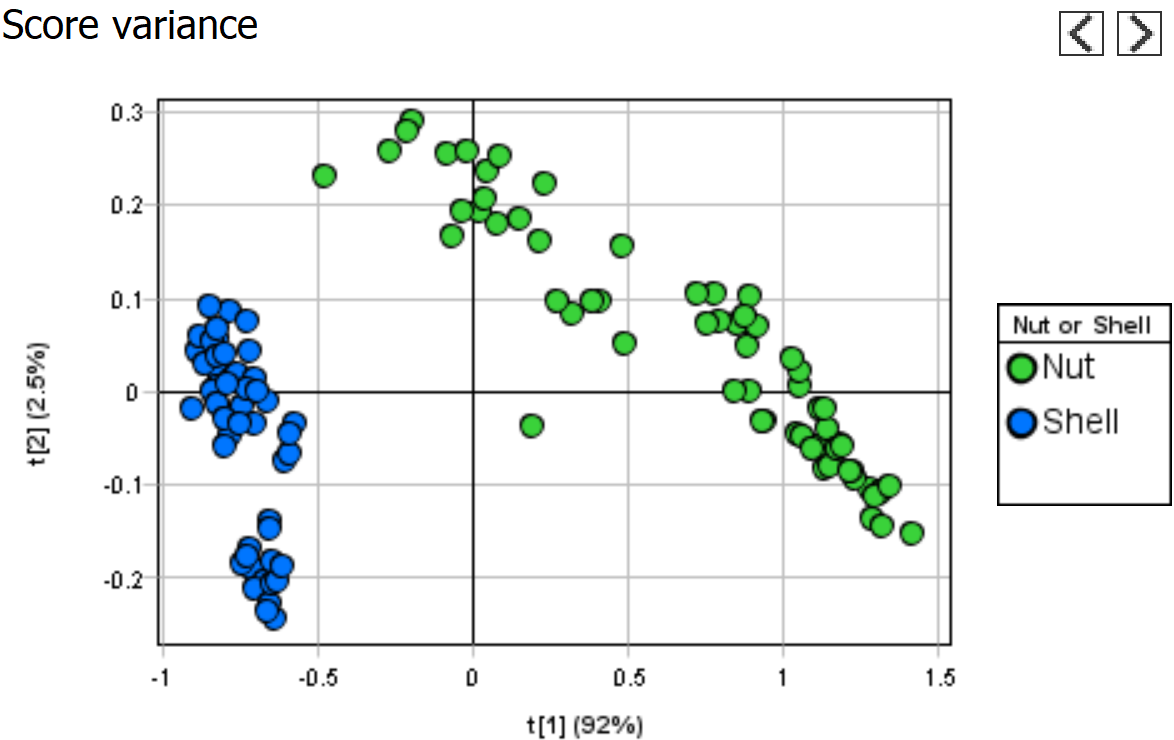
The Distance to model in X and Y graphs show the distance to the model for each sample.
A high bar indicates that the sample might be an outlier (for the X distance the horizontal black line can be used as a guide).
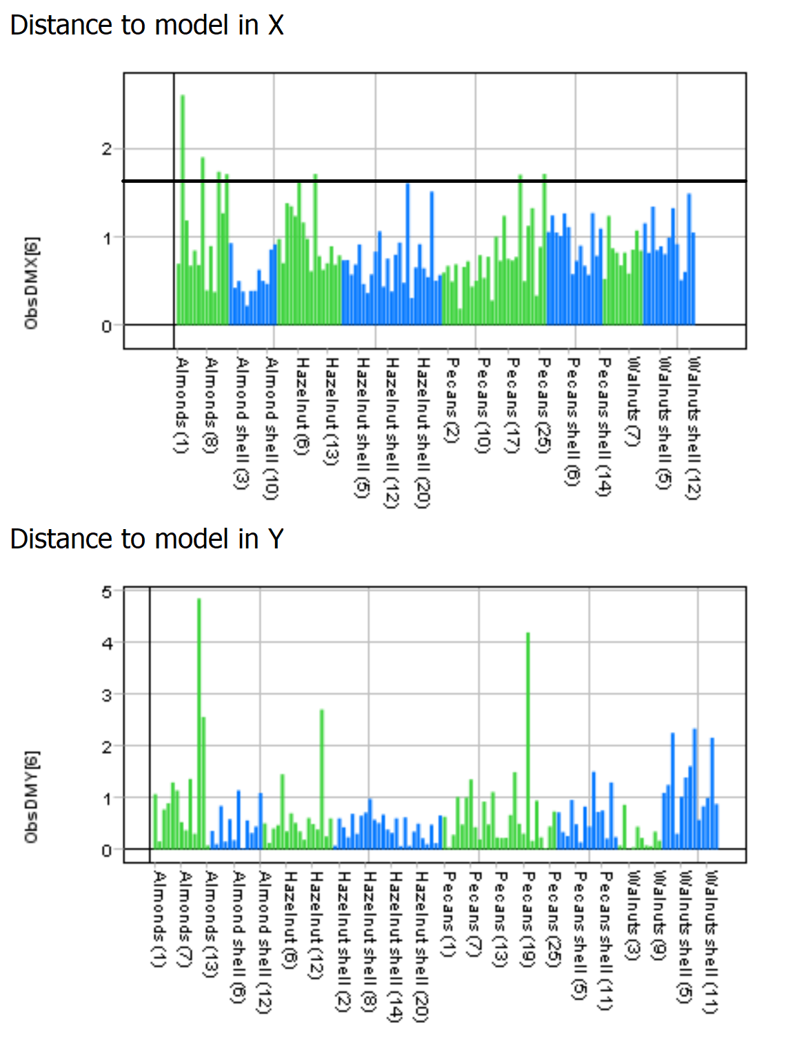
The Score variance scatter plot and the Distance to model graphs can be used to identify and exclude outliers.
In this example we are not going to remove any outliers.
Select Next.
Step 5 - Evaluate
Evaluate how good the model is.
Observed vs Calculated shows how well the model can separate the two classes.
Variable overview shows the R2 and Q2 for each class.
Everything looks OK.
Select Finish to complete the model.
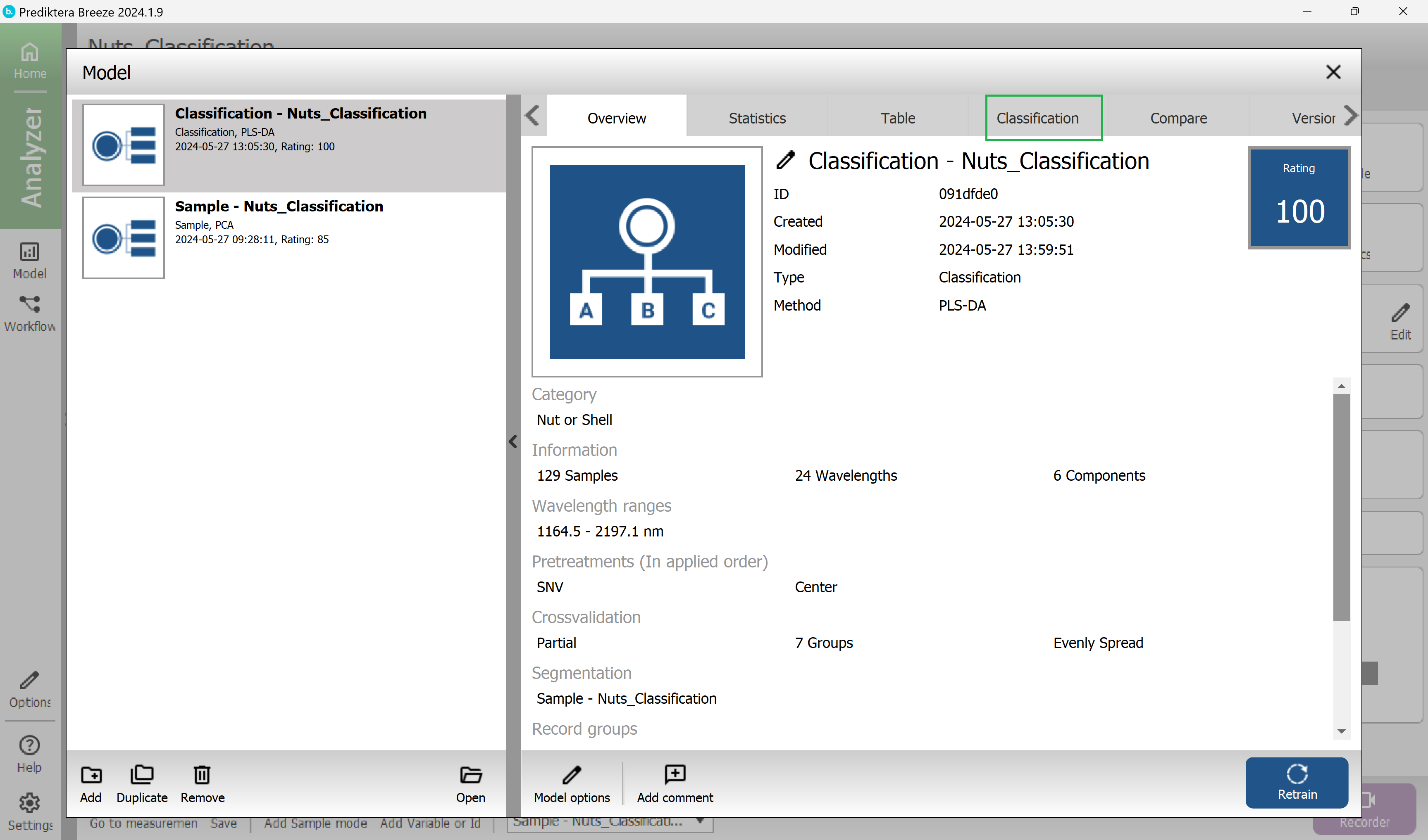
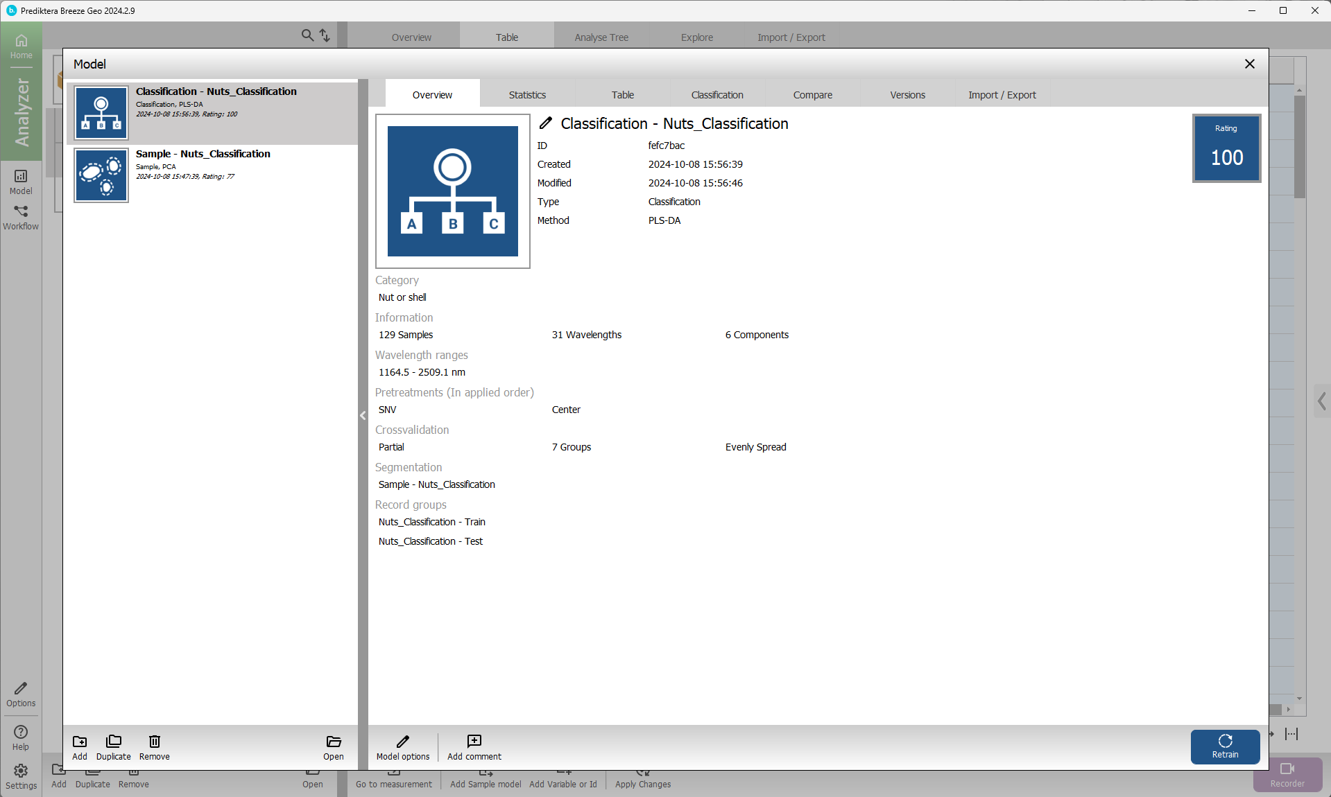
The Classification PLS-DA model has now been saved as you can see in the menu on the left.
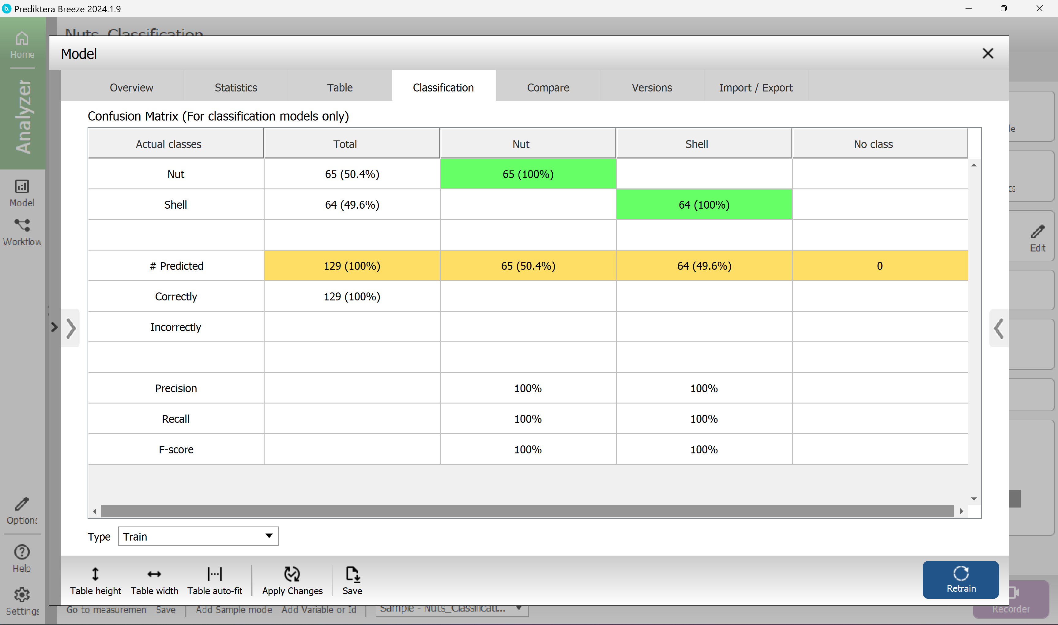
With this model selected click the Classification tab to see how many samples were correctly classified.
Each row is showing the correct class for the samples, and the columns are showing the classes that these samples are classified into by the model.
In this example, all the samples are correctly classified.
Close Model explorer.
Apply your model to classify samples
In this step, you will use the PLS-DA classification model (Classification - Nuts_classification, from the previous step) to analyze the images and classify the samples.
Select the Analyse Tree tab at the top of the screen.
Here you can make your own data processing workflow to automate the analysis of the images in your project.
The sample model we developed before is already in the Analysis Tree as the first processing step of your data (Measurements).
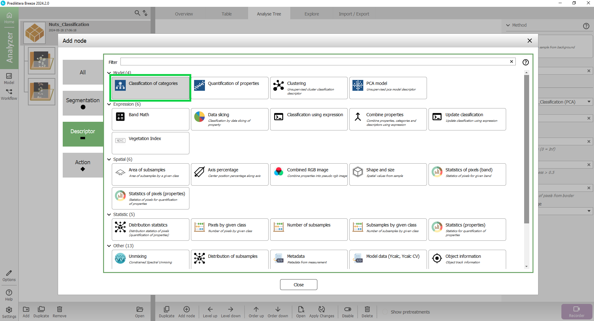
Select the + symbol after Object.
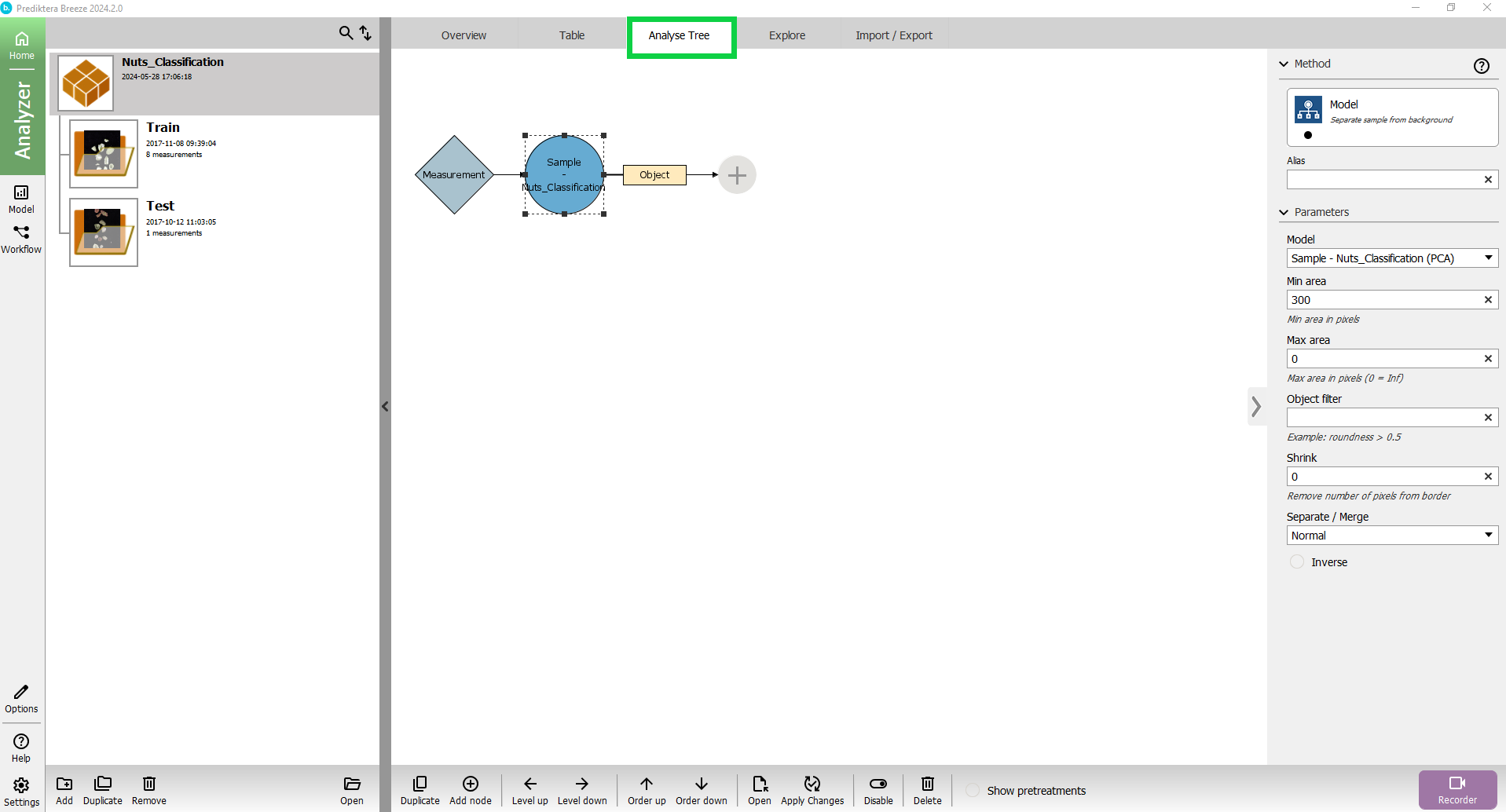
A pop-up will appear where you can select the data processing function you want to apply.
Click Descriptor and then select Classification of Categories.
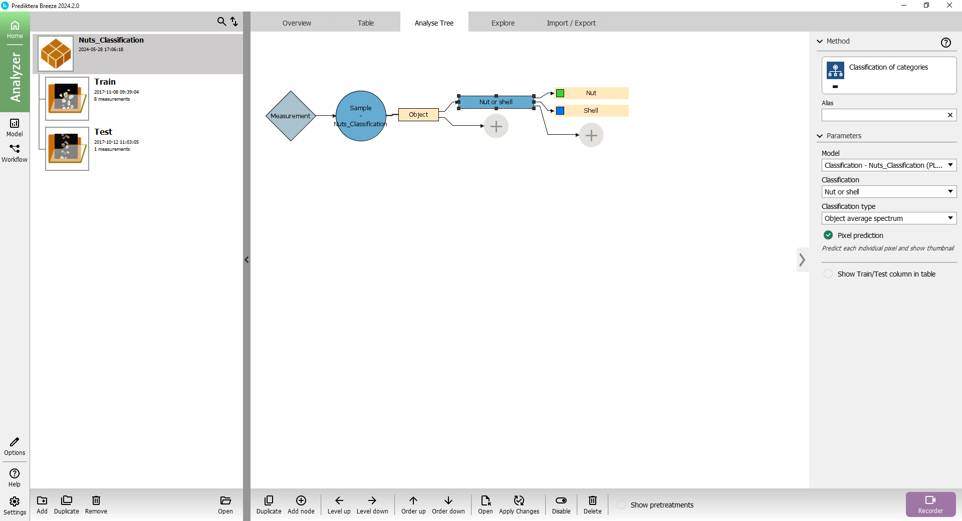
The Nut or shell PLS-DA model has now been added to the Analyse Tree.
When we apply this to our data, first, the Measurement (image) is analyzed by your sample model (Sample - Nuts_Classification) to find the sample Object.
For this object, it then applies your classification model (Nut or shell) to calculate the variables.
On the right side you can see a panel with the settings for this descriptor.
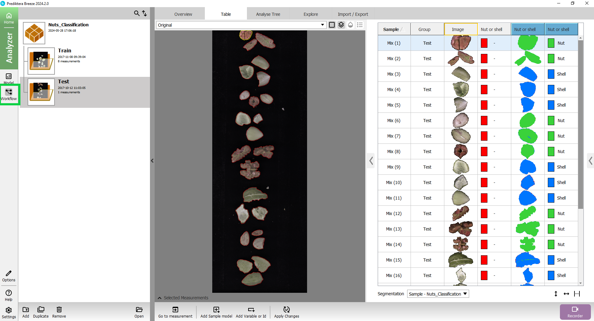
Go to the Table view.
Under the Table select Apply changes at the bottom of the window.
The Analyse Tree is applied to the data in this project and the table will be updated with the results.
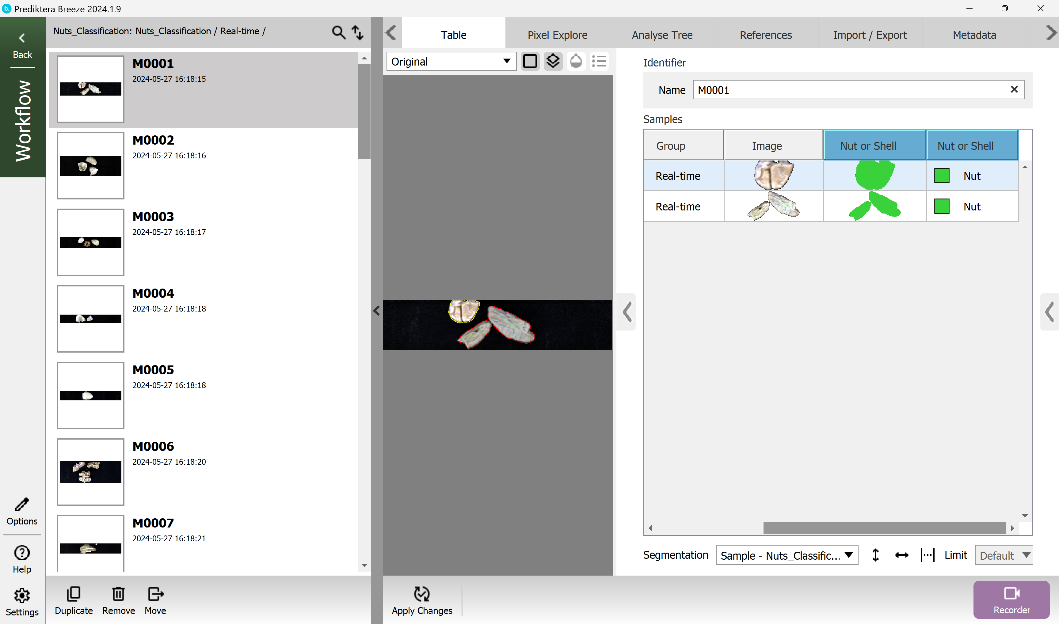
The columns with the blue headers are showing the classification results from the model.
You can click in the table to see the class for each sample in the image.
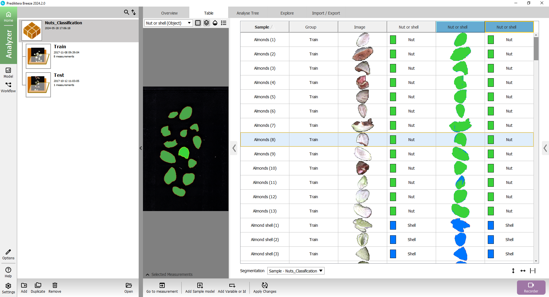
The Nut or shell column with the colored square is showing the class for the object based on its average spectrum.
The Nut or shell column with the small thumbnail image of the sample is showing the classification based on the spectrum for each pixel.
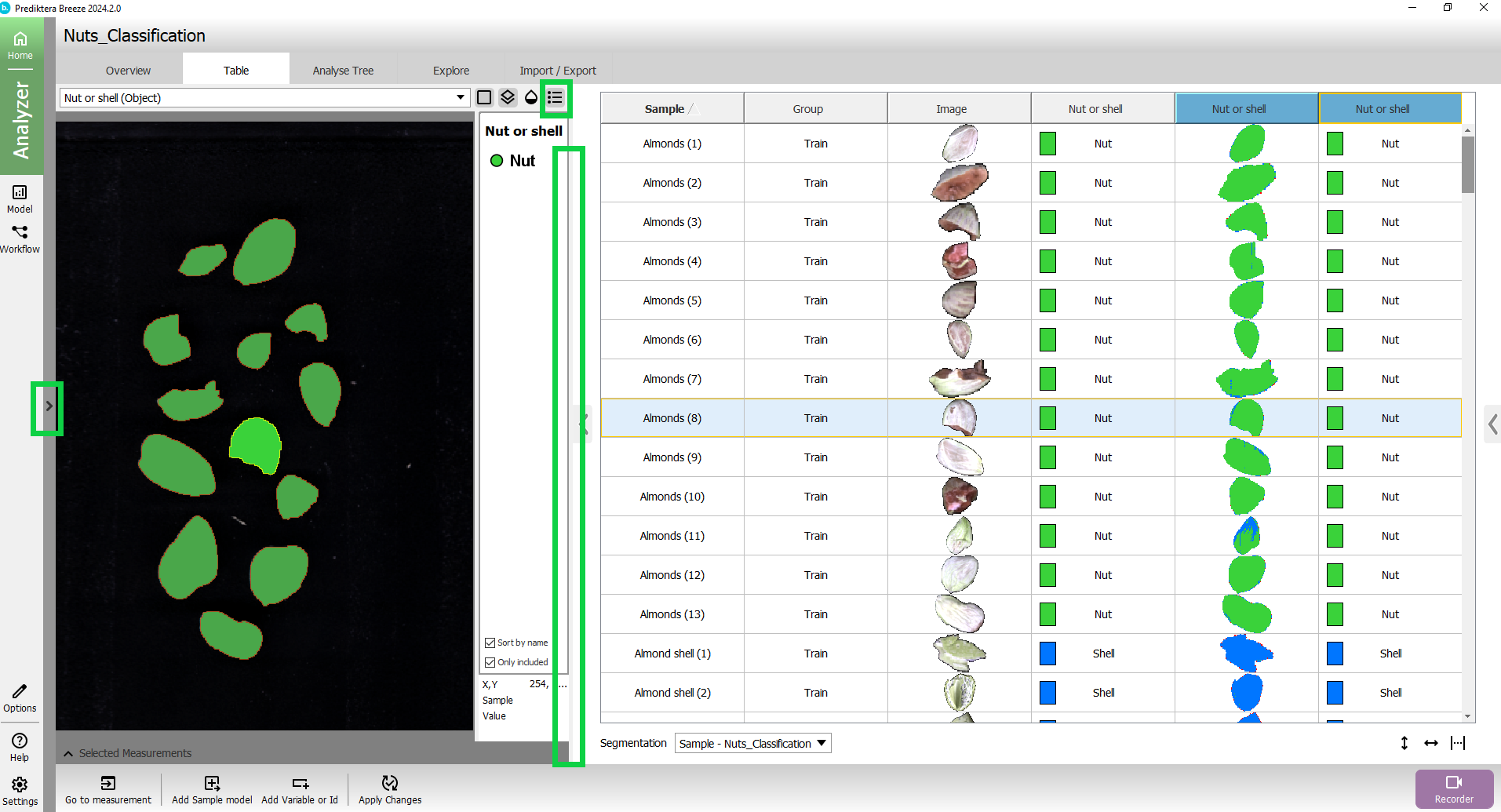
Collapse the left structure to view the results better. You can also drag the vertical line between the image and the table to adjust the image size.
Click the button above the preview image to add a legend with classes.
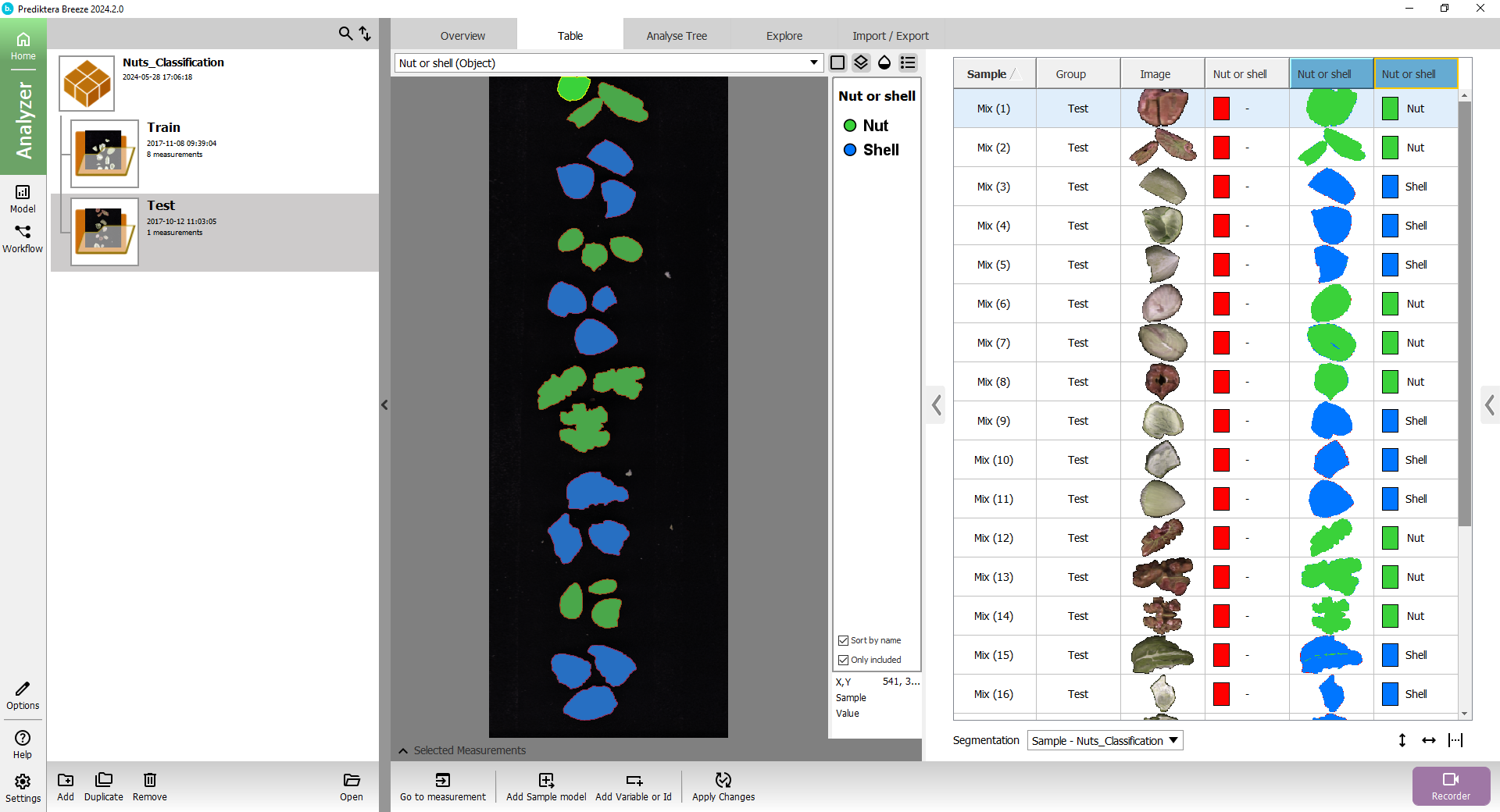
Expand the menu on the left, and select the Test group to see how it classified the objects in the test image.
Real-time prediction
In addition to analyzing images that are already recorded on your hard drive, you can also use Breeze Recorder to analyze images in real-time directly from the camera.
If your computer is not connected to a camera, you can simulate this by using the Simulator Camera in Breeze. With this, it will read images from your hard drive and analyze them continuously.
Add a Workflow for real time analysis
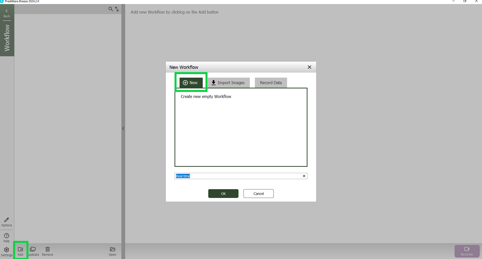
Select the Workflow button on the left side of the screen.
In the Workflow view select Add in the lower left corner and then select New. Give your workflow a name or use the default name.
Select OK.
In the Analyse Tree tab you can see that it is using as a default the Analyse Tree we just created in the previous step.
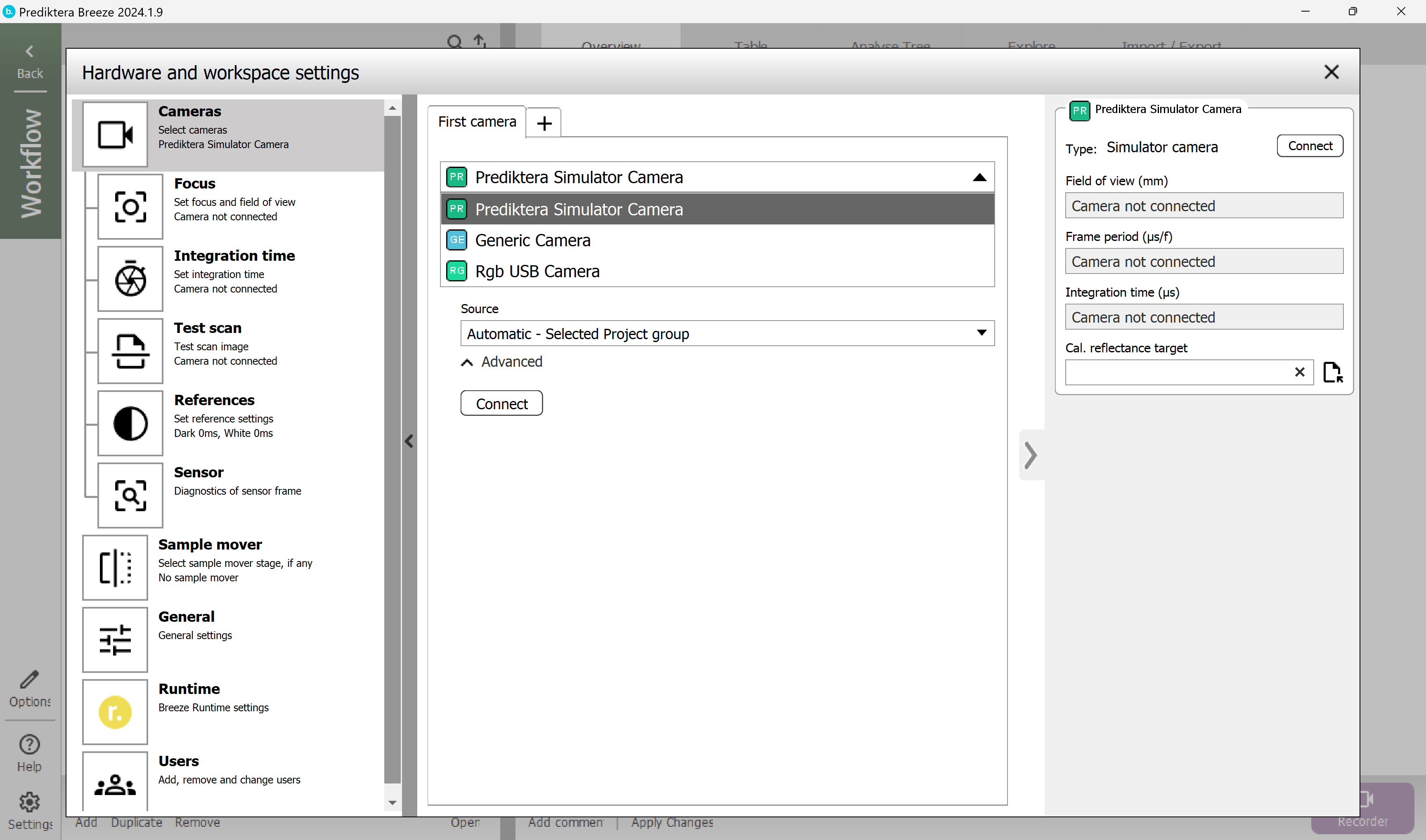
Before we can do the real-time prediction, we need to connect to the Prediktera simulated camera in settings.
Settings is always available from everywhere in the system.
Select Settings in the lower left corner. In this panel you can set up a camera or a sample mover.
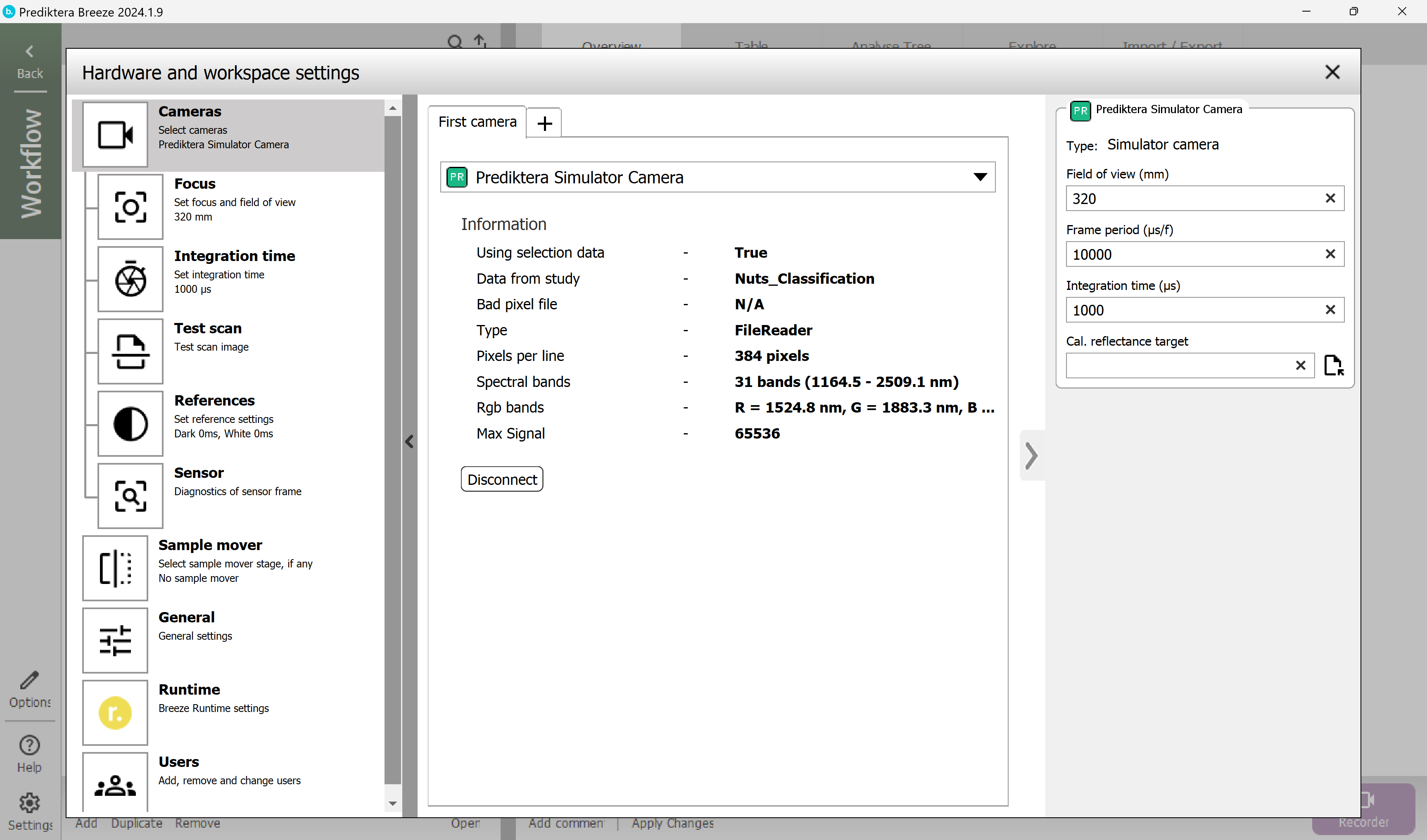
The Prediktera Simulator camera should be selected from the drop-down list. Click Connect.
When it's connected it should look like this.
Close Settings.
Start real time prediction
With your workflow of Nuts Classification selected, select Recorder.
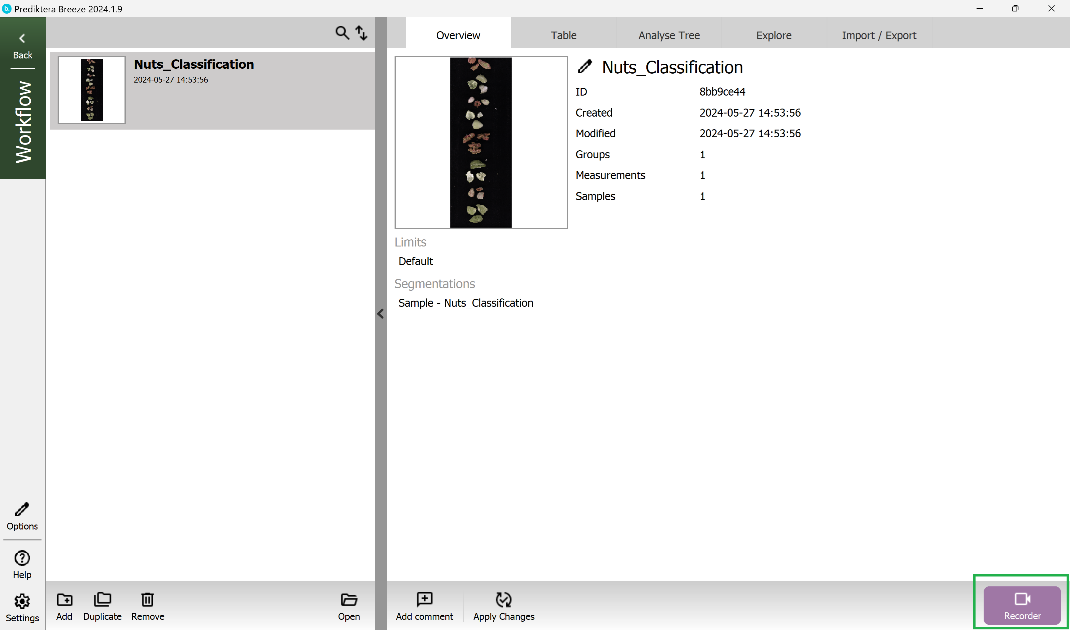
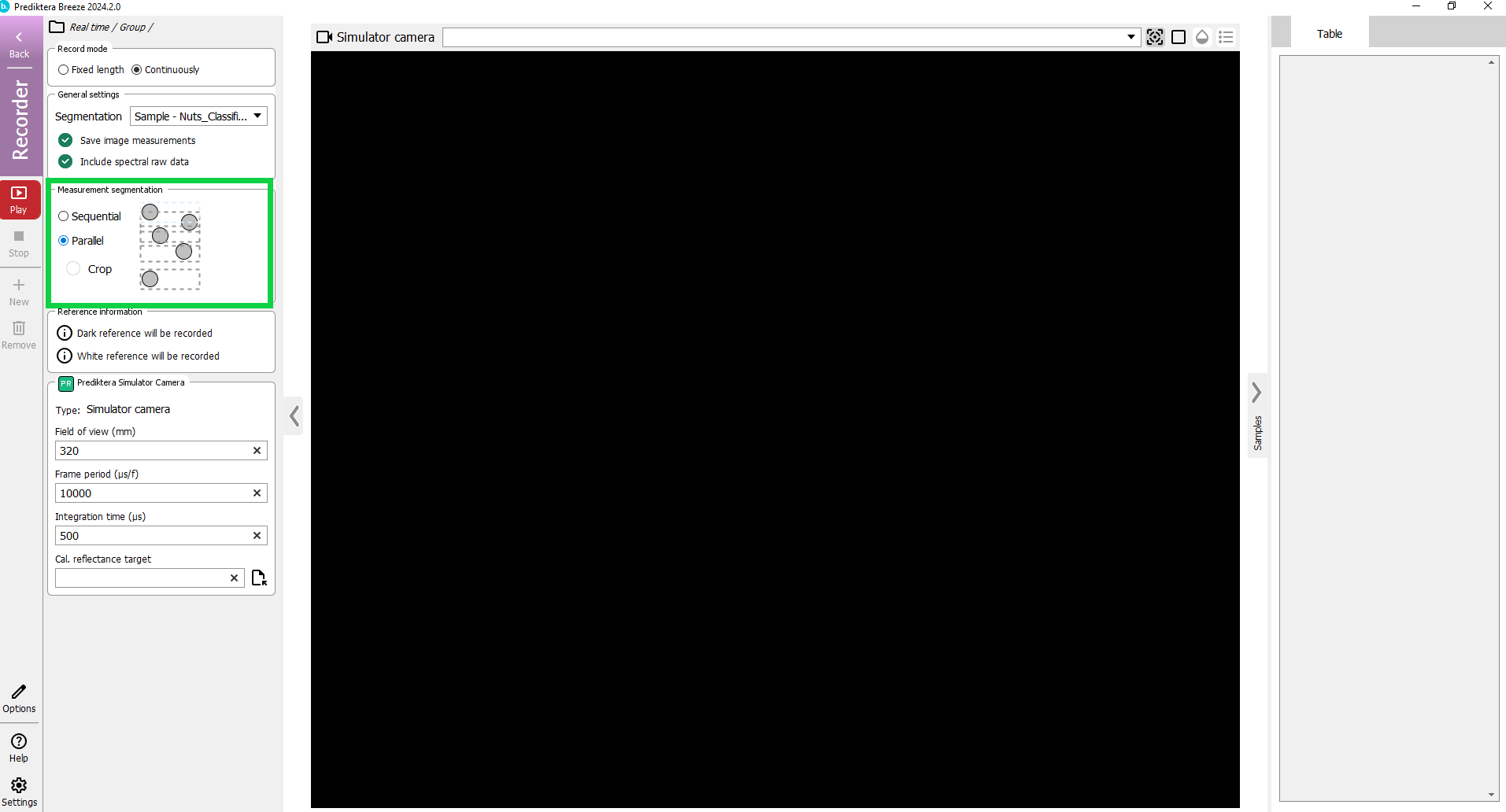
We are now in the Recorder mode. Here you can do data acquisition from a camera and run real time analysis using your Workflow.
In the panel on the left side you can configure how to run your workflow. If you want to inspect the recording later, ensure Save image measurements and Include spectral raw data are checked.
Under Object processing select the option Parallel.
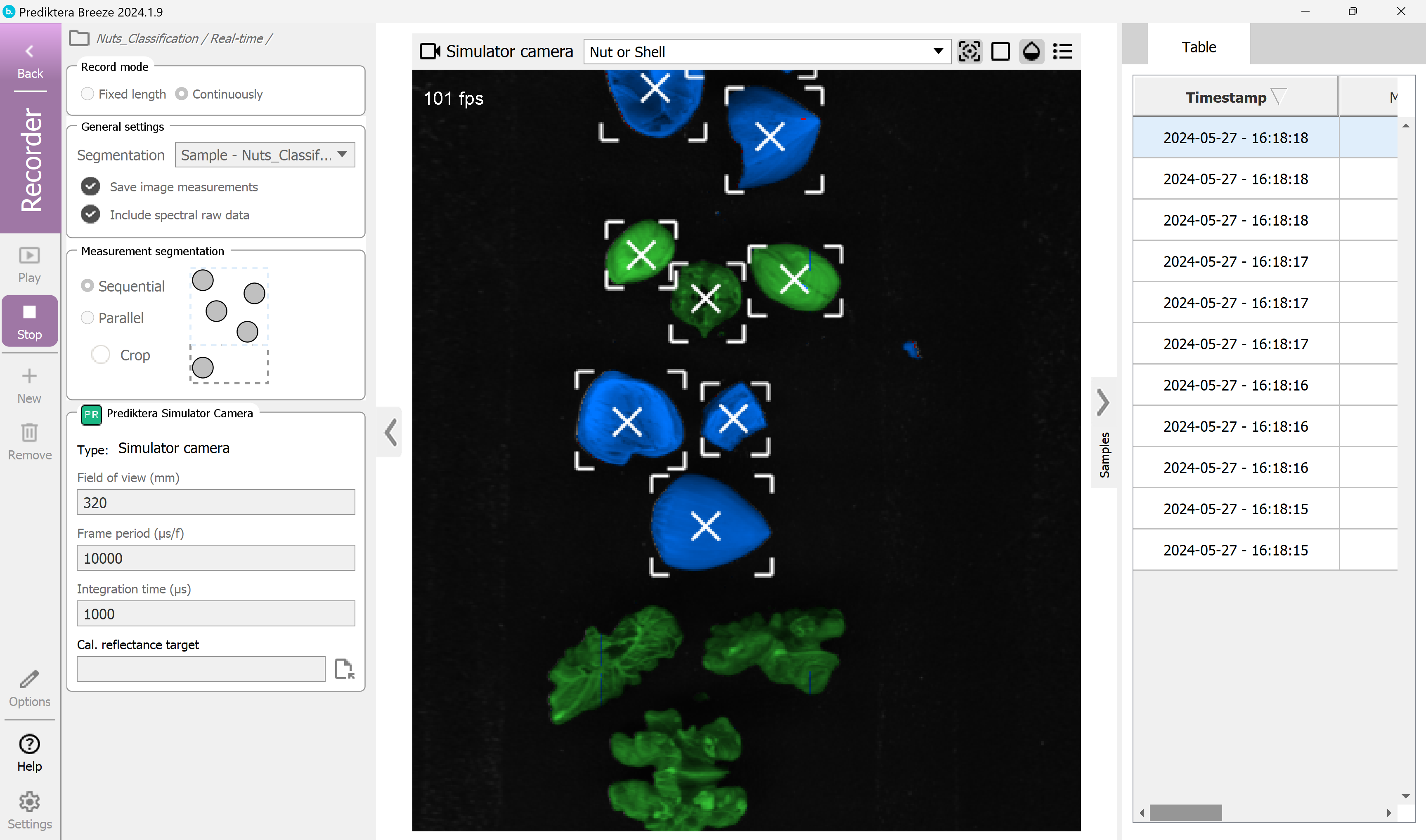
Click the red Play button on the left side to start the real time prediction.
You should see a wizard for the the white reference procedure. Press Take and then Record.
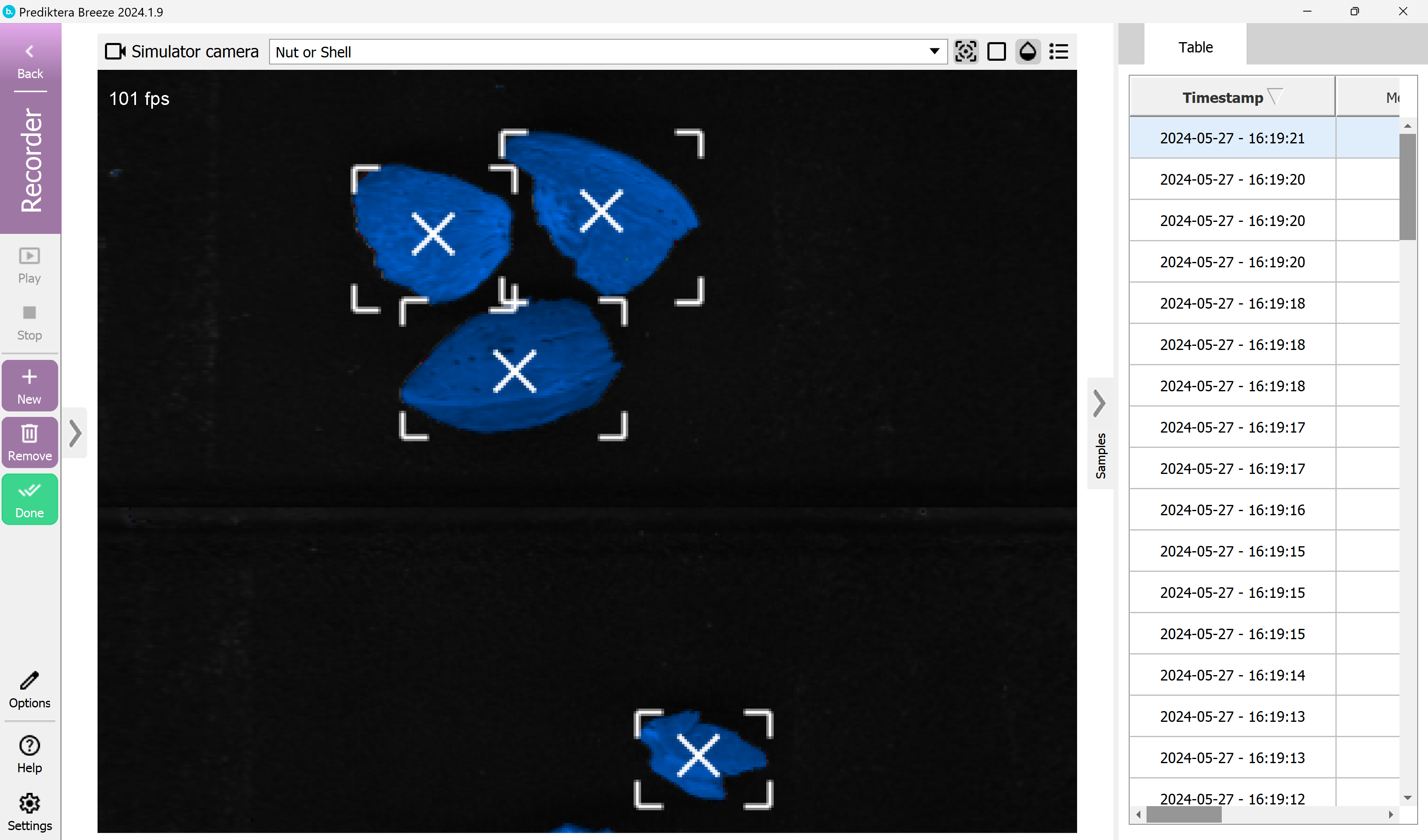
As you can see the image is analyzed in real-time and the results are displayed in the table to the right.
Click the Stop button.
Select the green Done button to leave the Recorder mode and go back to the Workflow view.
Here you can see the results saved in the table.
Nice job! You have reached the end of step 1 of the “Classification of Nuts” tutorial.
If you would like to learn more about classification analysis please try tutorial step 2 to learn some additional features.